About
Content Hubs is the upgraded legacy Video Portal experience, powered by Kaltura’s Theming design system, which controls the layout, navigation, and overall look and feel of your site.
Watch this short video for a quick overview of the Theming design system before exploring the features below.
Content Hubs capabilities
✔ Technology - Aligned with industry-leading standards to assure faster, slicker, and better UI.
✔ Branding - Incorporate branding elements such as colors, logos, and typography to create a cohesive and recognizable visual identity for the website.
✔ Design principles - Reuse of elements and components from the layout, and coherence in the design buttons, forms, and navigation menus that can be combined to create consistent and efficient designs.
✔ Accessibility - Prioritized accessibility to ensure all users can easily access and use the site.
✔ Responsive design - Ensures usability across various devices, from desktops to mobiles.
✔ Design language - Clear terminology and naming conventions for design consistency.
✔ Room to Grow - Our new page builder allows you to create as many different pages as you want, with as many elements as you want on each page.
Theme Builder
Content Hubs includes a Theme Builder which centralizes site-wide styling. Instead of configuring individual elements separately, you can define a theme and apply it across your site.
You can select a light theme, a dark theme, or create a custom theme.
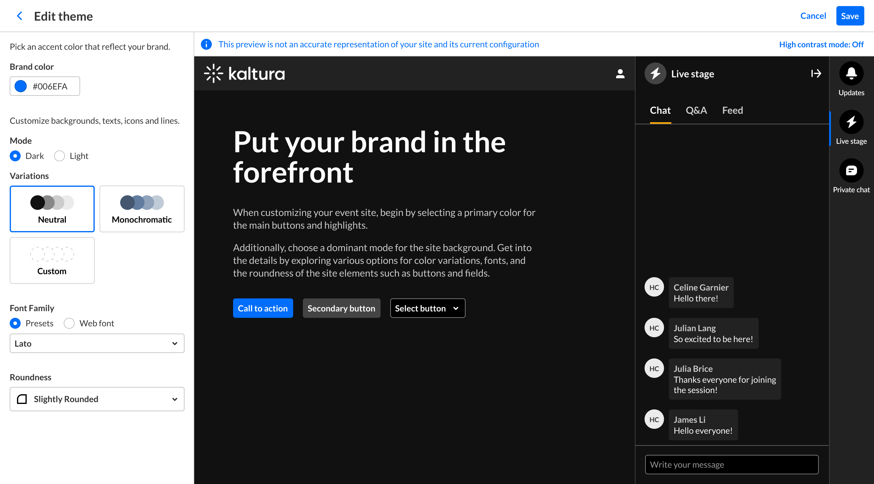
For more information, see Theme Builder.
Site-wide elements
Header
The main navigation bar displays across your site. It includes your logo, navigation menu, CTA buttons, and the +Create menu.
To customize the site's header, see the following:
- Header module - Set your site logo and basic header appearance
- Navigation module - Choose the navigation layout (horizontal or vertical)
- AddNew module - Configure the +Create menu and its order
- Headermenu module - Add call-to-action (CTA) buttons and links
Footer
The footer appears across all pages, with plenty of room for links, text, and branding elements.
To customize the footer, see the Footer module.
Core pages
Content Hubs includes a variety of built-in and customizable page types to help you organize and present your content.
My Media page
A user’s personal media library.
Users can upload, manage, and take actions on their own content, including editing, publishing, and organizing media.

For more information, see My Media in Content Hubs.
Media page
The media viewing experience for individual items.
Includes playback, metadata, and actions such as share, publish, and more.

- For more information, see Media page in Content Hubs.
- For editing options, see the updated Edit media page experience.
Upload media page
Upload, edit, and publish media, including bulk upload workflows.
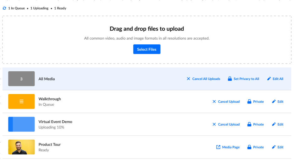
For setup instructions, see Upload media in Content Hubs.
Channels page
Browse and manage channels with customizable layouts and branding, including channel images and welcome videos.

- For more information, see Channels page in Content Hubs.
- For editing options, see the updated Edit channel experience.
Gallery page
Organize and showcase collections of media in a clean, flexible layout.
Gallery pages support sub-galleries, tabs, search, and filters, making it easy for users to browse, discover, and manage content.

- For more information, see Gallery page in Content Hubs.
- For editing options, see the updated Edit gallery experience.
Playlists page
Displays collections of media grouped into playlists.
Offers improved layout and presentation options for curated content.

- For more information, see My Playlists page in Content Hubs.
- For editing options, see the updated Edit playlist experience.
Additional pages
Channel collections page
Group channels into collections displayed in grid or list views, with support for filtering and manual sorting.

For more information, see Introduction to channel collections in Content Hubs.
Help page
Create a Help page with FAQs or Q&A content organized by topic.
You can add:
- Section titles
- Contact Us button linked to a URL
- Contact Us button linked to email
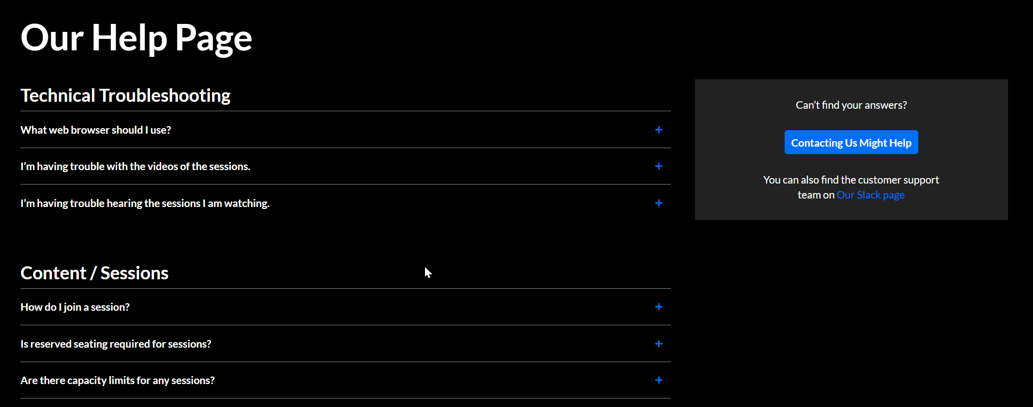
For setup instructions, see Helppage module.
Login page
Configure a branded login experience, including text and logo.

For setup instructions, see Login module.
List page
Create a list of links to highlight featured topics, resources, or destinations.
You can configure:
- Titles
- Descriptions
- Thumbnails
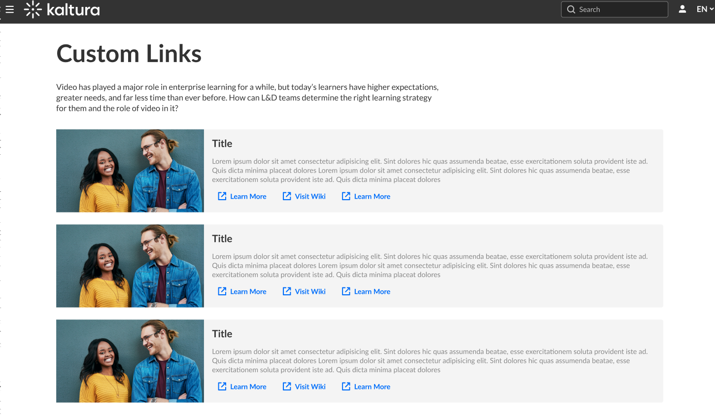
For setup instructions, see Listpage module.
My Profile page
Provide users with profile pages that include:
- Biography
- User content
- Profile design elements
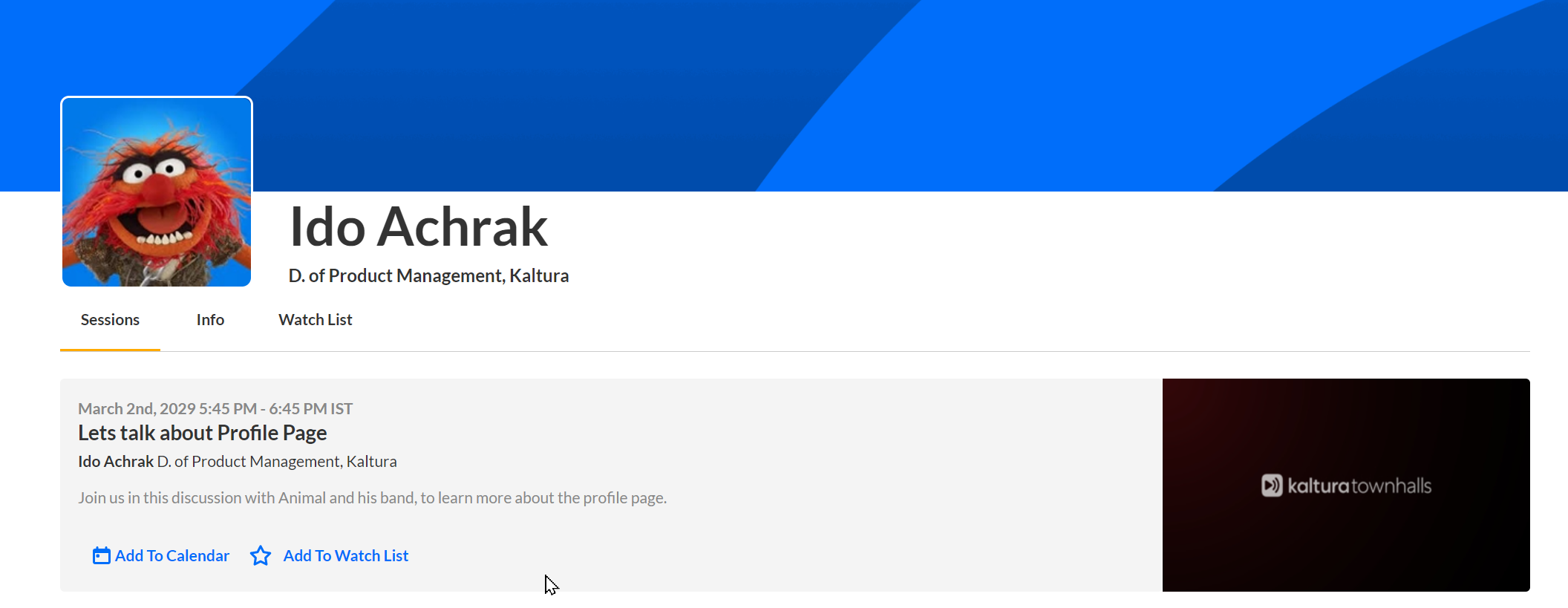
For more information, see My Profile page in Content Hubs.
Build your homepage and custom pages
You don't have to be a designer to create the pages you want. You now have creative freedom using a variety of great new components that you can mix and match.
With the new page builder, you can create as many different pages as you want, such as multiple homepages or special landing pages. It gives you the flexibility to refresh your site’s look and structure using reusable components.
For the setup guide, see Create and use a template page and the Templatepages module.
Here is a list of new components we've created for you:
Hero banner
Add a prominent visual section to your page. You can choose from layouts such as Player Carousel or Text & Counter, or remove the hero entirely.
 Text & Counter hero
Playlists
Add a playlist as a dynamic homepage element. Control the number of thumbnails displayed and how often they rotate - ideal for showcasing content like “Most viewed” or “Recently added”.
Clickable images
Attract your users with engaging images that redirect them to any web page of your choice.
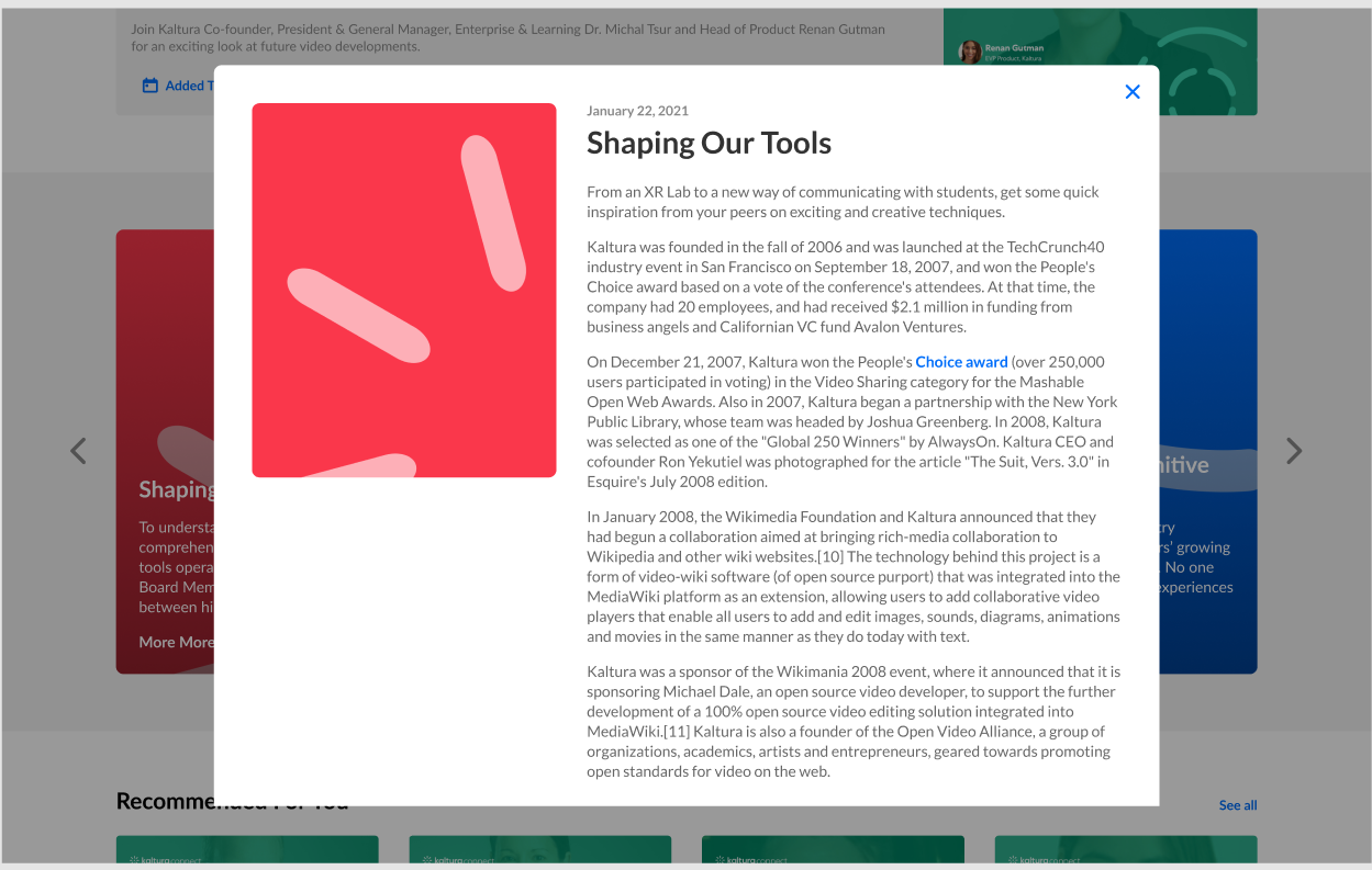
News Items
Have a playlist of articles in the form of a carousel. Each image on the carousel opens to an article, as shown below.
Plain text
Use this tool to feature content such as a ‘welcome’ message, an introduction to your site, or a content policy. You control the color of the text and the background.
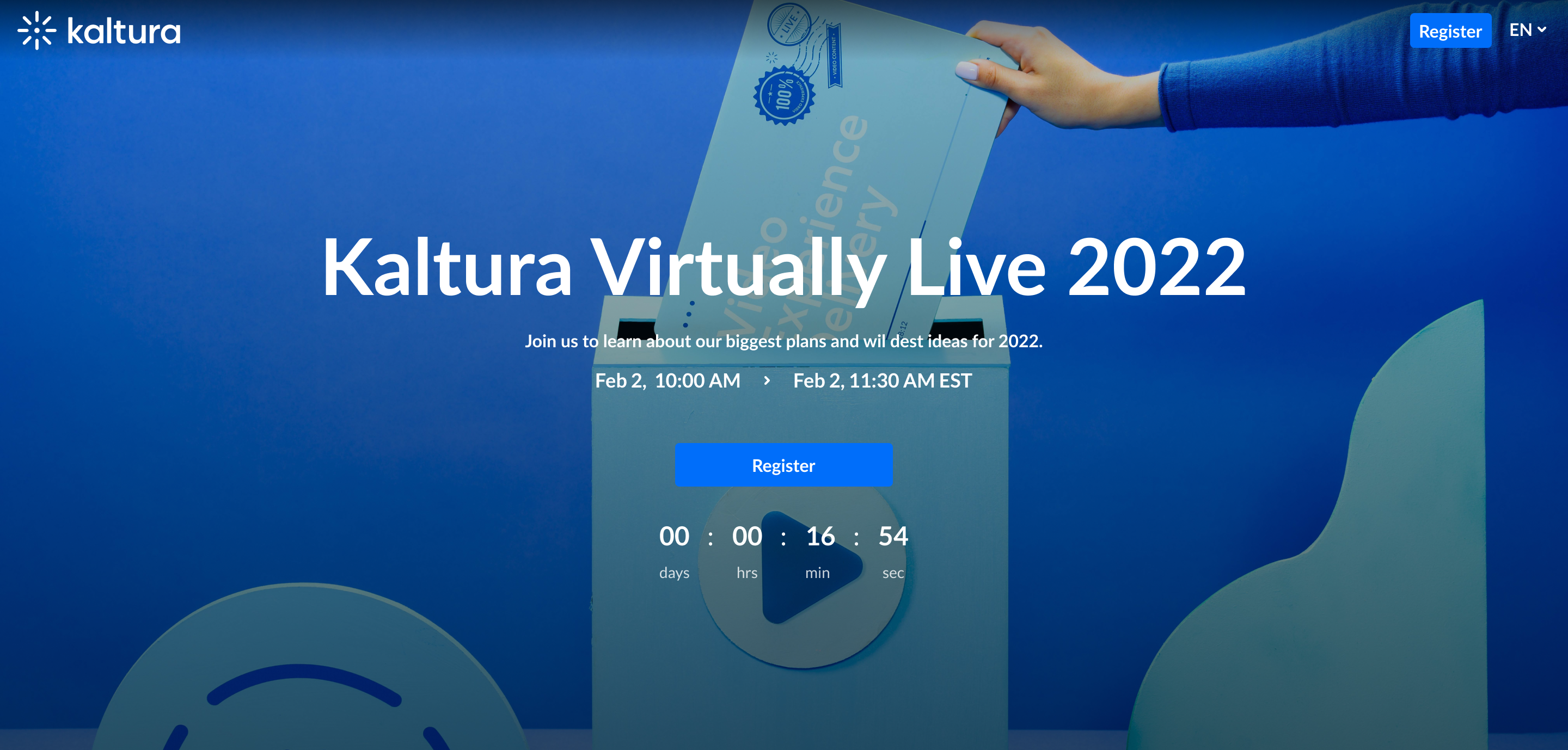
Registration
This component makes registering quick and easy for users. By clicking the "Register" button, the registration page opens on the side of the page for easy completion (as shown below). No need to navigate elsewhere!
Collection of channels
This feature gives users an easy way to explore and access channel collections. Clicking 'See All' will take users to your channel collection page. If you don't have any channel collections yet, you can set them up in the ChannelCollections module.
Banner & CTA
This component provides a banner with text, a call-to-action button and background image.
Groups page
Once enabled, this module allows you to create a dedicated 'group page' where users from a group are displayed in a tidy grid layout, while promoted users take the spotlight in a carousel.
It's the perfect tool to organize and highlight the standout members of your community or enterprise.
Example of a homepage
This example shows how Theming components can be combined to create a homepage layout.

