About
Landing page components populate the body of a landing page with media, text, banners, playlists, registration flows, and interactive content.
Components are added and configured in the components section of the Templatepages module and can be used to create dynamic landing page experiences for events, campaigns, showcases, and branded destinations.
Components can be used to:
- Display playlists or featured media
- Show content from channels or categories
- Highlight trending or recently added content
- Display banners, text, and calls to action
- Promote registration and event sessions
- Highlight speakers or featured users
Applies exclusively to Content Hubs and requires the Theming module to be enabled.
Access component settings
- Go to your Configuration Management console, and select the Templatepages module. You can also navigate directly using a link: https://{your_site_url}/admin/config/tab/templatepages.
- Click Edit next to an existing page template to open it, or click the +Add TemplatePage button to create a new one.
- In the TemplatePage section, scroll down to the Components section and click +Add "components".
The 'Templatepages' page opens.

To learn how to create and publish a landing page, see Templatepages module.


In the type drop-down menu, select the component type you want to configure then follow the setup instructions below.
Shared component settings
All component types share the following fields:
- Order - Defines the order in which components appear on the page. Lower numbers appear higher on the page. We recommend using non-consecutive values such as 10, 20, and 30 to simplify future reordering.
- Allowed Groups - Limits component visibility to selected user groups. Leave empty to display the component to all users. You can add multiple components of the same type to a landing page.
You can add many components of a single type to the page. However, note that adding too many components may impact page load time and overall user experience.
Component types
Available component types include:
- Text only
- Single playlist
- Two images side by side
- News images
- Registration
- Collection of channels
- Banner & CTA
- Group of users
- Sessions

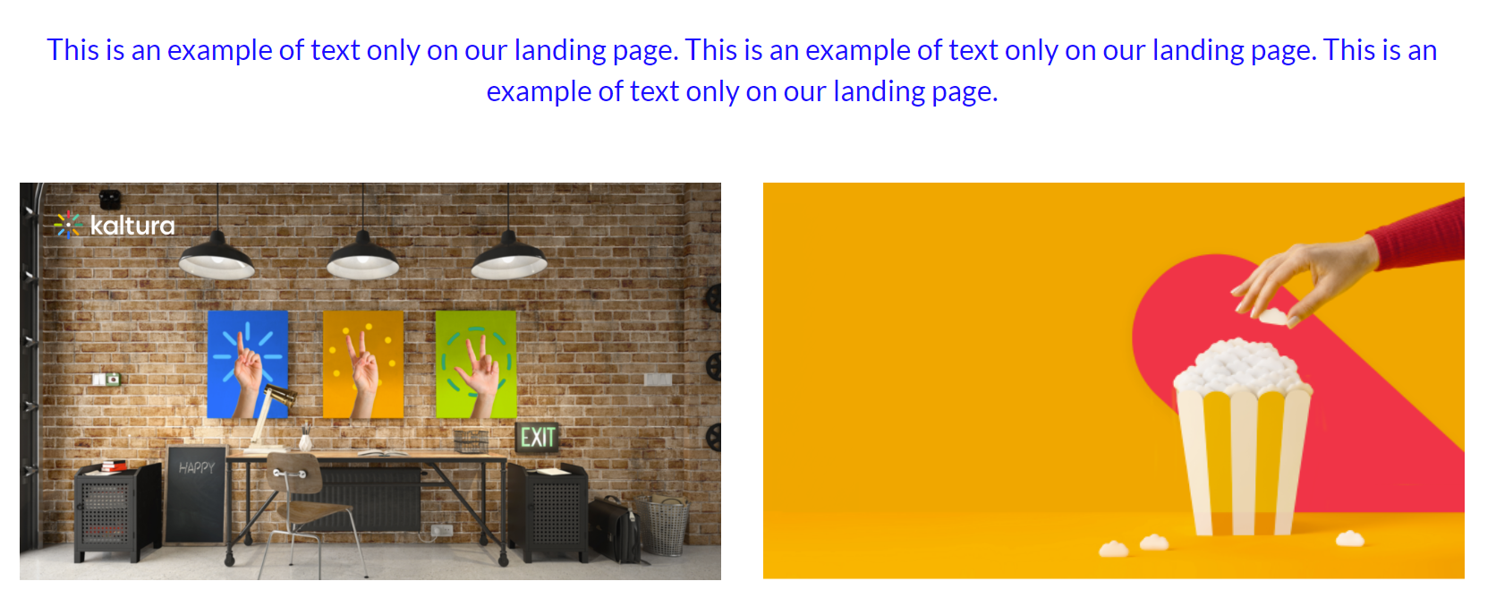
Text only
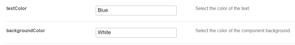
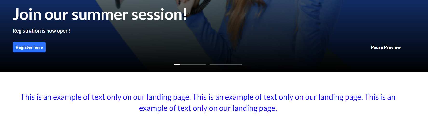
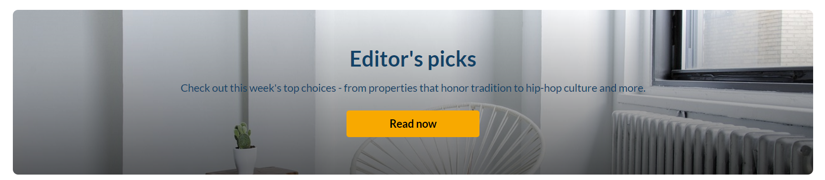
This component displays centered text content on the landing page. The text color and background can be set (as shown in the example below).
Rich text content can be added in the form of basic HTML only: div, br, strong, em, u, a, ul, ol, li. Note that adding body or footer tags will break the component. If you need more elaborate HTML, use the dedicated HTML component instead. (If you paste content from another tool, remove extra formatting and HTML before saving.)
Settings example:
Settings result:
Single playlist
This component displays media in a carousel layout.
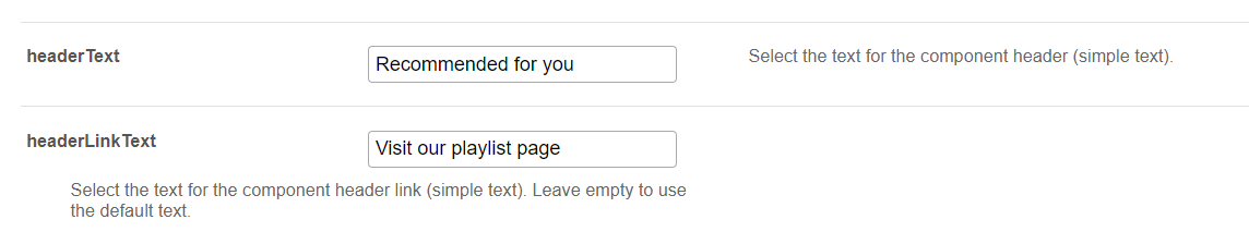
headerText - Defines the title displayed above the playlist.
headerLinkText - Defines the link text displayed on the right side of the playlist. If left empty, the default text 'See All' is used.
Select the content of the playlist from the playlist section.
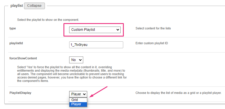
- If you choose Custom playlist, see note about Custom playlist below.
- If you choose Channel content, see note about Channel content below.
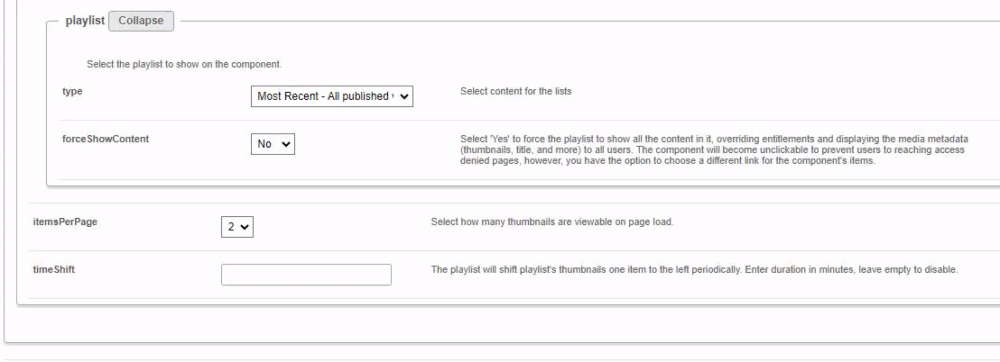
forceShowContent
- Set to 'No' to respect entitlements. Content will not be clickable, and the "See All" link will either be removed or redirected based on the URL specified in the headerLinkAction field.
- Set to 'Yes' to display media metadata to all users, including guests. When you select 'Yes', an additional field appears:
- clickableThumbs - Makes thumbnails clickable and allows users to navigate directly to media pages.
- When a user clicks "See All", they're directed to the channel page where they can explore all content.
- When a user clicks a thumbnail, they're directed to the selected video in the single entry player.
- When user clicks "See All", they're navigated to either grid or player view, depending on what was configured in PlaylistDisplay.
- When a user clicks a thumbnail, they're navigated to that item either in the playlist player or the entry page, depending on what was configured in the Playlistpage module > ThumbLink field.
- When a user clicks "See All", they're navigated to the grid view to browse the playlist. (Clicking a thumbnail there directs them to the single entry page.)
- When a user clicks a thumbnail, they're navigated to the entry page of that item.
This feature is commonly used on public landing pages for unauthenticated users.
If you select Custom Playlist, you have additional configurations:
playlistID - Enter the ID for your custom playlist.
PlaylistDisplay - Defines how the playlist opens when users click 'See All'.
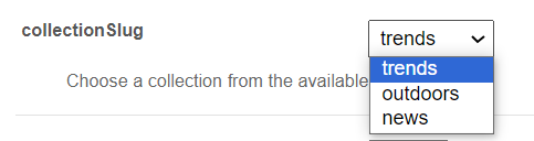
If you choose Channel content, an additional field displays:
contentType - This feature allows you to filter channel content, specifying VOD only or other types of content.

Choose from the drop-down options:

If you select the Choose from list option, an additional field displays:
mediaType - Select the types of media to show in the list.

itemsPerPage - Select how many thumbnails you want to display on the page.
Time Shift - Defines how often playlist thumbnails shift to the left. Leave empty to disable automatic shifting.
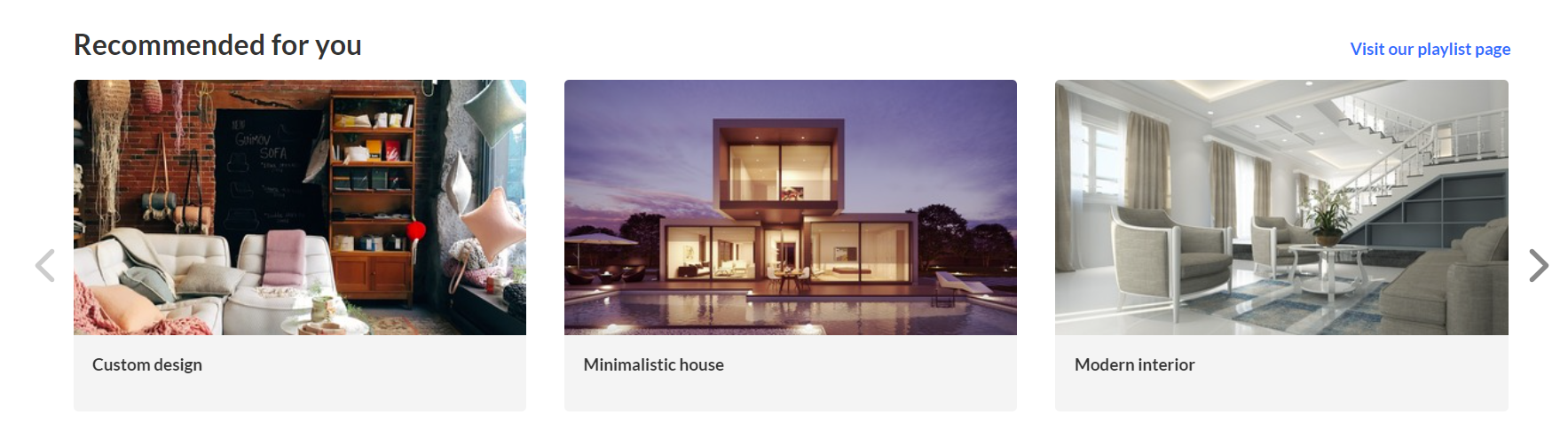 Playlist configuration with three thumbnails
User interaction with single playlist component
Channel Content Playlist:
Manual Custom Playlist:
Dynamic Playlist ('Most Recent', 'Recently Watched', etc. excluding 'Recently Watched' and 'Continue Watching'):
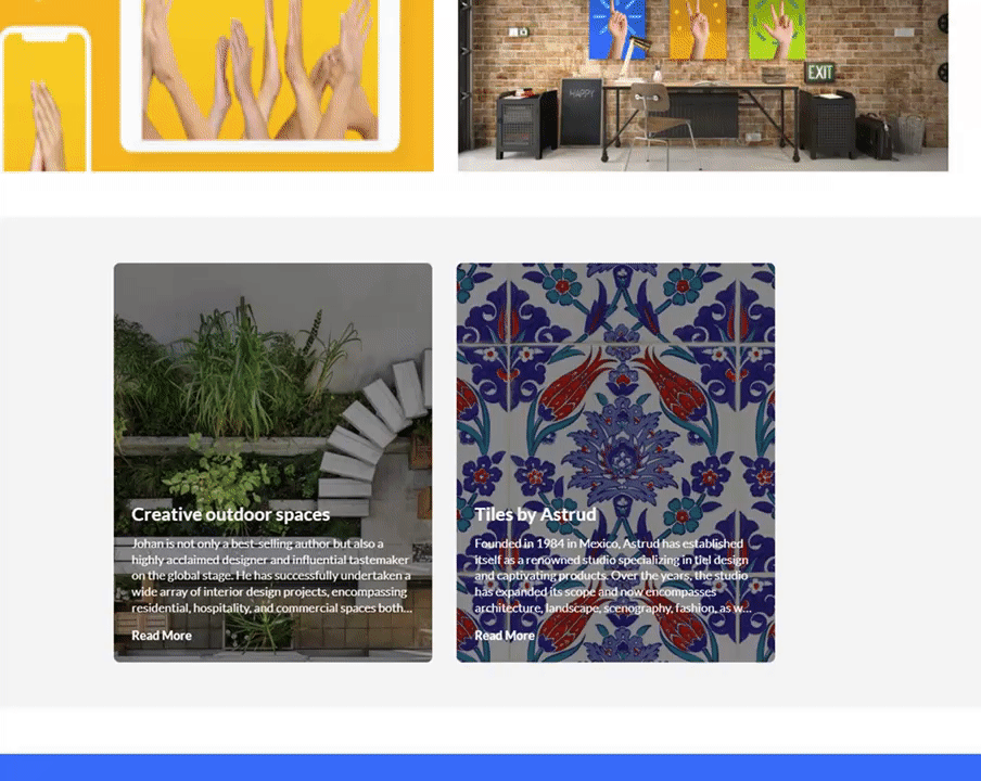
Two images side by side
Configure the left and right images using one of the following three options:
- image entry ID
- image URL
- image upload
For best results, the aspect ratio of the image should be 16:9.
callToActionUrl - Defines the destination URL for the image CTA. The link will open in a new tab. If left empty, the image will not be clickable.
AnalyticsString - Defines the data-analytics value added to the image tag. Enter a keyword or intuitive description, for example, 'tools'.
Alt Text - Defines alternative text for accessibility.
 Two images side by side
News images
This component displays images and text in a carousel layout. Each element on the carousel will open to an article. For information on creating news images, visit our article News Images playlist.
You can change the background color using the modalBoxMaskColor field.
After you have created a News Images playlist, enter the playlist ID.
 Example of two News images
Registration
This component displays a registration CTA that opens the registration flow in a side drawer.
title - Enter a title for your registration page, for example, Register for the event.
buttonText - Add any text you want. If you leave the field empty, the default text Register will display.
scheduleTimeFrom - Enter the time you want registration to begin in Unix time. Leave empty if you don't want to show a time.
You can use the on-line EpochConverter tool to convert your times to Unix time.
scheduleTimeTo - Enter an end time (unix time). Leave empty if you don't want to show a time.
inScheduleText - Enter text that you'd like to display while registration is open.
outofScheduleText - Enter text to display after registration has closed.
If the Siteregistration module is disabled, this component won't be visible to users. In addition, if the registrationClosed function in the Siteregistration module is set to 'Yes', the component won't appear.
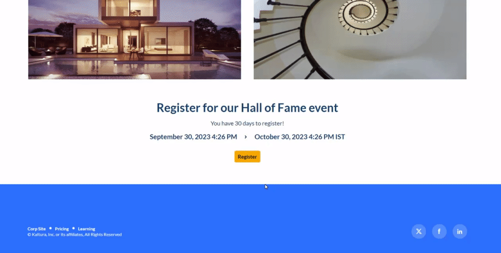 Example of the Registration component
Collection of channels
This component displays channel collections on the landing page. Clicking 'See All' will take users to your channel collection page.
If you don't have any channel collections yet, you can set them up in the ChannelCollections module.
If the ChannelCollections module is disabled, this component won't be visible to users.
headerText - Type in any name you'd like for the component header, for example, 'Our channel collections'.
headerLinkText - Select the text for the component header link (simple text). Leave empty to use the default text.
timeShift - Defines how often channel thumbnails shift to the left. Enter a duration in minutes or leave empty to disable.
The channels will appear on the page in the order specified in the ChannelCollections module's 'sortBy' field (the default sort you chose for your channel collection). The time shift feature ensures that all channels will be displayed over time.
Updated channels appear after the page is refreshed.
In the collection window, choose the channel collection you want to display on the page. All your channel collections appear in the drop-down menu.
forceShowContent - Choose 'Yes' to display all collection content to every user, regardless of entitlements. This makes the component unclickable, but you can still choose a different link for the component's items, for example if you want to use this templatepage as an external page / landing page that everyone can see.
headerLinkAction - This is where you can add a link to take your users to the page you choose.
channelsInLine - Choose how many channels you'd like to display on one line - 6 or 8. (Choosing 8 will reduce the size of each circle.) The thumbnails come from your channel.
If you've added a banner icon (see our Edit a Channel article), it becomes the thumbnail. Otherwise, the thumbnail uses the banner's central background.
maxLinesNumber - Choose how many lines of channels to display from the drop-down menu. The default is 2 lines.
Below is an example of the 'Collection of Channels' component in two rows of eight:
Banner & CTA
This component provides a banner with text, a call-to-action button and background image.
HeaderText - Add the text that you want to appear as a title on the banner.
DescriptionText - Add a description or text that you want to display below the header.
The more text you add, the bigger the banner will become.
Banner image - You have three options for adding an image: entryID, imageURL or imageupload. Uploaded images are automatically resized to fit the component layout.
Avoid using images with text as the text may be cut off on different screen sizes. Opt for atmospheric, text-free images for the best display.
Button - Enter text for the CTA button and the URL that will redirect users when they click it. (Note: If you have text but no URL, the button will not appear on the banner.)
OpenLinkInNewTab - Select 'Yes' to open button link in a new tab, or 'No' to open it in the same window.
All fields are optional. If you don't add an image, the banner will automatically use the design system colors.
 Banner with a short description
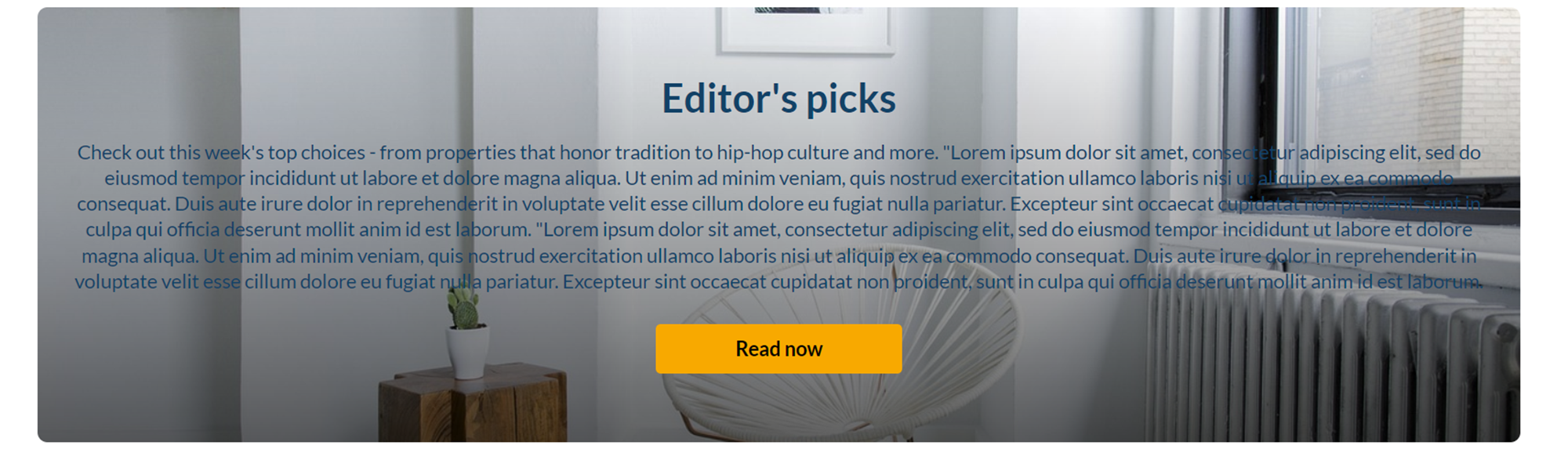 Banner with a long description
Group of users
This component highlights a group of individuals, such as speakers or presenters, on your site's landing page. It presents a row of thumbnail images (or initials if no image is provided).
Clicking a thumbnail opens a window displaying their bio, as well as any previous or upcoming sessions of theirs. Users can navigate to the profile page or session page from the profile window.
This component requires the Grouppage module and Personalprofile module to be enabled.
headerText - Add the text that you want to appear as a title (for example "Meet our Speakers").
headerLinkText - Type the text you want to display on the right for users to click. Leave empty to use the default text “See All”.
group - Choose a group from the allowed groups in the Grouppage module to display its users on the page. Only the first 20 people will show on the page.
If no group is chosen, the component will be empty, and won't be displayed on the page.
uiType - Select how to display group members:
- Carousel - (default) People are displayed in a carousel format with right and left arrows for navigation. Users can scroll left to reach the last user on the list (round-robin).
- Side by Side - People are displayed horizontally next to each other without a carousel.
usersToShow - Select an option:
- Group list - Displays the first 20 people from the chosen group on the page, ordered alphabetically by name (A-Z).
- Promoted users only - Displays only the promoted people from the selected group on the page, following the manual ordering as set on the group page.
timeShift - Automatically shifts displayed users after a configured number of minutes. Leave empty to disable automatic shifting. Updated users appear after the page is refreshed.
This feature is only active when 'Group list' is selected in the usersToShow field.
Below is an example of a 'Group of Users' component. Clicking See All displays the group page, which is configured in the grouppage module:

Sessions
This component displays scheduled sessions as interactive session cards.
The Add to Calendar button automatically changes to Join Now a set number of minutes before the session begins (15 minutes by default). You can adjust this timing in the Widgets module using the SessionCardJoinNowIndication setting.
This component requires the eventplatformcore module to be enabled.
Content - This is the source of the content. Once selected, an additional section displays:

- contentType - Select the content of the component (custom Playlist / Channel Content) by entering the playlist ID or searching for the channel.
- tagsFilter - Enter comma separated tags to further filter the playlist/channel content, displaying sessions only if they are tagged with any of the entered tags (meaning content in the channel AND with either tag x or y).
- tagsFilterType - Select from the drop-down list how multiple tags will be applied to the filter: media with any of the entered tags or media with all selected tags.
- forceShowContent - Select 'Yes' to override entitlements and display session cards (including media metadata, thumbnails, title, and more) to all users, including guests. Select 'No' to respect entitlements.
- Earliest to Latest
- Latest to Earliest
- Show all (default) – Displays all sessions.
- Upcoming only – Displays only future sessions.
- Toggle Upcoming & Past sessions – Allows users to switch between viewing upcoming sessions and all sessions.
For guests, session links are disabled.
headerText - Add the text that you want to appear as a title on the top left (for example 'Agenda').
LinktoSessionsText - Enter text to show at the top-right of the component as a text or link. To make it a link, enter a link URL in the LinktoSessionsUrl field (below). Leave empty to hide.
LinktoSessionsUrl - Enter a link to show at the top-right of the component. It will open in a new tab.
scheduleOrder - Choose how sessions are ordered:
The maximum number of session cards that will display is 50.
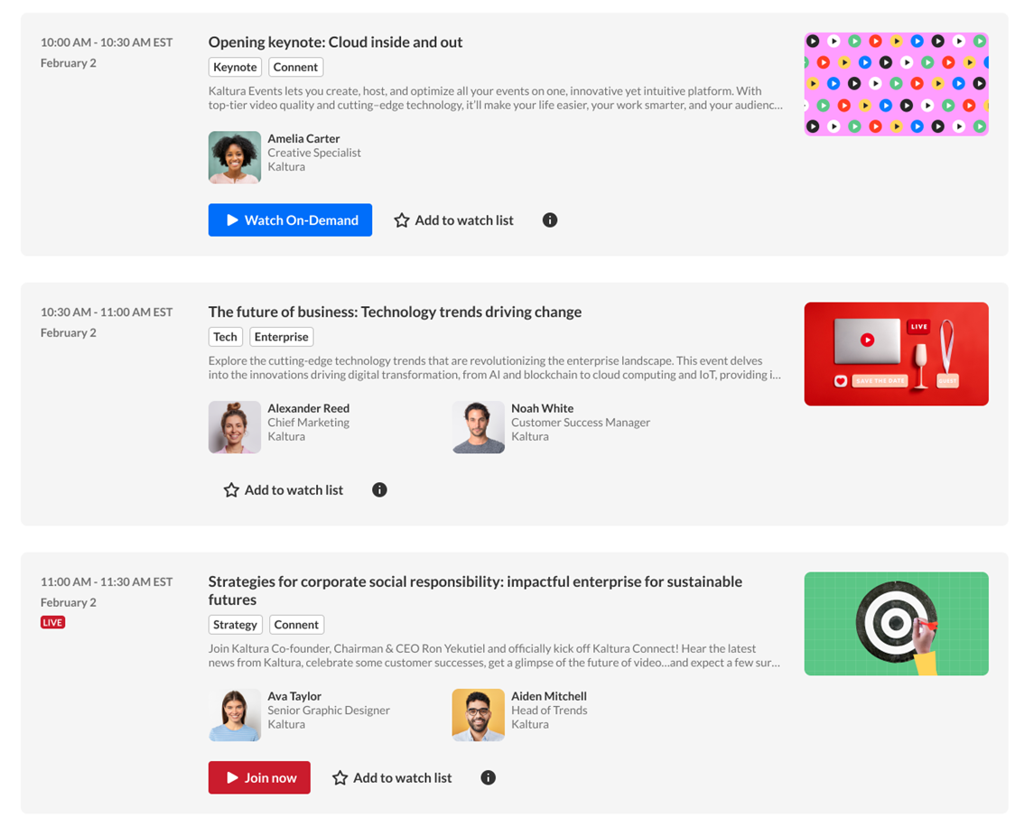 Example of interactive session cards
displayType - Choose how sessions are displayed:
When Upcoming only is selected, past sessions aren’t shown. If no upcoming sessions exist, the component isn’t displayed.
When Toggle Upcoming & Past sessions is selected, the default view shows upcoming sessions. Users can switch between upcoming sessions and all sessions.
Once you have finished configuring your template page, click the Save button at the very bottom, which will save your new page, and will also clear the cache for the module and site.
To set up a homepage for your site, visit our article Set up a homepage in Content Hubs.
