About
The Real-time analytics dashboard lets you monitor live event performance as it happens, from viewer engagement to stream quality. Viewers’ activity and playback metrics update every 30 seconds, giving you immediate insight into audience behavior, stream health, and technical issues during the broadcast. You can also filter data, export reports, and explore historical trends from the past seven days.
Access the dashboard
- Log into the Rich Media CMS and select the Analytics tab from the Content menu.
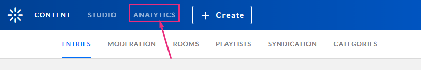
The Analytics page displays. - In the Analytics menu, select the Real-Time tab.
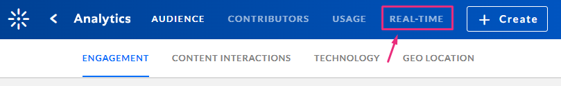
The real-time analytics page displays. - Under the Broadcasting Now tab, locate the desired entry and click Full Dashboard.
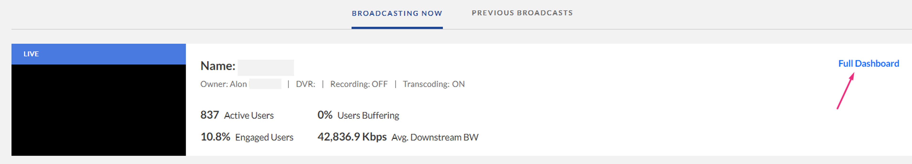
The real-time analytics dashboard displays.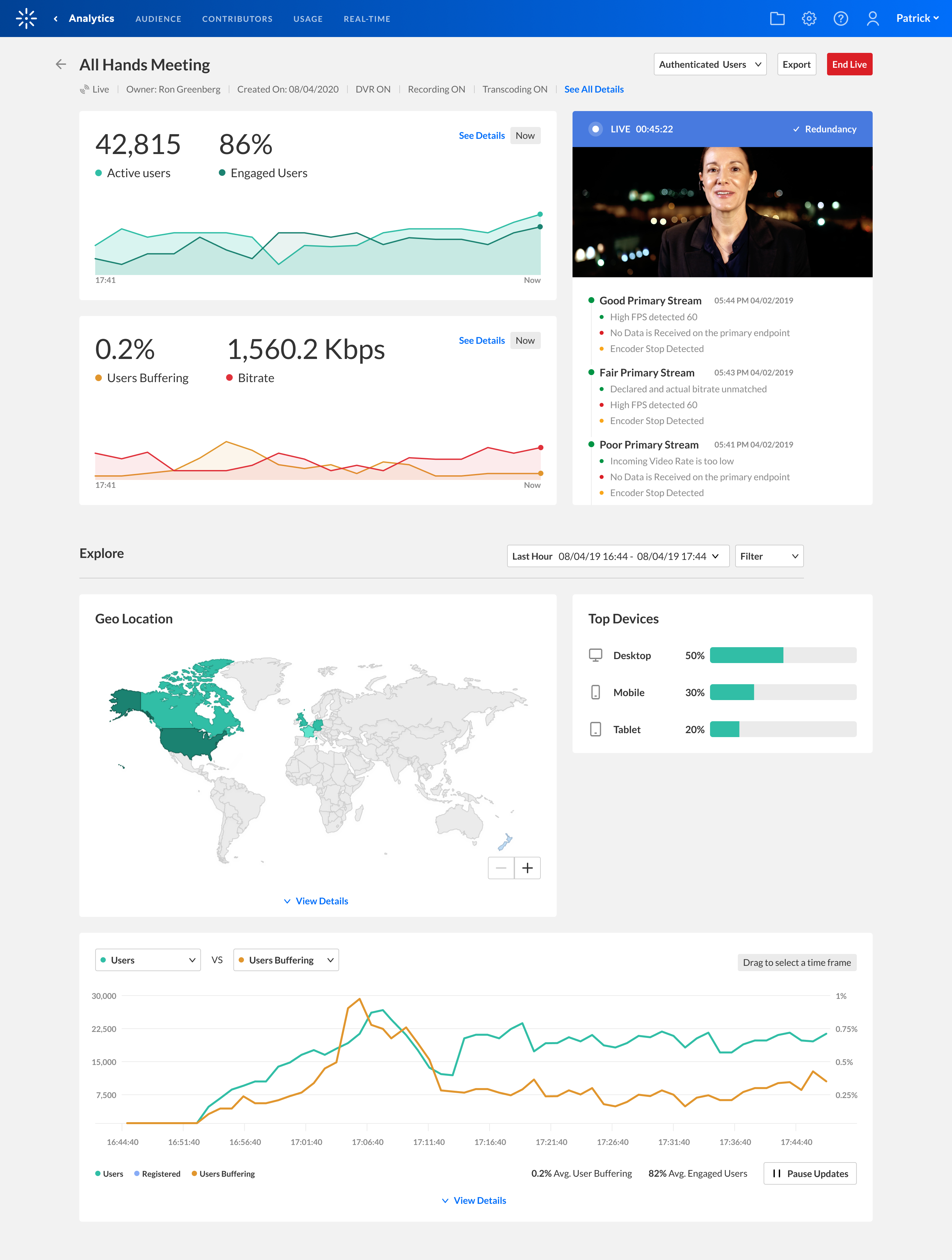


As a reference for analytics terms and definitions, please visit our article Kaltura analytics terminology.
Actions bar
At the top of the dashboard, there is an actions bar with four functions: users menu (1), filter function (2), export function (3), and Live button (4).

Users

From the users menu, you can select the desired option to monitor the event:
- Authenticated Users - for events that all users are required to authenticate
- All Users - for events that don't require authentication
Filter
The Filter function allows you to filter the data on the dashboard.

- Click on the Filter function to open the filters pane.
- Select the relevant filters you'd like to use. The options are:
- Device - computer, tablet, mobile
- Browser - Chrome, Firefox, Safari, Internet Explorer, MS Edge, Opera, WebKit, Vivaldi
- Operating system - Windows, Mac OSX, Android, Linux, iOS, Chrome OS
- Country (then Region and City of that country)
- Users
- Click Apply to show the filtered data in the dashboard.
Export
The export function gives you the option to export data to a CSV file.

- Click Export to open the drop-down list and select the data you'd like to export. One or more options may be selected.
- Click Export Reports.
A confirmation displays: We are preparing your report. We will send it to your email address shortly.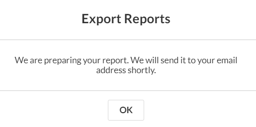
- Click OK.
A notification is sent to your email. If the data in the report was filtered, the report is based on the filter applied. Note that export is limited by 60,000 records and time to execute. If you receive an error, break down your report to smaller time frames or use filters to reduce the size of the report.

The files expire in seven days.
Live button
The Live button allows you to change the state of the broadcast. There are 3 states and the button will change automatically depending on the state of the entry:
 End Live (red) - the broadcast is live
 Go Live (green) - broadcasting is in preview state
 Go Live (white) - the broadcast is offline
Overview of the current broadcast
The upper panel of the real-time dashboard provides a snapshot of both the video downstream and the upstream, showing the last 3 minutes. The values shown for each metric are only the values for the last point of time on the graph, not the entire 3 minutes which you can see from the graph. There are two sections: engagement (1) and quality of service (2) .

The Engagement section shows:
- Active users - The users that are now viewing the broadcast whether they are live or DVR. The Active users count is an estimate of unique authenticated viewers. Anonymous users are counted as one. This number may differ slightly (around 2%) from the totals in exported reports, which are calculated more precisely.
- Engaged users - The percent of users from the active users that have both the tab in focus and the sound on for the entry.
You can hover over the graph to see the statistics.

The Quality of Service section shows:
- Avg. Buffer Rate - The total time of viewers' player buffered during total view time.
- Avg. Bitrate - Kaltura sends info every 10 seconds about the stream. We take the all the reported bitrate events from the player and average them out to give you an average of the consumed bitrate.
You can hover over the graph to see the statistics.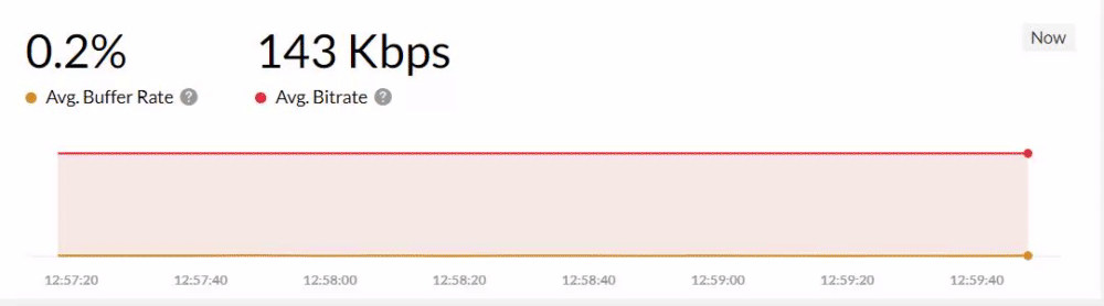

The dashboard updates every 30 seconds without the need to refresh. During the live broadcast, the graph dynamically updates. The most recent data is shown on the right, pushing older data slightly to the left with each new addition. The information is captured and analyzed every 10 seconds throughout the duration of a Kaltura Live Streaming event.
Upstream section
This section shows how the stream is ingested along with the player including the lapsed time. You can see stream health (1), redundancy (2) and stream health details (3).

Stream health - There are three states of stream health for the current broadcast:
- Offline
- Preview
- Live
Redundancy (2) - This Indicates whether you are broadcasting to the secondary RTMP endpoint. There is a check symbol if the encoder is now broadcasting to the fallback RTMP (with a tooltip showing seamless failover if enabled). The broadcast updates as closest to real-time as possible.
Stream health details (3) - Newest messages are added to the top of the list. The messages are in chronological order describing changes to the stream health during the live broadcast. These are the same messages that are shown in the Live Dashboard today. The messages received from the Live Service are grouped together. For each time the dashboard fetches the latest messages, the Live service retrieves a group of messages of all the events that happened in the last minute. Messages are updated every 5 minutes in accordance to the Live API Service.
Player Preview - The standard V7 player playing the Live entry along with a LIVE label to indicate the status is displayed. If the entry is Offline, the offline thumbnail is displayed and the status is indicated as Offline. If the player is in Preview mode, the stream in the player is displayed and the status is updated to Preview. The entry is auto-played with the sound off when the page loads.
Explore during and after the event
The Explore section shows time period (1), geo-location (2), active users per device (3), and a metrics graph (4). Use this section to better understand the QoS and engagement metrics.

Time period
You can filter time period data by a preset time or a specific date range.

For more information about changing the time period or filtering the data, see Analytics date picker and Time Period Comparisons.
Geo Location
The Geo Location section of the real-time dashboard presents the ranking of the geographical distribution of your users, whether by plays, views or drop-off rate. You can identify where your most active users come from.
Clicking on a country on the map will drill down to region and clicking on the region will drill down to the city level.

Click View Details to view the geo location table. The table ranks all geographies by plays in the selected timeframe. The following metrics are available for each geography:
- Users Distribution
- Avg. Buffer Rate
- Avg. User Engagement
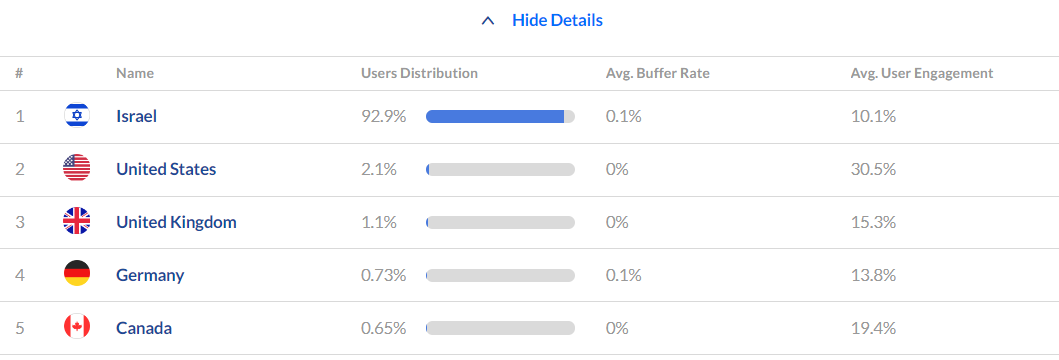

The data shown in the geo location map and table is for the last 3 hours.
To learn more, see Working with the Geo Location Dashboard.
Active users per device
The Active Users Per Device section lists the devices that are being used to access the live event.

Graph
You can select two metrics to be shown on the graph at the same time in order to better understand the correlation between them.

The metrics are divided into 2 sections - Engagement and Quality of Service.

Engagement
- Users
- Engaged Users
- Minutes Viewed
- DVR users - users that are viewing a recorded section and not live
Quality of Service
- Bitrate - the quality of the video being consumed by the users
- Avg. Buffer Rate - buffered time/view time
- Avg. Segment Download Time
- Avg. Manifest Download Time
- Dropped Frame Rate - number of frames that weren't rendered
- Average Latency Rate - The Average latency indicates the latency in the time that the stream is broadcasting as opposed to the latency in the view.
- Downstream Bandwidth - the ratio between downloading the video and the size in Kbps
- Errors
Select the metrics you want to analyze. Once selected, you can hover over any point in the graph to see the detailed data for that point in time.

Each metric that you select will display a custom calculation at the top of the graph. Some of the basic calculations like average and summary will be shown as a footnote.

You can also zoom into the data simply by dragging the mouse over the desired point in time and the graph will update accordingly. Once the graph updates, the dashboard will attempt to bring the data at the most granular intervals it can, this will change depending on the selected time frame. In order to reset the zoom, just click on the Resume Updates and the zoom will return to it's original zoom.

Presence
Selecting Presence will show a detailed metrics of devices usage.

The metrics are as follows:
- Devices - the devices viewers used to watch the live stream
- Avg Buffer Rate - the percent of time (out of the total amount of time viewed) the viewer encountered a buffer issue that was more than 1 sec
- Minutes Viewed
- Avg. Engagement - the percentage of time the user for the correlating device viewed the live stream with their tab in focus and sound on
You can change the date by clicking Change Date, which will navigate you to the date picker at the top of the section.

