About
Registration and speaker components help you promote an event on a homepage. Add a registration call to action that opens registration in a side panel, and highlight the people who speak at your event.
Here, homepages are the main page of your site and the main page of each event or campaign that you build in Content Hubs. Content Hubs calls the pages you design yourself custom pages.
To add a component to a homepage, and to set its order and who can see it, see Configure components for homepages in Content Hubs.
Applies only to Content Hubs. Requires Theming to be enabled on your site.
Registration
This component shows a registration call to action (CTA) that opens registration in a side panel.
If the Siteregistration module is disabled, or its registrationClosed setting is set to Yes, users don't see this component.
- title - Enter a title for the registration, for example, Register for the event.
- buttonText - Enter the button text. Leave empty to use the default text, Register.
- scheduleTimeFrom - Enter the time registration opens, in Unix time. Leave empty if you don't want to show a time.
To convert a time to Unix time, you can use an online tool such as EpochConverter.
- scheduleTimeTo - Enter the time registration closes, in Unix time. Leave empty if you don't want to show a time.
- inScheduleText - Enter the text to show while registration is open.
- outofScheduleText - Enter the text to show after registration closes.
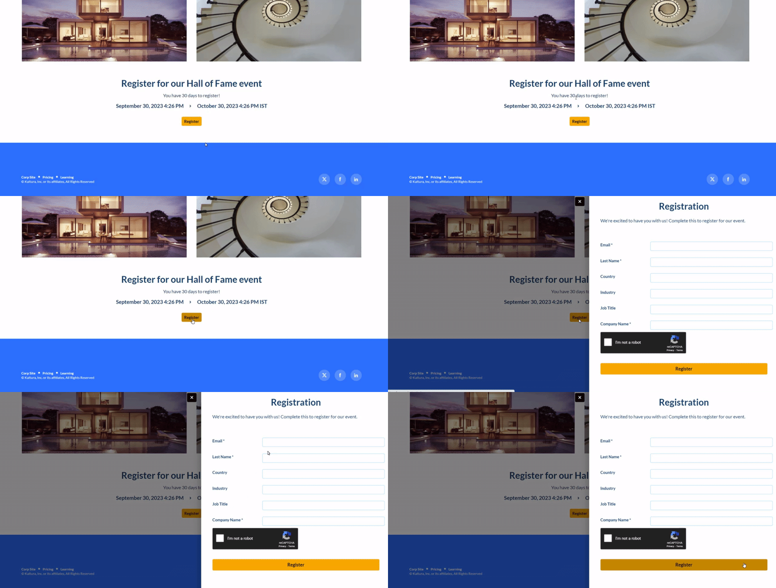 Example of the Registration component
Group of users
This component highlights a group of people, such as speakers or presenters, on the page. It shows a row of thumbnail images, or initials if there's no image.
When users select a thumbnail, a window opens with the person's bio and their past and upcoming sessions. From there, users can go to the person's profile page or to a session page.
This component requires the Grouppage module and the Personalprofile module to be enabled.
- headerText - Enter the title, for example, Meet our speakers.
- headerLinkText - Enter the link text shown on the right. Leave empty to use the default text, See all.
- group - Select a group from the allowed groups in the Grouppage module. The component shows only the first 20 people in the group.
If you don't select a group, the component is empty and doesn't appear on the page.
- uiType - Select how to show group members:
- Carousel (default) - People appear in a carousel, with left and right arrows. Users can scroll left to reach the last person in the list.
- Side by side - People appear next to each other, without a carousel.
- usersToShow - Select an option:
- Group list - Shows the first 20 people in the group, sorted by name (A–Z).
- Promoted users only - Shows only the promoted people in the group, in the order set on the group page.
- timeShift - Enter how many minutes to wait before the people shown shift. Leave empty to turn off automatic shifting. Updated users appear after you refresh the page.
Time shift works only when Group list is selected in the usersToShow field.
In the following example of a Group of users component, selecting See all opens the group page, which you configure in the Grouppage module.

Save your changes
After you configure the component, select Save at the bottom of the page. This saves your page and clears the site and module cache.