About
Text, HTML, banner, and image components let you add your own message, custom code, a call-to-action banner, or a pair of images to a homepage.
Here, homepages are the main page of your site and the main page of each event or campaign that you build in Content Hubs. Content Hubs calls the pages you design yourself custom pages.
To add a component to a homepage, and to set its order and who can see it, see Configure components for homepages in Content Hubs.
Applies only to Content Hubs. Requires Theming to be enabled on your site.
Text only
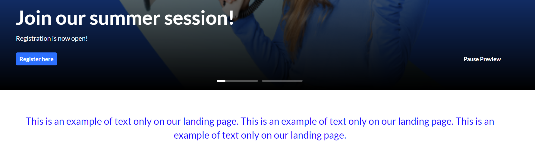
This component shows centered text on the page. You can set the text color and the background, as in the following example.
You can add rich text using basic HTML only: div, br, strong, em, u, a, ul, ol, li. body or footer tags break the component. For more complex HTML, use the HTML component. If you paste content from another tool, remove any extra formatting and HTML before you save.
Example settings.

The result on the page.
HTML
This component lets you add custom HTML to the page. You can include HTML, CSS, JavaScript, and iframe content.
- htmlCode - Enter the HTML code for the component.
- isFullWidth - Select Yes to show the component across the full width of the browser. Select No to use the site's standard content width.
- maxHeight - Enter the maximum height of the component in pixels. Leave empty to use the default of 250 px.
The component shows your HTML exactly as you enter it. Make sure it's responsive, so it displays correctly on different screen sizes.
Two images side by side
This component shows two images next to each other. Add each image using one of these options:
- Image entry ID
- Image URL
- Image upload
For best results, use images with a 16:9 aspect ratio.
- callToActionUrl - Enter the URL that opens when users select the image. The link opens in a new tab. Leave empty if you don't want the image to be clickable.
- AnalyticsString - Enter the
data-analyticsvalue that's added to the image tag. Use a keyword or a short description, for example,tools. - Alt Text - Enter alt text for the image, for accessibility.
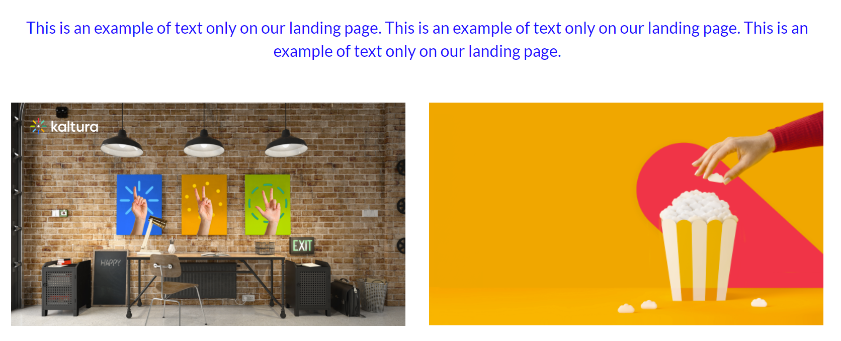 Two images side by side
Banner & CTA
This component shows a banner with text, a call-to-action (CTA) button, and a background image.
All fields are optional. If you don't add an image, the banner uses your design system colors.
- HeaderText - Enter the title shown on the banner.
- DescriptionText - Enter the text shown below the header.
The more text you add, the taller the banner gets.
Use images without text. Text in an image can be cut off on different screen sizes, so atmospheric, text-free images display best.
- Banner image - Add an image using one of these options: entryID, imageURL, or imageupload. Uploaded images are resized automatically to fit the component.
- Button - Enter the text for the CTA button and the
URLit opens. If you enter text but no URL, the button doesn't appear. - OpenLinkInNewTab - Select Yes to open the button link in a new tab, or No to open it in the same tab.
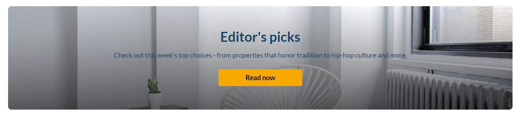 Banner with a short description
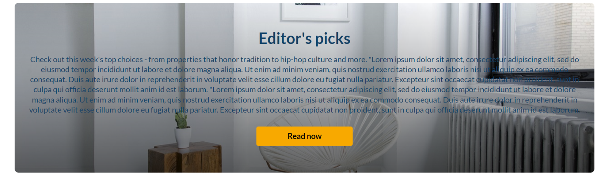 Banner with a long description
Save your changes
After you configure the component, select Save at the bottom of the page. This saves your page and clears the site and module cache.