About
This article describes the Virtual Events Homepage structure and Homepage display design.
A Homepage is the first page attendees see when logging in to their virtual event.
The Homepage serves as a significant landing page for attendees, capturing their attention.
Kaltura recognizes the need for easy, self-explanatory navigation right from your Homepage using ads, video carousels, and more.
Hero Banner
The hero banner auto-plays sessions from the live agenda. When there are no live sessions being broadcasted, the hero banner falls back to play VOD content.
Deliverables
Please provide a list of live sessions to be included as well as a fallback VOD playlist. The VOD playlist will include up to 8 videos.

Next Session
The component displays the following live sessions from the agenda. The component displays up to two live sessions.

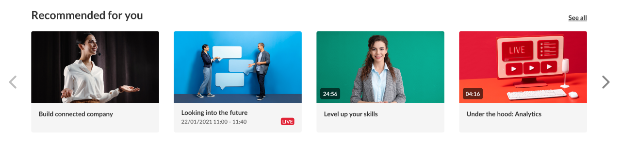
Recommended Content
The playlist shows content based on the user’s interests that were selected during registration so that different users see different playlists (4 grid view).

News Items
Images and text, allowing the user to read the content in a newspaper type of experience.
Deliverables
Please provide an image, title, and description for every item (according to the technical specifications below). Please provide at least three items.
Technical Specifications
1. Images: 760x920 pixels, Format: JPG
2. Title (60 char limit)
3. Description (2,500 char limit). The description can accommodate rich text (Links, Bold, Underline, etc.).

Spotlight Video
Shows featured video content played automatically.
Deliverables
Please provide a VOD and the following text items:
- Label: 25 char limit
- Title: 25 char limit
- Description: 300 char limit

Homepage Carousel
The carousel displays selected content that can auto-swap. (2, 3, or 4 grid views).
Deliverables
1. A list of videos for the carousel's playlist
2. Select the grid view (2, 3, or 4)
3. Carousel title (60 char limit)


Homepage Ads
The ads component may display two ads. The ads are clickable.
Deliverables
1. Two image ads 960x540 pixels, Format: JPG
2. Destination link for every image.

HTML Banner & CTA
The HTML Banner component displays a horizontal ad. The ad is clickable. You may also add a title/description to this.
Deliverables
1. Ad 1980x300 pixels, Format: JPG
2. Destination link

Single Playlist
Select a playlist of content, which upon clicking, will take the user to the entry page, in the context of the entry's category.
Collection of Channels
Displays a carousel of icons which correlate to a channel collection.

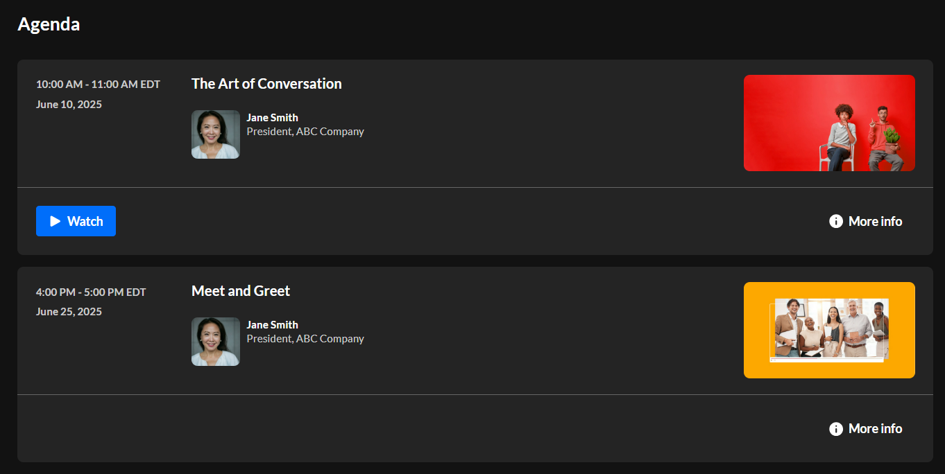
Agenda (Sessions component)
A list of scheduled sessions (which are uploaded to either a channel or a playlist) is automatically displayed.
This component offers the option to add a small "Agenda" feature to your homepage. You can also filter the component by tags or gated groups and add a link to another page in the upper right corner of component.
Group of users
Displays a group of users. Note that only the first 20 users will display. Use this component, for instance, to introduce your speakers.
