About
Administrators can use the Templatepages module to create multiple pages containing different components suitable for each page. Once a template page is configured, use the CustomPages module and set it with its own unique URL and permissions.
To learn more, visit Create and use a template page.
Note: KMS only Module. Depends on the Theming module.
Get started
1. Go to your KMS admin page, and navigate to the Templatepages module. Your link should look like this: https://{your_site_url}/admin/config/tab/templatepages
2. Enable the module by setting enabled to 'Yes'.
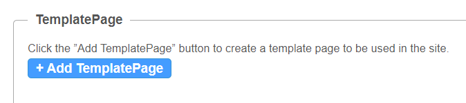
3. Click the +Add TemplatePage button. This will allow you to create a page from any of the template pages.
General page settings
At the top of your new template page there are 3 general page fields:
pageName - Enter a name for your page. This name will be presented in other modules when prompted to select a template page from a drop-down list. For example, in the Custompages module.
pageTitle - Enter a title for the page. This title will show on the browsers' tabs names.
pageHeader - Enter a header for the page (optional field). This header will show on the top of the page only when using a Hero unit.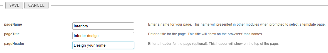
Page elements
There are 3 types of elements on the page that as a page builder you can choose from:
Below you will find the information on each type.
Navigation bar
For each page, a navigation bar will be presented. You can choose from two types of navbars: Site Navigation or Clean NavBar.
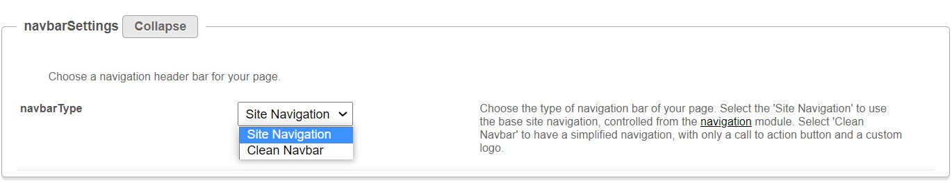
Site navigation
This navbar will present the same navbar as the site's navigation. This navbar is controlled from the navigation module, and will be the same on all the site's pages.
Clean navbar
This navbar will provide simplified and clean navigation. Limited to a call to action button and a custom logo, this will provide different settings for the page.
If you choose a clean navbar, an additional window displays: 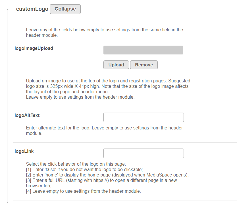
Configure the following fields:
logoImageUpload - Upload your own or use the site's logo.
logoAltText - enter alternate text for the logo
logoLink - Select the click behavior of the logo
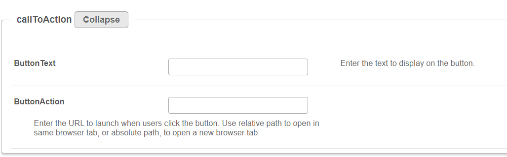
If you'd like to present a call to action button, fill in the callToAction section.
If you'd like to present the language selector (assuming it is available on the site), set the showLanguageSelector field to 'Yes'.

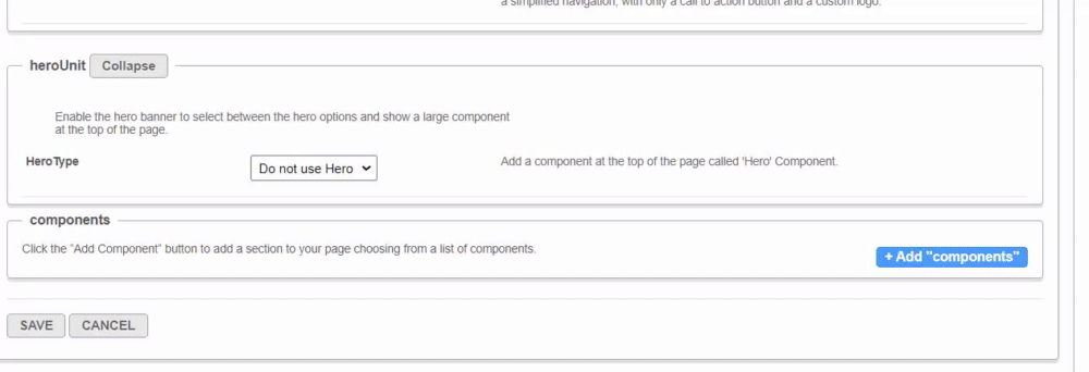
Hero unit
A hero unit is a component that can only be available at the top of the page. This is for a few reasons, mainly because of the interaction with the navbar and its transparency. It's not mandatory to have a hero unit on the page.
You can select from two types of hero units: Player Carousel or Text & Counter.
Player carousel
This hero will present a dynamic carousel, playing back a list of live or VOD media on a muted player to create a feeling of a live site and moving elements. The Video is muted, and cannot be played in the ordinary way - you could consider it as a carousel of GIFs.
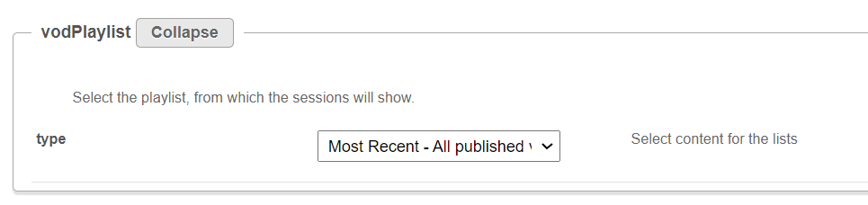
There are 3 sets of media that can be displayed on the carousel: Live events, VOD playlist, or Images.
- liveCategory - select the category from which the live sessions will show. Leave it empty to not show live media on the banner.
When choosing a category is name/ID, entitlements may apply and hide any media not published in the site.
Select a fallback option - 'VOD Playlist' or 'Images and CTA list' (see how to configure these below below).
- VOD list - Select a playlist to show using the vodPlaylist section. Note that the available playlist types include a custom playlist and a channel playlist. If no VOD list is selected, the hero unit will not show on the page. Live media will be presented at their scheduled time. Meaning, if the event is not live, the player and carousel will not show. If no media is live at that moment, the hero will fall back to present either on the player the VOD list of media or the images.
Scheduled Room type media is not supported.
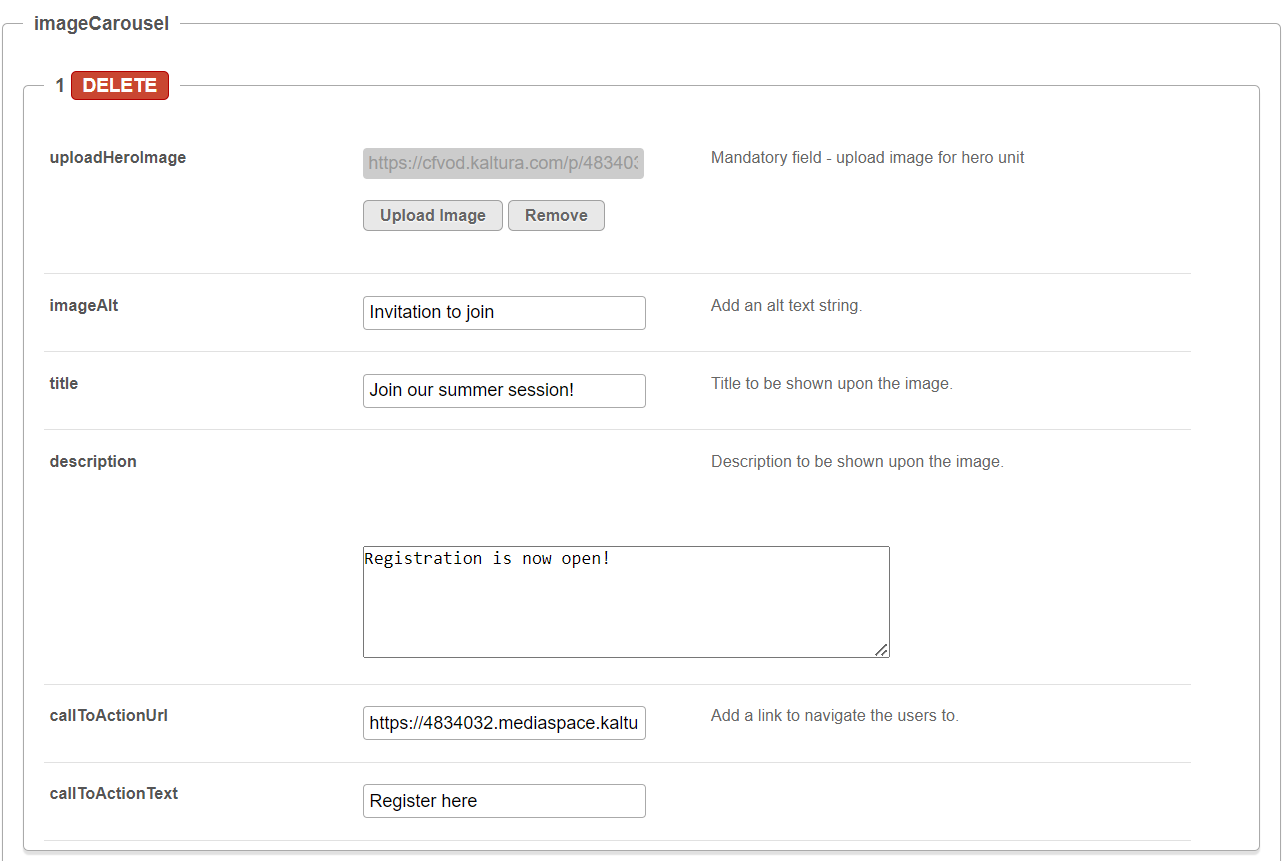
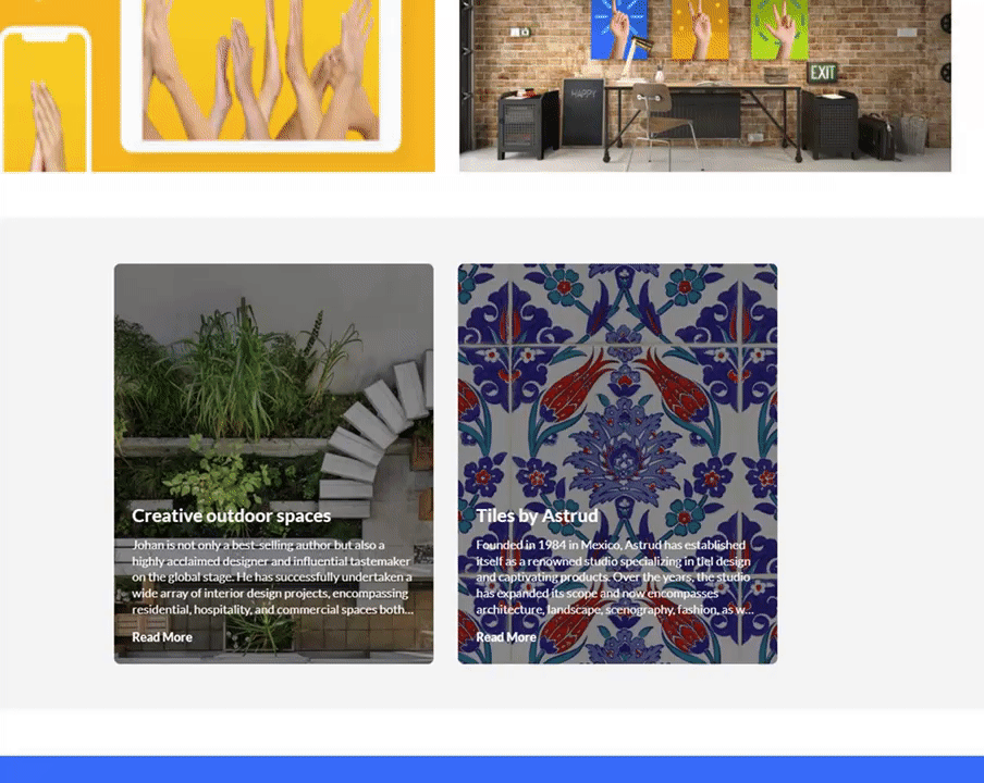
- Image List - You can add up to 8 images to the hero carousel. In the imageCarousel window, configure the following:
- uploadHeroImage - Upload the image you want in your hero.
- imageAlt - Add an alt text string (this will be shown if the image doesn't load immediately)
- Title - Add a title or wording you want to be shown on the image.
- Description - Add short description to be shown on the image (optional).
- Add a CTA url - Add a link for the users to navigate to when they click the CTAbutton.
- callToActionText - Add text you want to show on the CTA button.
You can add more images to the hero carousel by clicking +Add "ImageCarousel" repeating the steps above.
For more than one image, you will need to type the carousel transitions interval (in seconds) in the carouselInterval field. For the best results, it is recommended to have a 30-second transition time.

UI/UX - Note that users can always skip between elements, and for accessibility reasons, the carousel transitions can always be stopped by the end user.
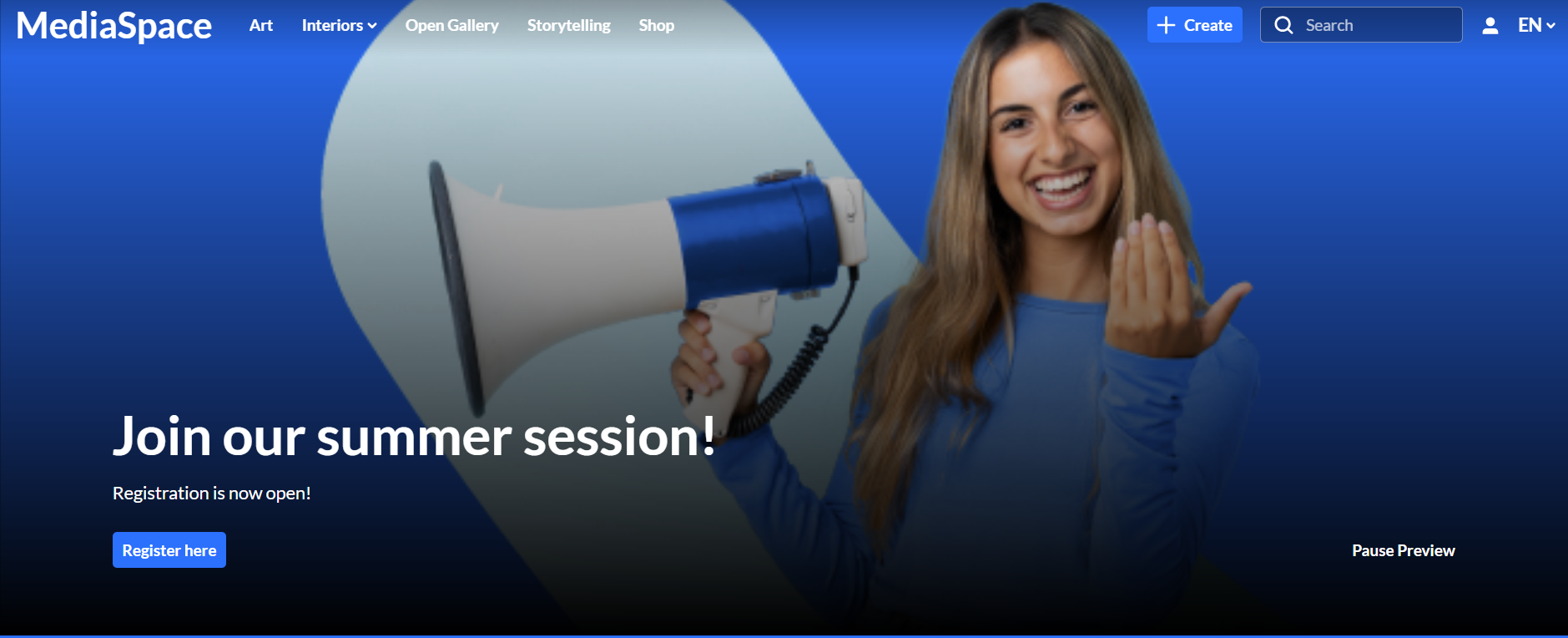
The image below is our hero with the imageCarousel configuration:
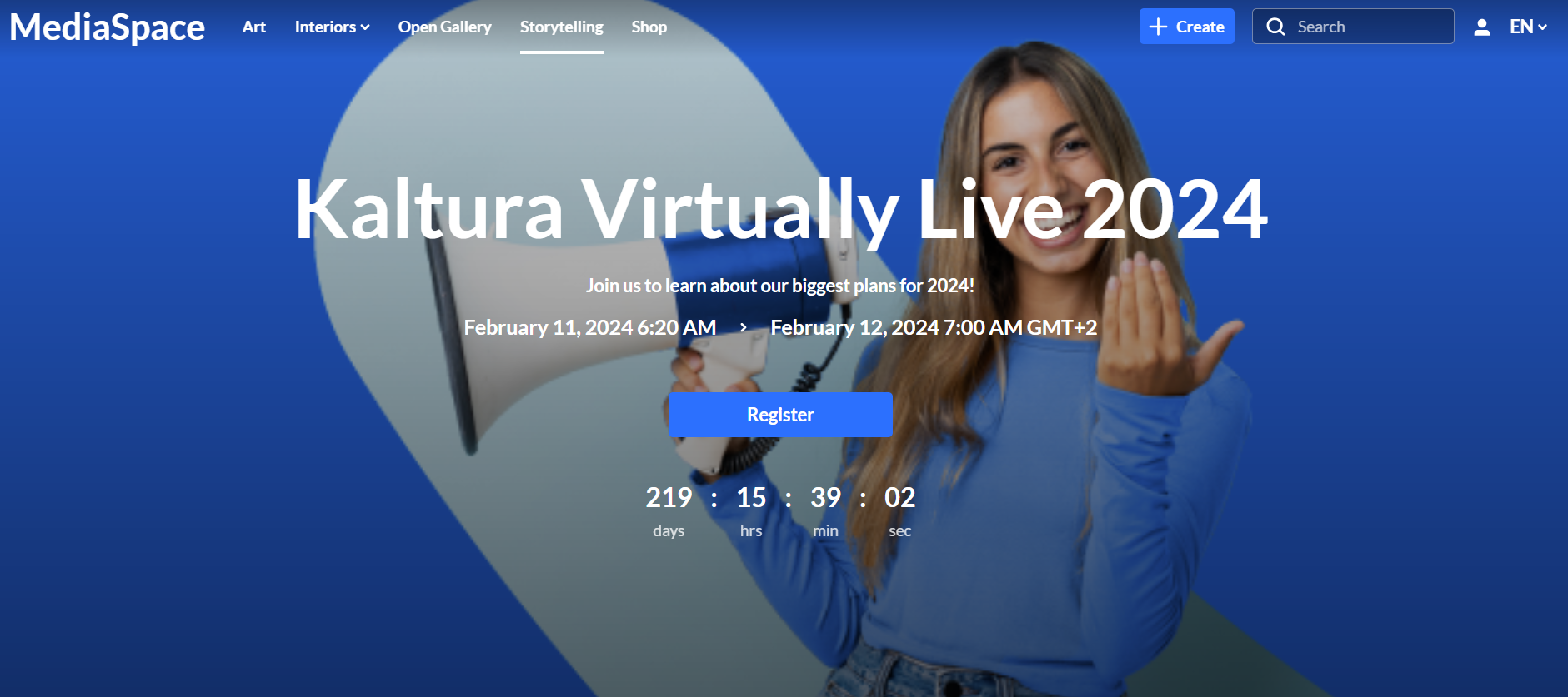
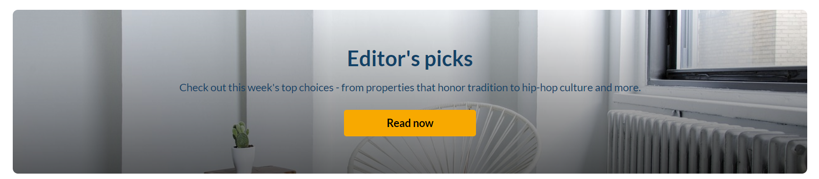
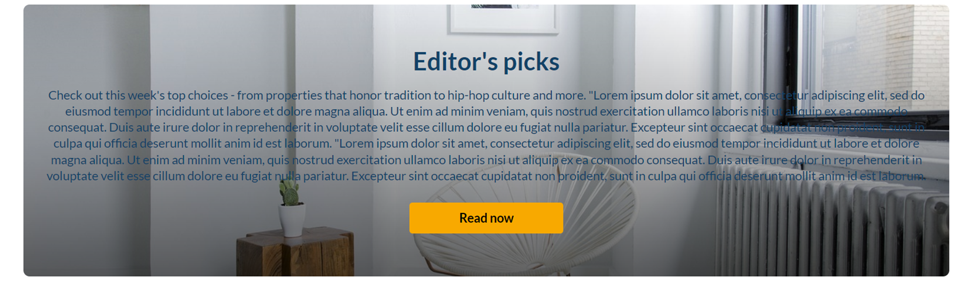
Text & Counter
This hero will show static texts and selected background at the top of the page with the option to add a time counter.
Note that all elements on this hero unit are optional, and can be hidden by leaving the fields empty.
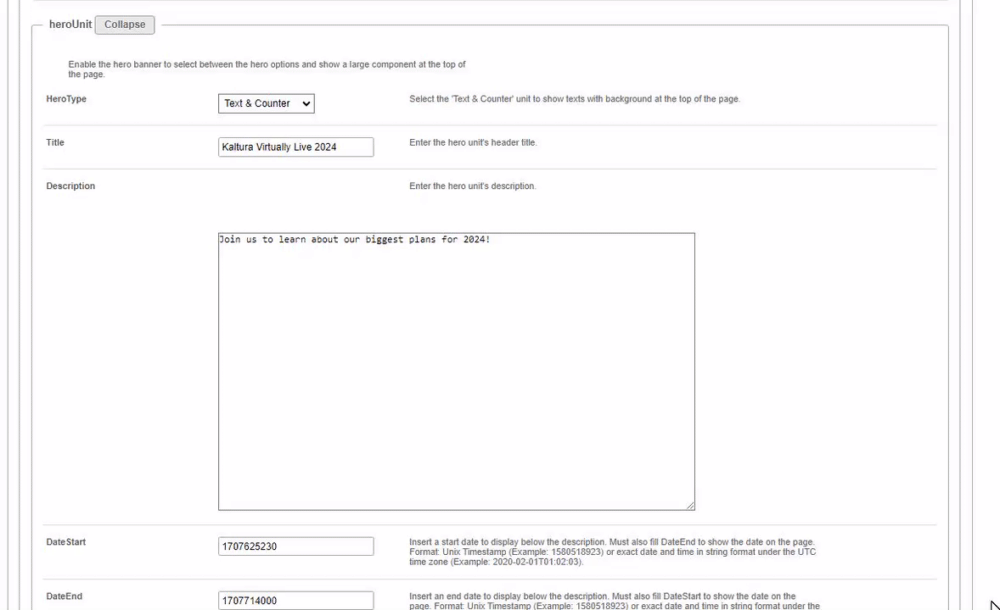
- Enter the Title and Description to show at the top of the unit.
- Fill in a Start and End Date(fill in both or none) to show a "from...to" element on the screen below the description. Acceptable date formats:
- Unix Timestamp - Example: 1580518923 (look for 'unix timestamp converter' in any browser)
- String format under the UTC time zone (Example: 2020-02-01T01:02:03)
- Add a Call to Action button. You can add 1 or 2 buttons, that will show up as a Primary and Secondary.
- Add a Time Counter to your hero unit, counting down to a specific time and date. The counter will disappear once it reaches the deadline.
- Upload a Background atmospheric image for the hero. We recommended a 1920x1080 resolution, with no text to prevent clashing with the formatted text on the hero.
The image below shows the hero with the Text & Counter configuration:
Components
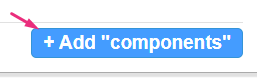
Click +Add "components" to create a new component.
All components have a few shared fields:
Type - Select the type of component you want: Text only, Single Playlist, 2 Images Side by Side, News Images, Registration, Collection of channels, Banner & CTA or Group of users.
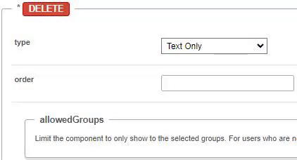
Order - Fill in a number (larger than 0) for the order in which the components will appear on the page, for example 1 = highest position on the page. However, we suggest using large, non-consecutive numbers such as 10, 20, 30, as this will allow for simple changes in the future. For example, if you want to add a new component between the first and the second component, you can call it 15 and you won't have to renumber all your components.
Allowed Groups - This feature allows you to limit the visibility of each component to a selected set of users in a group/s. Leave empty to show to all users.
Note that the page is not limited to one component type per page. You can add many components of a single type of the page. However, please note that adding too many components will cause the page to load slower (for example, adding 100 playlists to the page will slow it down, and is not a good UX anyway).
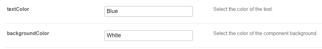
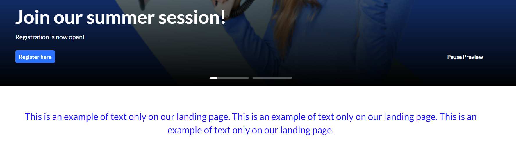
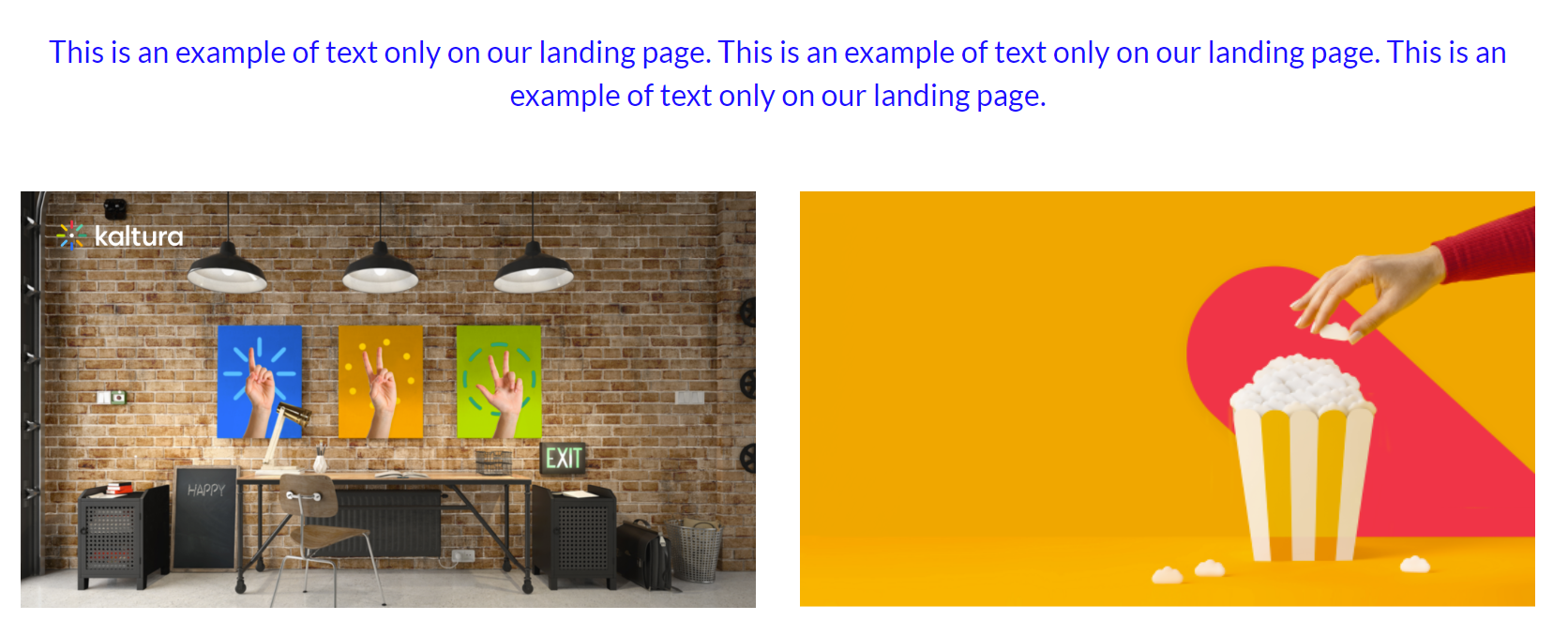
Text only
This component is simple text which is centered on the page. The text color and background can be set (as shown in the example below).
Line breaks and other capabilities can be achieved using html tags (e.g. <br>)
Settings example:
Settings result:
Single playlist
This component shows a list of media in the form of a carousel.
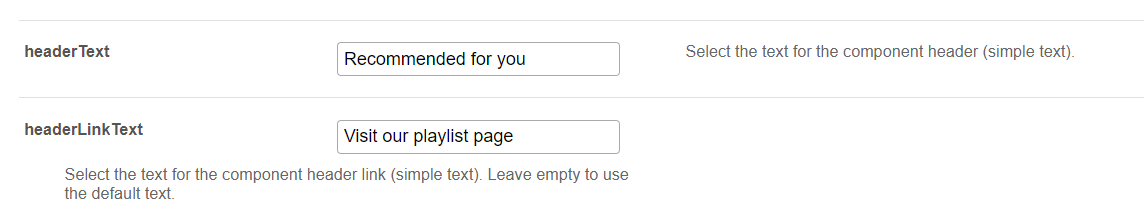
headerText - Enter a title to show at the top left of your playlist(s).
headerLinkText - If you don't enter any text, the default "See All" is automatically set and will take the users to the playlist page.
Select the content of the playlist from the playlist section. (If you choose Custom playlist, see note* below.)
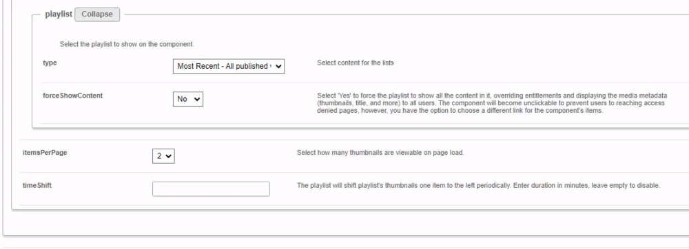
The forceShowContent will allow you to override entitlements for the playlist. However, the content will not be clickable.
(The "See All" link will also be removed or redirected to a link of your choosing in the headerLinkAction field.)
This feature is mainly used for external pages, where the site guests (unauthenticated users) will be able to get a sneak peek of the content.
*If you select Custom Playlist, you have additional configurations:
playlistID - Enter the ID for your custom playlist.
PlaylistDisplay - Choose how the playlist is displayed when the viewer clicks "See All" - as a grid layout or as the playlist player page with the list of other entries in the playlist.
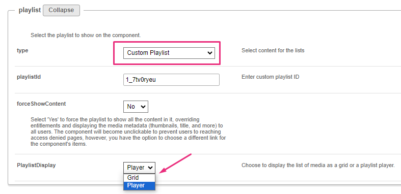
itemsPerPage - Select how many thumbnails you want to display on the page.
Time Shift - Set a time in minutes where the the media will shift one thumbnail to the left. Leave empty to disable.
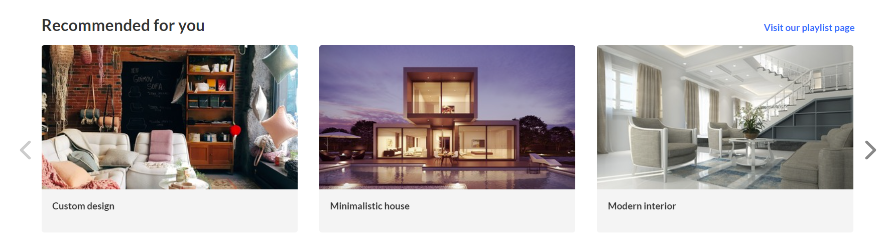
The image below shows a playlist configuration with three thumbnails:
User interaction with single playlist componentChannel Content Playlist:
Manual Custom Playlist:
Dynamic Playlist ('Most Recent', 'Recently Watched', etc. excluding 'Recently Watched' and 'Continue Watching'):
|
Two images side by side
Configure the left and right images using one of the following three options: image entry ID, image URL or image upload.
For best results, the aspect ratio of the image should be 16:9.
callToActionUrl - Add a link to navigate the users to. The link will open in a new tab. If left empty, the image will not be clickable.
AnalyticsString - This adds the "data-analytics" to the image tag. Enter a keyword or intuitive description, for example, 'tools'.
Not to forget - Alt Text for accessibility.
The image below shows two images side by side:
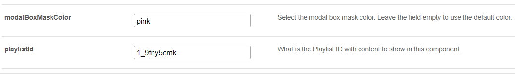
News images
This component shows images with texts in the form of a carousel. Each element on the carousel will open to an article. For information on creating news images, visit our article News Images playlist.
You can change the background color using the modalBoxMaskColor field.
After you have created a News Images playlist, enter the playlist ID.
Example of our configuration of two News images:
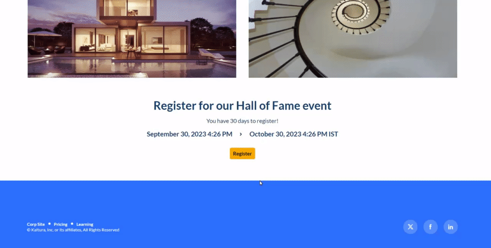
Registration
This component makes registering quick and easy for users. By clicking the "Register" button, the registration page opens on the side of the page for easy completion. No need to navigate elsewhere!
title - Enter a title for your registration page, for example, Register for the event.
buttonText - Add any text you want. If you leave the field empty, the default text Register will display.
scheduleTimeFrom - Enter the time you want registration to begin in unix time. Leave empty if you don't want to show a time.
Unix time is a common computer timestamp system. It counts seconds from 00:00:00 UTC on January 1, 1970, known as the Unix epoch, without considering leap seconds. You can use the on-line EpochConverter tool to convert your times.
scheduleTimeTo - Enter an end time (unix time). Leave empty if you don't want to show a time.
inScheduleText - Enter text that you'd like to display while registration is open.
outofScheduleText - Enter text to display after registration has closed.
If the Siteregistration module is disabled, this component won't be visible to users. In addition, if the registrationClosed function in the Siteregistration module is set to 'Yes', the component won't appear.
Below is an example of the Registration component on a MediaSpace site.
Collection of channels
This feature gives users an easy way to explore and access channel collections. Clicking 'See All' will take users to your channel collection page. If you don't have any channel collections yet, you can set them up in the ChannelCollections module.
If the ChannelCollections module is disabled, this component won't be visible to users.
headerText - Type in any name you'd like for the component header, for example, 'Our channel collections'.
headerLinkText - Select the text for the component header link (simple text). Leave empty to use the default text.
timeShift - This determines how often each thumbnail in the collection will move to the left. Simply enter a duration in minutes (e.g., 1, 2, 3, 4) or leave empty to disable. The channels will appear on the page in the order specified in the ChannelCollections module's 'sortBy' field (the default sort you chose for your channel collection). The timeshift feature ensures that all channels will be displayed over time.
This shift occurs when the page is refreshed.
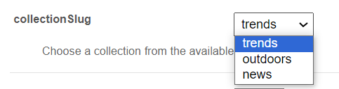
In the collection window, choose the channel collection you want to display on the page. All your channel collections appear in the drop-down menu.
forceShowContent - Choose 'Yes' to display all collection content to every user, regardless of entitlements. This makes the component unclickable, but you can still choose a different link for the component's items, for example if you want to use this templatepage as an external page / landing page that everyone can see.
headerLinkAction - This is where you can add a link to take your users to the page you choose.
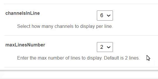
channelsInLine - Choose how many channels you'd like to display on one line - 6 or 8. (Choosing 8 will reduce the size of each circle.) The thumbnails come from your channel. If you've added a banner icon (see our Edit a Channel article), it becomes the thumbnail. Otherwise, the thumbnail uses the banner's central background.
maxLinesNumber - Choose how many lines of channels to display from the drop-down menu. The default is 2 lines.
Below is an example of the Collection of Channels component on a Video Portal site in 2 rows of 8:
Banner & CTA
This component provides a banner with text, a call-to-action button and background image.
HeaderText - Add the text that you want to appear as a title on the banner.
DescriptionText - Add a description or text that you want to display below the header.
The more text you add, the bigger the banner will become.
Banner image - You have 3 options for adding an image: entryID, imageURL or imageupload. Feel free to upload any image size - the system adjusts it to fit perfectly. It's best to use atmospheric images instead of those with text.
Button - Enter text for the CTA button and the URL that will redirect users when they click it. (Note: If you have text but no URL, the button will not appear on the banner.)
All fields are optional. If you don't add an image, the banner will automatically use the design system colors.
Banner with a short description:
Banner with a long description:
Group of users
This component highlights a group of individuals, such as speakers or presenters, on your site's landing page. It presents a row of thumbnail images (or initials if no image is provided). Clicking on See All opens the group page (configured in the grouppage module) itself. Clicking on a group member's thumbnail opens a window displaying their bio, along with details of their previous or upcoming sessions. To navigate to that person's profile page, simply click on either "See profile page" or "See all sessions".
This component requires the Grouppage module and Personalprofile module to be enabled.
headerText - Add the text that you want to appear as a title (for example "Meet our Speakers").
headerLinkText - Type the text you want to display on the right for users to click. Leave empty to use the default text “See All”.
group - Choose a group from the allowed groups in the Grouppage module to display its users on the page. Only the first 20 people will show on the page.
If no group is chosen, the component will be empty, and won't be displayed on the page.
uiType - Select how to display group members:
- Carousel - (default) People are displayed in a carousel format with right and left arrows for navigation. Users can scroll left to reach the last user on the list (round-robin).
- Side by Side - People are displayed horizontally next to each other without a carousel.
usersToShow - Select an option:
- Group list - Displays the first 20 people from the chosen group on the page, ordered alphabetically by name (A-Z).
- Promoted users only - Displays only the promoted people from the selected group on the page, following the manual ordering as set on the group page.
timeShift - The group members list will periodically shift by one person to the left. You can specify the duration of the shift in minutes. For example, if you have a group with 30 users and set a 1-minute shift interval, initially users 1 to 20 will be displayed. After 1 minute, users 2 to 21 will be displayed, and this pattern will continue until all users are displayed. Please note that the change will only take effect upon refreshing the page. If you want to disable this feature, simply leave the duration field empty.
This feature is only active when "Group list" is selected in the usersToShow field.
Below is an example of a Group of Users component. Clicking See All displays the group page, which is configured in the grouppage module:

Once you have finished configuring, click the Save button, which will save your new page, and will also save and clear the cache for the module and site.
To set up a homepage for your site, visit our article Setting up a homepage with Theming.