About
This article describes how to implement your brand on the webinar's site.
Brand the webinar site
Navigate to the Branding page; from the site page, click the Branding tab.
The Branding page displays.
 The Branding page allows you to edit the logo, banner, and theme for your webinar.
Edit logo
The default logo is taken from the initial setup. If you wish to insert a different logo, click Edit logo and choose the desired file. We recommend that your logo has adequate contrast on dark backgrounds. Recommended size: max height 200px.
Edit banner
The default webinar banner is taken from the template initial setup. If you wish to insert a different image, click Edit image and choose the desired file. The image may be cropped. We recommend avoiding texts and placing the subject at the center of the image. Recommended size: 1920x1080 px.
Edit a custom theme
Custom themes must be enabled on your account. If custom themes are not enabled on your account, click Let's talk on the box entitled "Looking for a custom theme?" to contact a Kaltura representative about enabling them.
- If the custom theme has not been edited (for instance, if you've just created the webinar and this is the first time branding the webinar site), click the + Create custom theme button. If the custom theme has been previously edited, click the three blue dots button on the lower right corner of the theme, then choose Edit.
The Edit theme screen displays. The options display on the left side of the screen, and a preview of the webinar site displays on the right.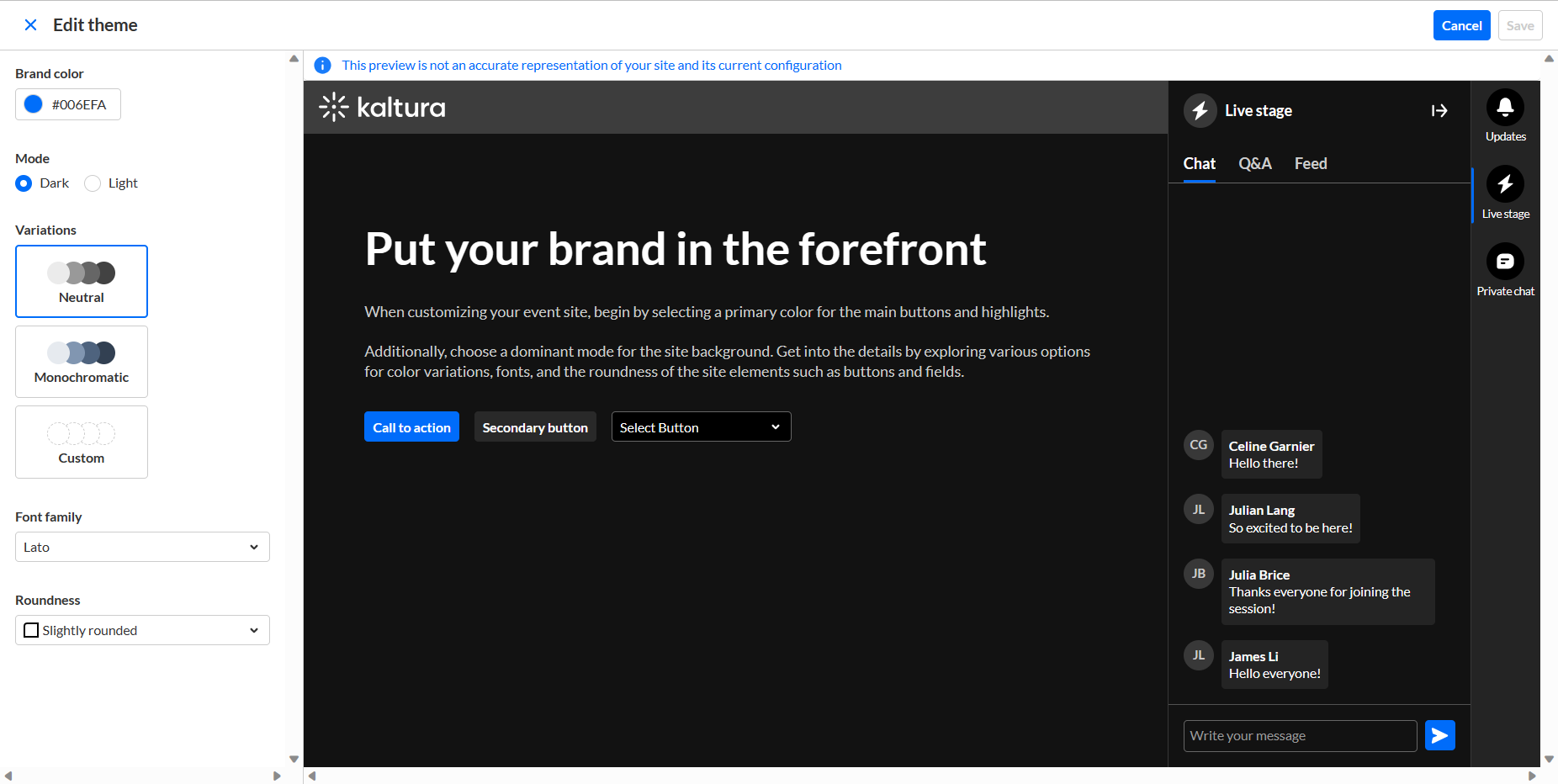
- Type a hex brand color. The brand color is used as an accent color, reflected in interactive elements such as call-to-action buttons, links, and highlighted elements.
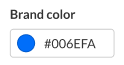
- Select the theme color mode from one of the following options:
- Dark Mode
- Light Mode
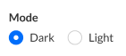
- Variations offer several options to add a unique touch to your theme. It controls the colors of your backgrounds, text, and other UI elements. You can select from three options:
- Neutral - The scheme will composed with shade of neutral grays.
- Monochromatic - The scheme will use the tint from your brand color to created a low-saturated color palette.
- Custom - This gives you more control. You can set a separate color for your header and choose a specific color to create the color palette for the rest of the UI elements. If you choose Custom variation, two additional options display on the Edit Theme screen - "Header" and "All other elements".
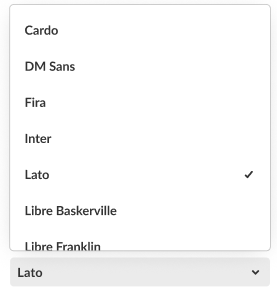
- You can choose from the following fonts:
- Arial
- Garamond
- Georgia
- Lato (default)
- Sans-serif
- Tahoma
- Times New Roman
- Trebuchet MS
- Verdana
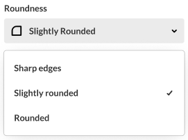
- Select the roundness of UI elements such as buttons, input fields, and certain menus. Choose from the following options:
- Sharp Edges
- Slightly Rounded (Default)
- Rounded
- When finished click Save. If the theme is activated, changes will be applied on the event site.


Activate theme
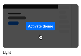
- Hover over the desired theme, then click Activate theme.
 A confirmation screen displays.
 - Click Activate theme to confirm or click Cancel or cancel.
A message displays confirming your request. The activated theme is denoted below the theme box by "Active" and when you hover over the theme box, "Theme activated".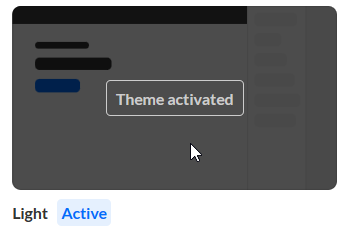
 A confirmation screen displays.
