About
This article describes how to implement your brand on the event's site.
The screens shown here represent a multi-session event. The same actions apply when working with single session.
Navigate to the Branding page
From the Event page, click the Branding tab.

The Branding page displays.

The Branding page allows you to edit the logo, banner, and theme for your event, as well as set an image for social sharing.
Replace logo
The default logo is taken from the initial setup. If you wish to insert a different logo, click Replace logo and choose the desired file. We recommend that your logo has adequate contrast on dark backgrounds. Recommended size: max height 200px.
Replace banner image
The default event banner is taken from the template initial setup. If you wish to insert a different image, click Replace image and choose the desired file. The image may be cropped. We recommend avoiding texts and placing the subject at the center of the image. Recommended size: 1920x1080 px.
For single session events, the banner is automatically used as the session banner.
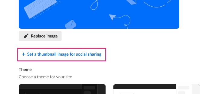
Set a social sharing image
This feature requires additional functionality to be enabled on your account. Contact your Kaltura representative for more information.
You may designate an image to appear when sharing event links on social media platforms. If no image is set, the logo image will be used.
For the best cross-platform compatibility when sharing URLs on Facebook, LinkedIn, and X, we recommend using an image size of 1200x630 px (1.91:1 aspect ratio) to ensure optimal preview display without cropping.
Upload image
- Click Set a thumbnail image for social sharing.
- Locate and upload the image.
You receive confirmation that the social sharing image was added successfully. A preview is also displayed on the Branding page.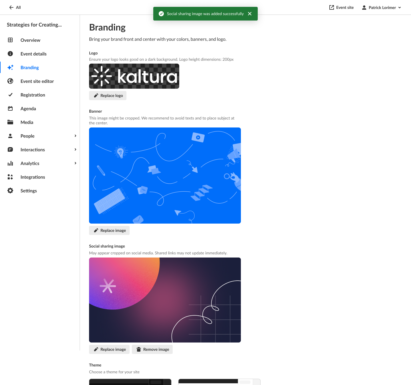


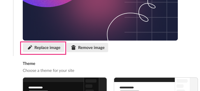
Replace image
- Click Replace image.
- Locate and upload the image.
You receive confirmation that the social sharing image was added successfully. It is also displayed on the Branding page.

If the event link was already shared, the time it takes for your replacement image to reflect on the social media platform depends on their caching refresh.
Remove image
- Click Remove image.
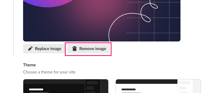 You are asked to confirm your action. If you proceed, the social sharing image that you remove will be replaced with the uploaded logo.
 - Click Remove to confirm or Cancel to cancel the action.
If you clicked Remove, you receive confirmation that the social sharing image was successfully removed.
 You are asked to confirm your action. If you proceed, the social sharing image that you remove will be replaced with the uploaded logo.
 When the social sharing image is removed, the logo image will be used its place. If the event link was already shared, the time it takes for the logo image to reflect on the social media platform depends on their caching refresh.
Edit a custom theme
If your Kaltura Virtual Events account is configured with Custom Templates, and when creating your event, you chose a Custom Template (see Create an event), please do not edit the event theme on the Branding page. Doing so will override your Custom Template settings.
Custom themes must be enabled on your account. If custom themes are not enabled on your account, click Let's talk on the box entitled "Looking for a custom theme?" to contact a Kaltura representative about enabling them.
- If a custom theme has not been created (for instance, if you've just created a new event and this is your first time branding the event site), click the + Create custom theme button.
If the custom theme has been created, click the three dots on the lower right corner of the theme, then choose Edit.
The Edit theme screen displays. The options display on the left side of the screen, and a preview of the event site displays on the right.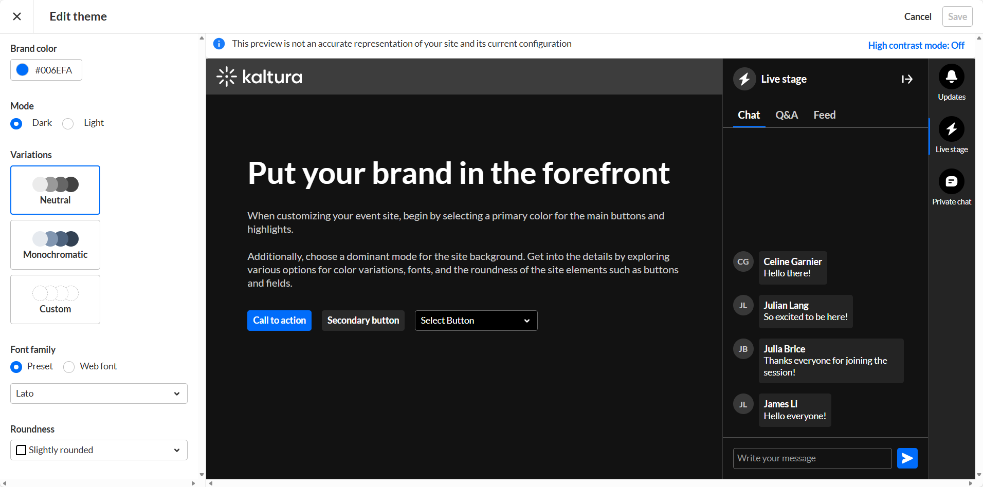
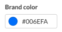
- Type a hex brand color. The brand color is used as an accent color, reflected in interactive elements such as call-to-action buttons, links, and highlighted elements.
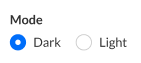
- Select the theme color mode from one of the following options:
- Dark Mode
- Light Mode
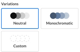
- Variations offer several options to add a unique touch to your theme. It controls the colors of your backgrounds, text, and other UI elements. You can select from three options:
- Neutral - The scheme will composed with shade of neutral grays.
- Monochromatic - The scheme will use the tint from your brand color to created a low-saturated color palette.
- Custom - This gives you more control. You can set a separate color for your header and choose a specific color to create the color palette for the rest of the UI elements. If you choose Custom variation, two additional options display on the Edit Theme screen - "Header" and "All other elements".
- Choose either Preset or Web fonts.
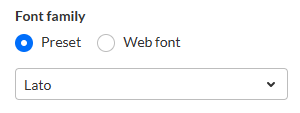
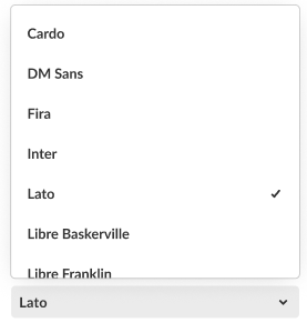
- If you chose Preset, select from the following fonts:
- Arial
- Garamond
- Georgia
- Lato (default)
- Sans-serif
- Tahoma
- Times New Roman
- Trebuchet MS
- Verdana
- If you chose Web font, complete the following sub-steps:
- Enter an External stylesheet URL containing your embedded fonts.
For example, you can grab the URL from your provider: https://fonts.googleapis.com/css2family=Roboto:wght@400;700&display=swap
Only a single font family should be embedded. We recommend including the following weights: 400 (Normal) and 700 (Bold). - Enter a Font family name as it is declared in the stylesheet or supplied by your provider.
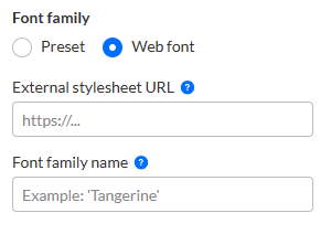
- Enter an External stylesheet URL containing your embedded fonts.
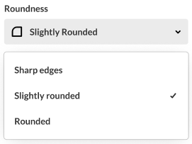
- Select the roundness of UI elements such as buttons, input fields, and certain menus. Choose from the following options:
- Sharp Edges
- Slightly Rounded (Default)
- Rounded
- When finished click Save. Once the theme is activated, changes will be applied on the event site.


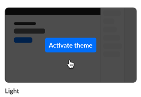
Activate a theme
- Hover over the desired theme, then click Activate theme.
 A confirmation screen displays.
 - Click Activate theme to confirm or click Cancel or cancel.
A message displays confirming your request. The activated theme is denoted below the theme box by "Active" and when you hover over the theme box, "Theme activated".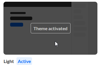
 A confirmation screen displays.
