About
This guide covers the Visual settings tab, where you can control the look and feel of the player, including colors, logos, and other visual elements.
Access the Visual tab
1. Log into the Rich Media CMS and click the Studio tab.

2. From the list, choose the player you want to customize.

The settings tab opens.

3. Click the stars icon.

A list of available settings for that player is displayed.
Here’s how to identify which settings apply to which players:
| Tag | Player |
| VOD | VOD player |
| Audio | Audio player |
| Reels | Reels player |
Unless noted otherwise, the images shown in this article are of the VOD player.
Visual options
Visual options vary depending on the type of player.
| VOD player | Audio player | Reels player |
 |
 |
 |
Dark/light mode
Audio
Sets the overall appearance of the player to dark or light mode.

Audio player shown in image above.
Player color
VOD Audio Reels
Controls the colors used across the player interface. You can change the default colors using a hex value or the color picker.
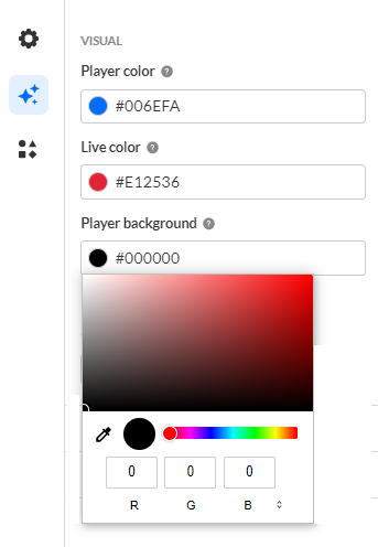
- Player color - Sets the primary color used for player controls and UI elements.
- Live color - Sets the color for Live indicators and related buttons.
- Player background - Sets the background color when playback is not full size.
External CSS
VOD Audio Reels
Applies a custom CSS file to the player.
Check the box to enable.

Enter the URL of the CSS file. The player loads and applies the styles from this location.
Example
The following CSS code hides the Advance captions settings from the player.
 a.playkit-advanced-captions-menu-link {
display: none;}

Set default player ratio
VOD Audio Reels
Sets the default width and height used when a player is embedded.
1. Click the gear icon to open the settings.

2. Configure the following values:
- width (in pixels)
- height (in pixels)
Logo
VOD
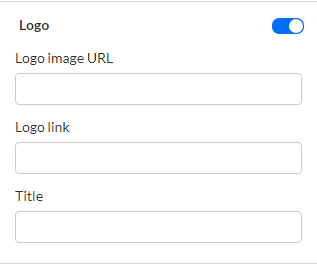
Controls the display of a custom logo in the player control bar.
1. Toggle on to enable.

2. Configure the following:
- Logo image URL - Type the URL for the custom control bar logo image. The logo image URL can be obtained by right-clicking on an image and selecting "Copy image address". Recommended image size is 32x32 pixels.
- Logo link - Set a logo URL. There are two types of logo URLs that you can set:
- Click-through URL - This logo URL is the website address that is being referred to upon clicking on the logo image. Type the URL for the control bar logo to click through to.
- Dynamic logo URL - A dynamic logo URL is a website address that automatically changes based on what video is playing. For instance, if someone clicks on your logo while watching a video, the link can take them directly to that same video on another site, such as your video portal. To set up a dynamic logo link:
- Type the URL and add {entryId}, for example: https://mycompanymediaspace.com/media/{entryId}. The link updates according to the entry ID of the video being played.
- Title - Type the title text to show on hover.
For the user guide, see Logo plugin.
Entry title
VOD Audio
Use the Entry title setting to show the entry title on the player on hover during playback. The title hides when the player is idle.
To enable, toggle on Show title on hover.

The setting has no effect for clipped entries, and the entry title is not displayed for YouTube entries, since YouTube already shows its own title.
For information about how this feature appears to viewers, see Entry title display on player hover.
Watermark
VOD
Controls whether a watermark is displayed on the player.
1. Toggle on to enable.

2. Configure the following:
- Watermark image URL - Image used as the watermark.
- Watermark link - There are two types of watermark URLs that you can set:
- Click-through URL - static destination
- Dynamic URL - automatically updates based on the video being played, for example: https://mycompany.com/media/{entryId}. To set up a dynamic watermark link, type the URL and add {entryId} where the video ID should appear.
- Watermark position - Choose the position of the watermark - top right, bottom right, top left, or bottom left.
- Display duration - Number of seconds the watermark is shown.
For the user guide, see Watermark plugin.
Error slate
VOD
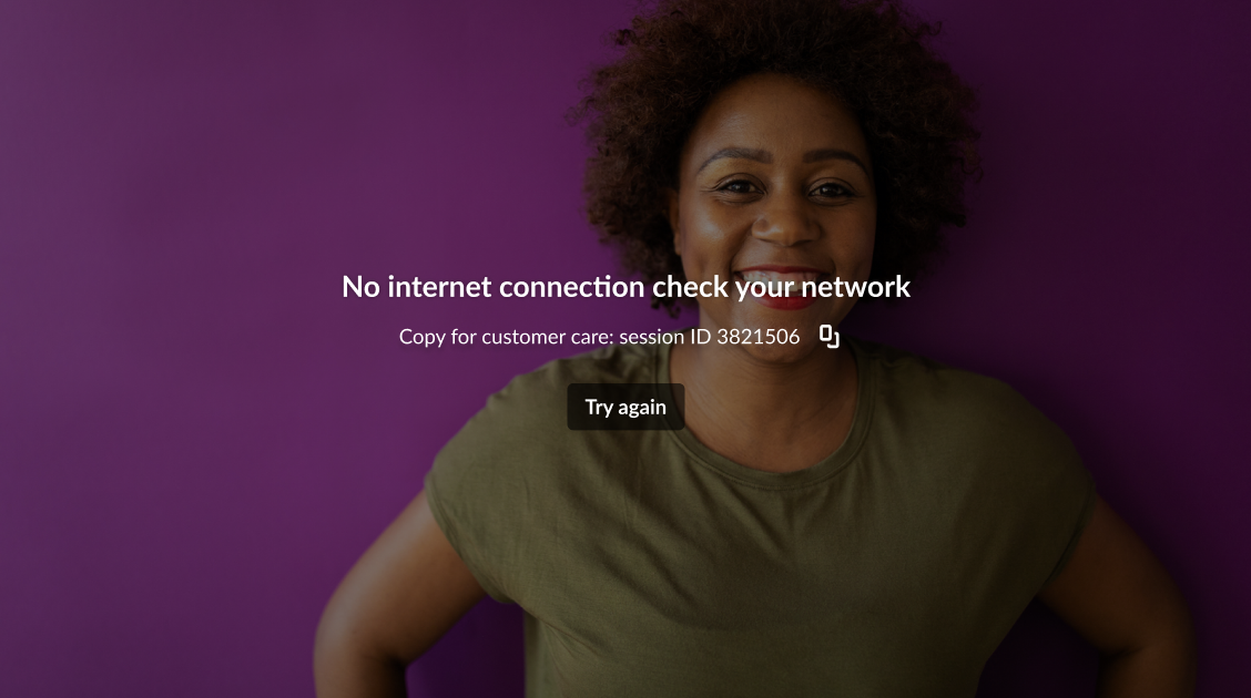
Controls the background image shown when player errors occur. By default, error messages appear over a black background.
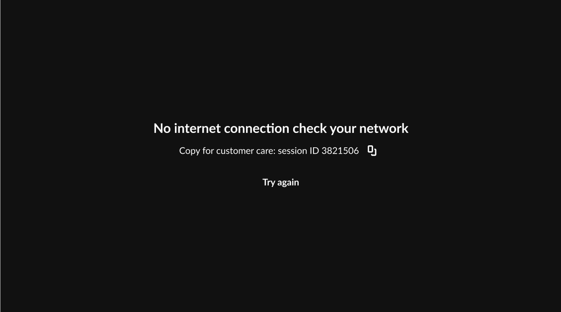
1. Toggle on to enable.

2. Enter an Error slate image URL.
The image is used as the background for all player error messages.
For the user guide, see Error slate.
Bumper
VOD
Controls whether a bumper video plays before and/or after the main content.
1. Toggle on to enable.
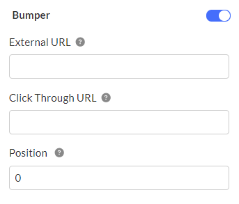
2. Configure the following:
External URL - Enter the URL of your video file that you want as the bumper.
You can use any valid video URL. Examples of common sources are listed below.
Click Through URL - (Optional) Enter the URL that users are redirected to when they click the bumper.
Position - Choose when the bumper will play:
- 0 - before playback (default)
- -1 - after playback
- 0,-1 - before and after playback
Example video sources
Use a video file from your Rich Media CMS:
- Click on the entry in Rich Media CMS.
- On the left menu bar, click Flavors.
- Click the three dots menu on the right of the flavor you want to use.
- Click Preview in the drop-down menu.
- Right-click on the video, and then click the following according to what browser you're using:
- Chrome - click Copy Video Address
- Firefox - Copy Video Link
- Microsoft Edge - click Copy Link
- Paste it into the External URL field.
Use a video from Dropbox:
- Copy the Dropbox link of your file.
- Paste the link into the External URL field, but change the end of the link from '=0' to '=1' - this changes the URL from a 'show' to a 'download'.
Use a video from Google Drive:
- Copy the 'share' link of your file (ie. the link for your file when sharing it).
- Change the link from a "share" to a "download" link by using the Google Drive Direct Link Generator.
- Paste the new, "download" link into the External URL field.
For the user guide, see Bumpers.
