About
The Theme Builder lets you create and customize the appearance of your site using the Theming design system.
Choose a primary brand color, color mode, typography, and UI styling options to create a consistent look and feel across your site. As you make changes, the preview updates in real time to help you visualize the theme.
Changes made in the Theme Builder apply to all pages that use the Theming design system.
Access the Theme builder
The Theming page opens.

2. In the Themes section, click Add Themes.
3. Click Edit.

The Theme builder opens.

Create a theme
Please note that if you're editing an older version of the theme using this editor, any changes you make will replace previous modifications and cannot be reversed.

Brand color
The brand color is used as an accent color, reflected in interactive elements such as call-to-action buttons, links, and highlighted elements.

You can change the color by clicking on it and opening the color palette, or by typing in a Hex code.
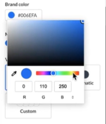
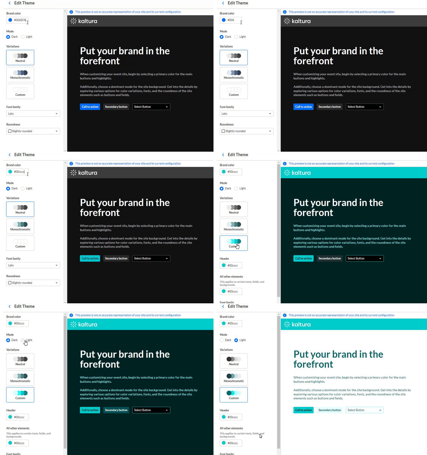
When you change the color, you can see how it looks in real-time in the preview window.
The preview is simply a guide and not an accurate representation of your whole site and its current configuration.
Theme mode
Select the theme color mode from one of the following options:
- Dark mode
- Light mode
The mode also allows you to create your own custom theme.
Color variations
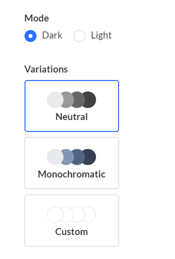
The color scheme offers several options to add a unique touch to your theme. It controls the colors of your backgrounds, text, and other UI elements. You can select from three options:
- Neutral - The scheme will composed with shade of neutral tones.
- Monochromatic - The scheme will use hues from your brand color to created a low-saturated color palette.
- Custom - This gives you more options, for example, you can set a color for your header and choose a specific color to create the color palette for the rest of the UI elements.
Custom colors
Note that there are two different colors you can use. You can choose a color for the header and a secondary color that will affect the hue of your site.

The 'Select Button' demonstrates the chosen Theming for drop-down menus.

Font family
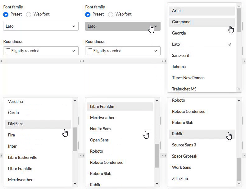
Choose Presets or Web font:
Presets
Select a font family from one of the following 26 options:
|
|
|
Web font
When you click Web font, additional functions display:
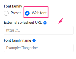
External stylesheet URL - Enter a stylesheet URL that contains your embedded fonts, for example:
https://fonts.googleapis.com/css2?family=Roboto:wght@400;700&display=swap
Only a single font family should be embedded. We recommend to include the following weights: 400 (normal) and 700 (bold).
Font family name - Enter the font family name (for example, 'Tangerine') as specified in the stylesheet, or as supplied by your provider.
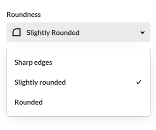
Roundness of UI elements
Select the roundness of UI elements such as buttons, input fields, and certain menus. Choose from the following options:
- Sharp Edges
- Slightly Rounded (Default)
- Rounded
When you're happy with your configuration, click Save.
Exit the Theme Builder by clicking the back arrow at the top left.
When your new theme is ready, learn how to apply it to your site in the Theming module.