About
The Styling module lets you create new styles based on common use cases. With this module, admins can preview the generated style, share it with other admins for review, and then apply it in production.
This guide covers the non-Theming styling options. For information about Kaltura's Theming feature set, see legacy Video Portal Theming tour.
For advanced theme creation, for which a deep CSS understanding is required, please use Kaltura’s Cssupload module.
Custom CSS fonts
Enable - Select Yes to enable the Styling module
Fonts - Select +Add "fonts" These fonts will be available in custom CSS and in the Font selectbox on the styling page
- familyName - Font family name that will be used in CSS and will be appended to the Font select box on the styling page.
- fallbackFonts - Font families and font types which should be used as a fallback when the desired font family is not ready or doesn't exist (comma-separated list, like in CSS specifications).
- System font - use worldwide supported font by name
- Import from URL - use an external font service (like Google Fonts)
- Upload files - upload your own font asset files
Specifying generic font type (like serif or monospace) is mandatory.
Example: 'Helvetica Neue',Arial,sans-serif
type - Font assets source type:
isCssApplied - This field indicates whether the style created in the Styling Module is applied on the site or not. Click Reset to clear all previously set styles.
Configuration
The Styling configuration page provides administrators with an interface where they can modify look and feel attributes like text color, background color, and fonts.
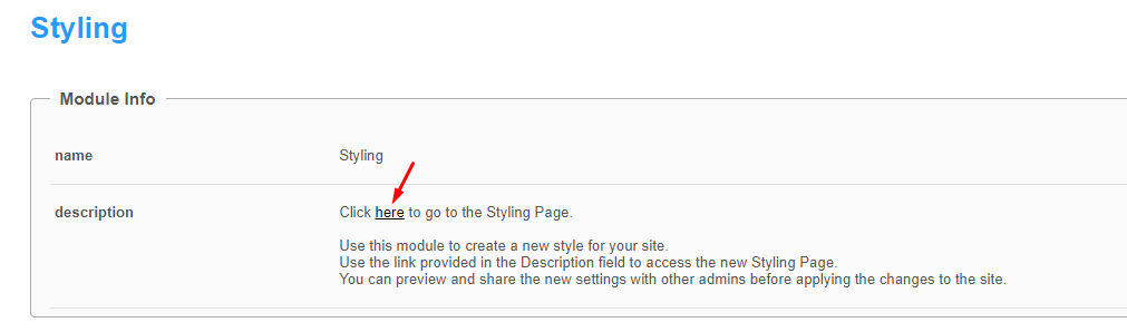
Use the link provided in the description to access the new Styling page.
The Styling Configuration page displays.
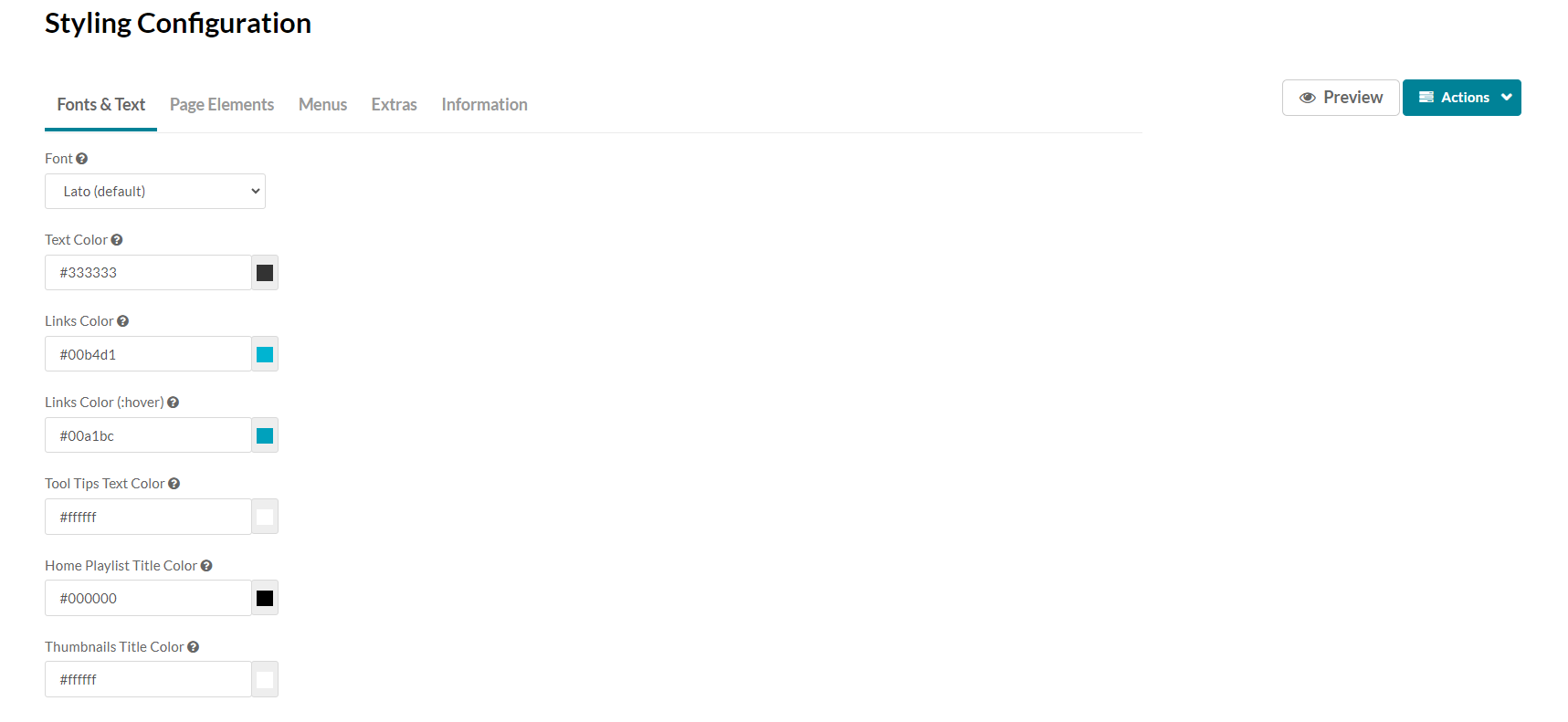
Here is a list of the items that can be modified in the Styling module:
|
Tab Location |
Attribute |
Description |
Visual |
|
Fonts & Text |
Font |
This modifies the default MediaSpace font. |
|
|
Fonts & Text |
Text Color |
This modifies the default text color within MediaSpace. |
|
|
Fonts & Text |
Links Color |
This modifies the color of hyperlinked text within MediaSpace, as well as certain icons and other dominant UI elements. |
|
|
Fonts & Text |
Links Color (:hover) |
This modifies the color of hyperlinked text that is currently being interacted with by the end user, as well as certain icons and other dominant UI elements that are being interacted with by the end user |
|
|
Page Elements - Buttons |
Buttons Color |
This modifies the text color and border color of buttons. |
|
|
Page Elements - Buttons |
Buttons Color (:hover) |
This modifies the text color of buttons when they are active or being hovered by a user. |
|
|
Page Elements - Buttons |
Primary Buttons Color |
This modifies the background color and border color of primary buttons. |
|
|
Page Elements - Buttons |
Primary Buttons Color (:hover) |
This modifies the background color of primary buttons when they are active or being hovered by a user. |
|
|
Page Elements - Buttons |
Danger Buttons Color |
This modifies the background color and border color of danger buttons. |
|
|
Page Elements - Buttons |
Danger Buttons Color (:hover) |
This modifies the background color of danger buttons when they are active or being hovered by a user. |
|
|
Page Elements - Background |
Header Background |
This modifies the background color of the KMS header. This area that contains the logo and primary navigation. |
|
|
Page Elements - Background |
Footer Background |
This modifies the background color of the KMS Footer at the bottom of each page. |
|
|
Page Elements - Background |
Page Background Color |
This Modifies the background color of the primary content wrapper. |
|
|
Page Elements - Background |
Tags Color |
This modifies the border as well as font color of any tags associated to videos. |
|
|
Menus - Header Navigation |
Header Navigation Text |
This modifies the color of both the text and the underline effect on the primary navigation. |
|
|
Menus - Header Navigation |
Header Navigation Text (:hover) |
This modifies the color of both the text and the underline effect on the primary navigation when hovered. |
|
|
Menus - Dropdown Menus |
Dropdown Menu Text |
This modifies the color of the text and icons in dropdown menus |
|
|
Menus - Dropdown Menus |
Dropdown Menu Text (:hover) |
This modifies the color of the text and icons in dropdown menus when that element is actively hovered. |
|
|
Menus - Dropdown Menus |
Dropdown Menu Background Color |
This modifies the background color of a dropdown menu. |
|
|
Menus - Dropdown Menus |
Dropdown Menu Background Color (:hover) |
This modifies the background color when a child element of a dropdown menu is hovered or clicked. |
|
|
Extras |
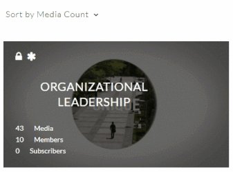
Black & White Home Page Thumbnails |
This applies a black and white filter to the home page playlist thumbnails below the carousel. On hover, filter is removed, and thumbnail will come back to full color. |
|
|
Extras |
Black & White Home Carousel Thumbnails |
This applies a black and white filter to the home page carousel background thumbnails. The small thumbnail in the carousel will keep its color. |
|
|
Extras |
Black & White Channel/Galleries Thumbnails |
This applies a black and white filter to the gallery thumbnails, and the channel’s playlist and media thumbnails as well (but not to the header). On hover, filter is removed, and thumbnail will come back to full color. |
|
|
Extras |
Black & White Channel Thumbnails |
This applies a black and white filter to the channel’ thumbnails within the All-Channels and My-Channels pages. On hover, filter is removed, and thumbnail will come back to full color. |
 |
|
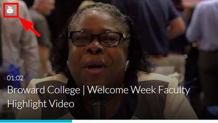
Extras |
Remove Media Type Icon |
Remove the little icon indicating the media type from the thumbnails top left corner. |
 |
|
Extras |
Carousel Buttons Always On |
Set the left and right buttons of the home carousel to always show. When off, the buttons will be displayed only when hover. |
 |
