About
This article explains how to customize the look, feel, and personality of your agent via the Experience tab. You'll learn how to configure key settings - including the agent's title, interaction type, appearance, and voice, as well as the site's visual theme - so that the experience aligns with your brand and your users' expectations. You'll even learn how to create a custom avatar, along with custom voices.
Navigate to the Experience tab
Click on the Experience tab.

Interaction model
Title - Type a title for your agent. Max is 20 char.

This title will appear on the Agent site and on the preview located on the right side of the Overview tab.
 Agent site
 Preview
Model - Choose which kind of interaction you would like your agent to have with users. Choose from 'Avatar and chat', 'Chat only', or 'Avatar only'.

Branding
Logo - Want to edit the logo on your avatar site? Click the 'Edit' pencil icon and choose a different image.
Background image - Upload a custom background image for your agent’s site, creating a branded and visually distinctive experience for end users. Click + Add background image and choose a desired JPG or PNG image. Recommended ratio is 16:9.

Edit and delete background image -
Want to change the background image? Simply click the 'Edit' pencil icon and choose a different image. To remove the background image from the site, click the trashcan icon.

Theme - Choose a theme for your experience.

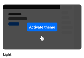
Activate theme -
-
Hover over the desired theme, then click Activate theme.
 A confirmation screen displays.
 - Click Activate theme to confirm or click Cancel or cancel.
A message displays confirming your request. The activated theme is denoted below the theme box by "Active" and when you hover over the theme box, "Theme activated".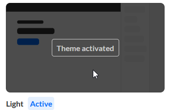
 A confirmation screen displays.
Create a custom theme -
-
Click the + Create custom theme button.
The Edit theme screen displays. The options display on the left side of the screen, and a preview of the event site displays on the right.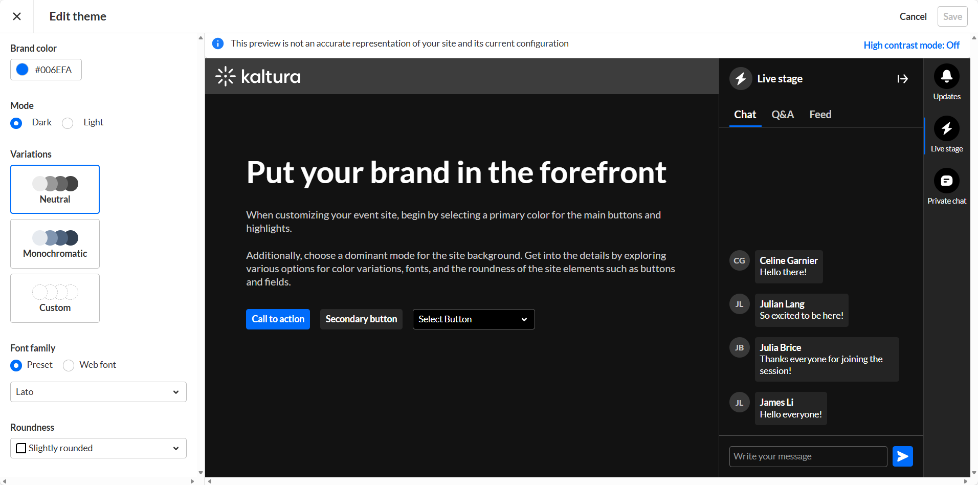
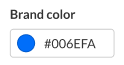
- Type a hex brand color. The brand color is used as an accent color, reflected in interactive elements such as call-to-action buttons, links, and highlighted elements.
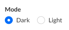
- Select the theme color mode from one of the following options:
- Dark Mode
- Light Mode
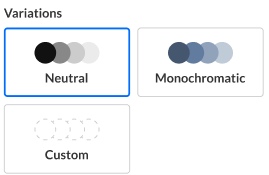
- Variations offer several options to add a unique touch to your theme. It controls the colors of your backgrounds, text, and other UI elements. You can select from three options:
- Neutral - The scheme will composed with shade of neutral grays.
- Monochromatic - The scheme will use the tint from your brand color to created a low-saturated color palette.
- Custom - This gives you more control. You can set a separate color for your header and choose a specific color to create the color palette for the rest of the UI elements. If you choose Custom variation, two additional options display on the Edit Theme screen - "Header" and "All other elements".
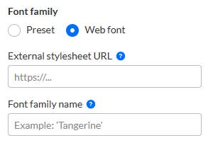
- Choose either Preset or Web fonts.
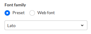
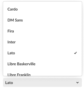
- If you chose Preset, select from the following fonts:
- Arial
- Garamond
- Georgia
- Lato (default)
- Sans-serif
- Tahoma
- Times New Roman
- Trebuchet MS
- Verdana
- If you chose Web font, complete the following sub-steps:
- Enter an External stylesheet URL containing your embedded fonts.
For example, you can grab the URL from your provider: https://fonts.googleapis.com/css2family=Roboto:wght@400;700&display=swap
Only a single font family should be embedded. We recommend including the following weights: 400 (Normal) and 700 (Bold). - Enter a Font family name as it is declared in the stylesheet or supplied by your provider.
- Enter an External stylesheet URL containing your embedded fonts.
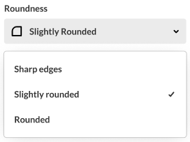
- Select the roundness of UI elements such as buttons, input fields, and certain menus. Choose from the following options:
- Sharp Edges
- Slightly Rounded (Default)
- Rounded
- When finished click Save. Once the theme is activated, changes will be applied on avatar site.


Avatar appearance
Voice - What type of voice would you like your avatar to have? Use the pulldown menu to select from a list of 10 available voices or create a custom voice.

You can listen to a preview of the selected voice by clicking the "Play" button to the right of the selection.

- Use the pulldown menu to select + Create custom voice.

The Create custom voice screen displays.
- Type a name for your custom voice (max 24 char).
- Upload an audio sample to be used as the voice for your avatar. Required format/size - MP3 up to 10 MB. See example photos and a quality checklist in the right pane for guidance.
 Once uploaded, listen to preview of the voice by clicking the "Play" button in the left pane. Replace the uploaded voice by clicking Replace voice.
 - Custom voice requires explicit consent via checkbox before submission - confirming age (18+), asset ownership, and compliance responsibility. Click on Kaltura's Artificial Intelligence Addendum to read it in its entirety. Check the box to agree with the addendum.

- Click Upload.
Your new custom voice is shown in the list of available voices.


 Once uploaded, listen to preview of the voice by clicking the "Play" button in the left pane. Replace the uploaded voice by clicking Replace voice.

Delete and edit a custom voice -
Two additional options display to the right of a custom voice - Delete and Edit.

Click Delete to delete custom voice.
Click Edit to access the Edit custom voice screen. Here you can make desired changes to your custom avatar's voice. Click Save when finished.
Avatar design - What do you want your avatar to look like? Click to select one of the available avatar designs.
Click See more to expand your choices.


Create custom avatar -
- Click + Create custom avatar.
- Type a name for your custom avatar (max 24 char).
- Upload an image to be used as the face for your avatar. Required format/size - jpg up to 10 MB, isolated object, 300x300 resolution minimum. See example photos and a quality checklist in the right pane for guidance.
Once uploaded, preview the image in the left pane. Replace the uploaded image by clicking Replace image. - Custom image requires explicit consent via checkbox before submission - confirming age (18+), asset ownership, and compliance responsibility. Click on Kaltura's Artificial Intelligence Addendum to read it in its entirety. Check the box to agree with the addendum.

- Click Upload.
Your new custom avatar is shown and selected in the list of available avatars.
- Use the pulldown menu to select from a list of 10 available voices for your custom avatar.

The Create custom image screen displays.


Delete and edit a custom avatar -
Hover over your custom avatar and click the three-button menu in the upper right corner.

Click Delete to delete custom avatar.
Click Edit to access the Edit custom image screen. Here you can make desired changes to your custom avatar's image. Click Save when finished.
Remember to click the Publish button on the Experience tab to publish any changes you've made.
Kaltura does not use customer data to train its AI models. To learn more, see Kaltura's Artificial Intelligence Principles.
