This document provides a detailed walk through on skinning the Kaltura Player v2, starting with architecture overview, why Kaltura leads with HTML5, and a detailed description of how to include and build custom skin resources. The contents of this document are targeted for designers with a technical understanding of web front-end (specifically HTML5, CSS and JavaScript).
A complimentary document will detail skinning and configuration with the friendly HTML5 player studio user interface.
For a listing of all the relevant player APIs see player.kaltura.com/docs/api
Kaltura Player v2 Toolkit Architecture Diagram
The following diagram visualizes the architecture of Kaltura Player v2 Toolkit, and highlights its flexibility and robustness across platforms and devices:

As the diagram outlines, we can leverage native components for iOS and Android in conjunction with the HTML5 runtime and Adobe flash or Microsoft Silverlight plugins, to transcend platform limitations across devices and browsers, while delivering the full Player v2 Toolkit experience.
Why Native?
What advantages are gained by going native? Here is a feature list that will help explain the advantages of Kaltura Player Toolkit in native environments:
| iOS WebView | iOS Native with Kaltura Player Toolkit | Android WebView | Android with Kaltura Player Toolkit |
CSS Skin | Not supported on iPhone | Supported | Supported | Supported |
JS Plugins | Supported | Supported | Supported | Supported |
Apple HLS Playback | Supported | Supported | Broken support across fragmented platform | Supported, with consistent experience across android versions. |
MPEG-Dash | Unsupported, dependent on Apple. | Supported via partners software players | No support in android < 4.1, Android Chrome supports in webview | Supported via partners software players |
ChromeCast | Unsupported | Supported | Unsupported | Supported |
AirPlay | Supported | Supported | Unsupported | Unsupported |
AutoPlay | Unsupported | Supported | Unsupported | Supported |
HTML5 Overlays | Not supported on iPhone | Supported on iPhone and iPad | Broken support across fragmented platform | Supported |
Fullscreen | Only native controls in true fullscreen | Supports custom HTML controls in fullscreen | No support in android < 4.1, Android Chrome supports fullscreen. | Supports custom HTML controls in fullscreen |
Volume Control | Only device level volume control | Supports in-player ui for volume control | Only device level volume control | Supports in-player ui for volume control |
Ads | Native controls on iPhone, ads can be skipped ui does not reflect “ad state” | Full Support via HTML controls that reflect ad playback | No support in android < 4.1, Android Chrome supports HTML controls | Supported, with consistent experience across android versions. |
Offline Playback | Unsupported | Supported | Unsupported | Supported |
DRM and Content Controls | Unsupported | Via Partners and part of offering | Unsupported, outside of latest version of Android Chrome with Encrypted Media Extension (EME) w/ Widevine & ClearText | Via partners and part of offering. |
Getting Started with Skinning a Kaltura Player
The following steps outline a basic "hello world" approach for CSS based player skin, and setup a player development environment:
- Login into your Kaltura Management Console (KMC) and open the Studio's player list.
- Create a "new" player in the "Universal Studio" and give it a title such as "Player V2 Custom Skin".
- Select Content from the Actions dropdown menu for the v2 Player you created.
- Select "Preview and embed" from the Actions menu, for an arbitrary entry from the content list,
- In the Preview and embed window, select Advanced Options and then select Dynamic Embed.
- Copy the respective code.
- Paste the code into a page hosted on a webserver ( locally or remote ). Note you should access the page via a web server with http:// not file://
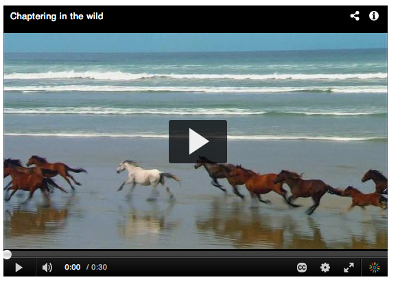
You should now have a page that looks like this:
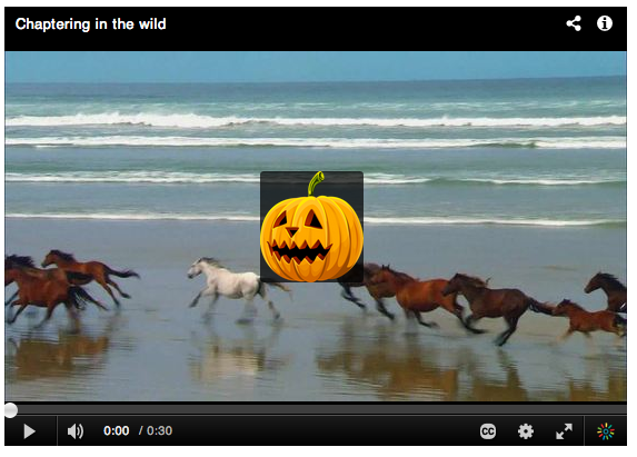
- Create a new file called "customSkin.css" in the same folder. For starters this will just change the play button to a jack-o-lantern.
/* clear out the font based icon */ .largePlayBtn.icon-play:before { content: ""; } /* replace play button with jack-o-lantern: */ .mwPlayerContainer .largePlayBtn, .mwPlayerContainer .largePlayBtn:hover{ background-image: url('http://0.tqn.com/d/webclipart/1/0/o/s/4/Jack-O-Lantern2.png'); background-size: 93px 100px; width:93px; height:100px; padding: 0px; margin:-50px; }- Save the file.
- Point the player to the css file with the "IframeCustomPluginCss1" configuration option bold in the sample code:
<script> kWidget.embed({ "targetId": "kaltura_player_1382198751", "wid": "_243342", "uiconf_id": 20540612, "flashvars": { "streamerType": "auto", "IframeCustomPluginCss1" : 'customSkin.css' }, "cache_st": 1382198751, "entry_id": "1_sf5ovm7u" }); </script> - Now load the page in your browser. You should get:

Because of the robust CSS based layout support, many skins can be built almost entirely using CSS. You can inspect the player to see the CSS target names of various player components.
When moving to production you should host your CSS file in an absolute URL and reference it from the same config line. In the near future we plan to support hosting all player related assets within Kaltura.
Edit UIVars, Adding CSS or JS to JSON config with the Universal Studio
After you are satisfied with your CSS adjustments and have pushed your CSS or JavaScript to a CDN location, you can use the Universal Studio to quickly insert your custom CSS & JS into the JSON config. Within the Universal Studio go to the "Plugins -> uiVars" section, and then use the same keys IframeCustomPluginCss1 & IframeCustomPluginJs1 to insert the values:

JSON Config vs uiConf Config
The Kaltura Player v2 principal configuration format is JSON. Older players used uiConf xml. The Kaltura Player v2 can convert uiConf xml on the fly to the JSON format that is uses, but you won't have as fine grain control over layout plugins configuration using the converter. Going forward, it is best to use the JSON format to configure your v2 player. A uiConf that broadly enables features with default configuration looks like this:
{
    "plugins":{
        "topBarContainer": {},
        "titleLabel": {},
        "controlBarContainer": {
            "hover": true
        },
        "largePlayBtn": {},
        "scrubber": {},
        "playPauseBtn": {},
        "volumeControl": {},
        "fullScreenBtn": {},
        "durationLabel": {},
        "currentTimeLabel": {},
        "sourceSelector": {},
        "closedCaptions": {},
        "watermark": {
            "cssClass": "topLeft",
            "img": "http://www.kaltura.com/content/uiconf/kaltura/kmc/appstudio/kdp3/exampleWatermark.png"
        },
        "logo": {},
        "infoScreen": {}
    },
    "uiVars":[{
        "key":"autoPlay",
        "value":false,
        "overrideFlashvar":false

    }],
    "layout":{
        "skin": "kdark",
        "cssFiles":[]
    }
}
Custom plugins can be written directly into the JSON with the same external resource attributes. These are:
iframeHTML5Js1 = location of custom javascript resource
iframeHTML5Css = location of custom css resource
Editing JSON locally
During development it can be beneficial to load and edit a local JSON file. To do this simply use the "jsonConfig" var and a local request. Assuming you saved the above json example as myplayer.json
<script>
$.ajax( "myplayer.json", function(jsonConfig){
   kWidget.featureConfig({
	'targetId' : 'kaltura_player',
	'wid' : '_243342',
	'uiconf_id' : '5994862',
	'entry_id' : '0_uka1msg4',
	jsonConfig: JSON.stringify(jsonConfig)
   })
});
</script>
How Can I Update server side jsonConfig Today?
Using the API, you can update the the JSON config with the player version utility. The Universal Player Studio also updates these JSON configuration files directly.
Adding a New Component to Your Player
To add a JavaScript component to the player you can use the "iframeHTML5Js1" attribute to add a JS file to your player. For example:
<script>
kWidget.featureConfig({
	'targetId' : 'kaltura_player',
	'wid' : '_243342',
	'uiconf_id' : '5994862',
	'entry_id' : '0_uka1msg4',
	'flashvars': {
		"myComponent":{
			"plugin": true, // plugins should be enabled with plugin=true attribute
		    	"iframeHTML5Js" : "myComponent.js" // your component javascript.
			"iframeHTML5Js1" : "moreStuff.js" // additional component javascript.
			"iframeHTML5Css": "myComponent.css" // you components css
		}
	}
})
</script>
NOTE: Flashvar based resoruce includes will only work on relative paths. You should save absolute external resource URLs to your configuration file for them to work in your pdocution players. Absolute URLs are also important in production players, so that your component or plugin wil work wherever your player is embeded.
This sample component file adds a logo to the control bar, Its configuration options are defined by the "defaultConfig" set.
Please note the mw.kalturaPluginWrapper(function(){ wrapping. This is needed for any external plugin because of how external resources are opertunitily loaded.
mw.kalturaPluginWrapper(function(){

	mw.PluginManager.add( 'myComponent', mw.KBaseComponent.extend({
		defaultConfig: {
			parent: "controlsContainer",    // the container for the button
			order: 41,                      // the display order ( based on layout )
			displayImportance: 'low',       // the display importance, determines when the item is removed from DOM
			align: "right",                 // the alignment of the button

			cssClass: "kaltura-logo",       // the css name of the logo
			href: 'http://www.kaltura.com', // the link for the logo
			title: 'Kaltura',               // title
			img: null                       // image
		},
		isSafeEnviornment:function(){
		        // any runtime checks to determine the plugin can be active
		        // for example if you need to check if this partner has a key against your service:
		        var deferred = $.Deferred();
		       $.ajax ( myAjaxRequst, function( data ){
		           deferred.resolve( !!data.isUserAllowed );
		        });
		        return deferred.promise();
		},
		setup: function(){
		       // The place to set any of your player bindings like:
		      this.bind( 'playerReady', function(){
		              // do something on player ready
		       });
		},
		getComponent: function() {
			if( !this.$el ) {
				var $img = [];
				if( this.getConfig('img') ){
					$img = $( '<img />' )
								.attr({
									alt: this.getConfig('title'),
									src: this.getConfig('img')
								});
				}
				this.$el = $('<div />')
								.addClass ( this.getCssClass() )
								.append(
								$( '<a />' )
								.attr({
									'title': this.getConfig('title'),
									'target': '_blank',
									'href': this.getConfig('href')
								}).append( $img )
							);
			}
			return this.$el;
		}
	}));

});
You can see all sort of components in the code repository. Remember the entire Player v2 Toolkit is open source ;)
Player States CSS
CSS states are CSS classes that are added to the outer most interface element at given player state. These are very useful for quickly building a given look and feel at a given player state, without involving a lot of complicated javascript bindings.
- .fullscreen - The player in fullscreen
- .touch - Indicates that we're currently on touch device.
- .player-out - The player is focus out ( I use it to hide the control bar ).
- .start-state - The player is on start screen ( before user clicked play ).
- .load-state - The player is in loading state ( on startup, change media ).
- .play-state - The player is playing.
- .pause-state - The player was paused.
- .end-state - The player is on end screen ( video completed )
- .adplay-state - The player is currently playing an ad.
- .disabled - The current component is "disabled" i.e the click or touch binding for this button is not active.
- .size-tiny – less than 300px
- .size-small – less than 450px
- .size-medium – less than 700px
- .size-large – more than 700px
CSS States Usage Examples
On screen redBox HTML
<div class="redBox"></div>
In the CSS files
.redBox {
    width: 100px;
    height: 100px;
    background-color: red;
}
To hide the box when the mouse cursor is over the player
.player-out .redBox { display: none; }As default, have your UI visible, and when it should be hidden use the .player-out class.
To increase the box size when player is in fullscreen state
.fullscreen .redBox { width: 300px; height: 300px; }To change the color to of the box to green when the video is paused
.pause-state .redBox { background-color: green; }CSS Animations Between Player States
You can also make use of CSS animations to transition between player states.
To transition the redBox box size transformation when entering fullscreen state
.redBox { transition: width 0.3s ease-in-out, height 0.3s ease-in-out;}
.fullscreen .redBox { width: 300px; height: 300px; }
Template Magic
Almost all plugin configuration options that end up being displayed on the player support templetized values. You have very powerful mechanisms at your disposal to create highly custom experiences with minimal effort. Let's take a simple example of displaying the view count. Here we have simply updated the title button text for its default "{mediaProxy.entry.name}" to "{mediaProxy.entry.name} has {mediaProxy.entry.views} views" Templates work by substituting data mappings against the current player / content instance.
Universal Studio
Read about the Player Universal Studio at length in the Universal Studio Information Guide.
