About
This article covers customizing the legacy Kaltura PlayKit Player (V2) with HTML and CSS.
Kaltura's V2 player is deprecated and no longer supported. We strongly recommend upgrading to the V7 player for the latest features, performance improvements, and long-term support.
For customization in V7, see Player settings.
Deprecated notice
- This guide applies only to V2 (PlayKit Player).
- The CSS class names and examples listed here do not apply to V7.
- V7 uses a new DOM structure and is managed primarily through Player Studio with modern branding and accessibility controls.
UI customization in V2
This Demo is an example of how you can customize the UI using the CSS.
And here are some of the classes you can override:
Important!
- The namespace for the default skin must be
playkit. - The Player uses the same font family in all of its components. You can override it in the general parent class (
.playkit-player-gui) or customize each component according to your preferences. - UI Componets may override your css modifications
Example - Customize UI Classes
Modify using style TAG
<style> #player-gui > div.playkit-gui-area > div.playkit-bottom-bar > div.playkit-right-controls > div.playkit-control-button-container.playkit-control-fullscreen { background-color: #4CAF50; } #player-gui > div.playkit-gui-area > div.playkit-bottom-bar > div.playkit-right-controls > div.playkit-control-button-container.playkit-control-settings { display: none; } </style>
Configuring UI Elements form external css file
- The css configuration can be also applied via css file that is hosted on your domain
"ui": { "css": "https://path/my.css", },
- Modifing the elements can be done programmatically in some more ways like querySelctor, gerElemetById and more
Example
document.querySelector("#player-gui > div.playkit-gui-area > div.playkit-bottom-bar > div.playkit-right-controls > div.playkit-control-button-container.playkit-control-fullscreen > div > button").style.display = "none"
Player Classes List
Here's a list of the Player classes you can customize:
Buttons
| Class Name | Description |
|---|---|
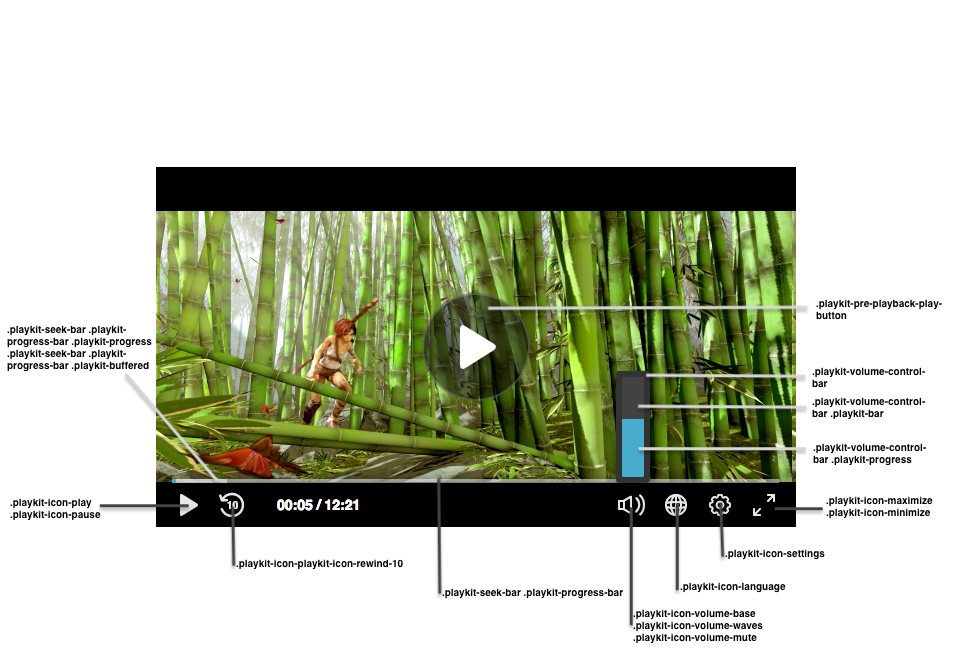
.playkit-pre-playback-play-button |
The background of the play button, before the Player begins playing |
.playkit-icon-play |
The Player icon, which is used in the bottom controllers and on the Player itself |
.playkit-icon-start-over |
Start-over icon, shown at the end of the video |
.playkit-control-button |
This is a class that's attached to all of the buttons in the control container, so a change here will affect all of the buttons. |
.playkit-icon-pause |
Pause icon |
.playkit-icon-playkit-icon-rewind-10 |
Rewind icon |
.playkit-icon-volume-base |
The left side of the volume icon |
.playkit-icon-volume-waves |
Shown when not on mute |
.playkit-icon-volume-mute |
Shown when the Player is muted |
.playkit-icon-language |
Languages selection icon |
.playkit-icon-settings |
Settings icon |
.playkit-icon-maximize |
Maximize icon |
.playkit-icon-minimize |
Minimize icon |
Volume and Seek Bar
| Class Name | Description |
|---|---|
.playkit-volume-control-bar |
Placeholder for the volume level, use transform: rotate(90deg); for a horizontal volume bar. See Demo for usage example. |
.playkit-volume-control-bar .playkit-bar |
The level background |
.playkit-volume-control-bar .playkit-progress |
Indicates the audio level |
.playkit-seek-bar |
Placeholder for the Player seek bar |
.playkit-seek-bar .playkit-progress-bar |
Placeholder for the actual progress bar |
.playkit-seek-bar .playkit-progress-bar .playkit-progress |
Indicates the progress of the video/audio |
.playkit-seek-bar .playkit-progress-bar .playkit-progress .playkit-scrubber |
Indicates the end of the progress bar. When hovering over the seek bar, it will indicate the current position of the mouse on the seek bar |
.playkit-seek-bar .playkit-progress-bar .playkit-virtual-progress |
When hovering and seeking to a future part of the media, this will show the progress until this point |
.playkit-seek-bar .playkit-progress-bar .playkit-time-preview |
When hovering on the seek bar, this will show the current mouse position time |
Overlays
| Class Name | Description |
|---|---|
.playkit-bottom-bar |
Placeholder of all the bottom controllers |
.playkit-overlay .playkit-overlay-contents |
Overlays container, for advanced captions settings (for example) |
.playkit-overlay .playkit-error-overlay |
Overlay that pops up when there's an error |
Spinner
| Class name | Description |
|---|---|
.playkit-spinner |
The spinner implementation, which consists of several span child elements that you can remove using: .playkit-spinner span{ display: none;} |
