Overview of the Universal Studio
The Universal Player Studio is a robust HTML based player editor. It supersedes the Studio Flash Player and natively edits the Kaltura Player Toolkit (v2) players' JSON based configuration. Kaltura Toolkit players can be embedded into responsive HTML web pages and native iOS and Android applications. For more information see Kaltura Player Toolkit.
Architecturally, the Kaltura Universal Studio Player works with non-destructive JSON editing that enables both manual edits of the JSON file as well as editing the JSON file with the player studio GUI. This guide is exclusively focused on the user interface. If you want to edit a player's JSON source directly, you can do so in the Kaltura Player Version Utility Page.
Designing and Configuring a Player
When upgrading a player that was created in the Flash Studio, be sure to duplicate the player. Not all of the Flash features are directly supported in the Universal Studio players, and unexpected results may occur.
Use the Universal Studio tab in the KMC to create configurations and design players and playlists. You can add, remove and adjust multiple buttons and features, and design a player to match the look of your site.
Updating the Player List in the Universal Studio
The Universal Studio tab displays the complete list of the players defined in your account. To edit any player in the Universal Studio, the player must be updated to the new Universal Studio Players. This includes any players previously created via API and even early versions of v2 players.
All players created using the previous KMC Studio are automatically available to be upgraded in the new Universal Studio.
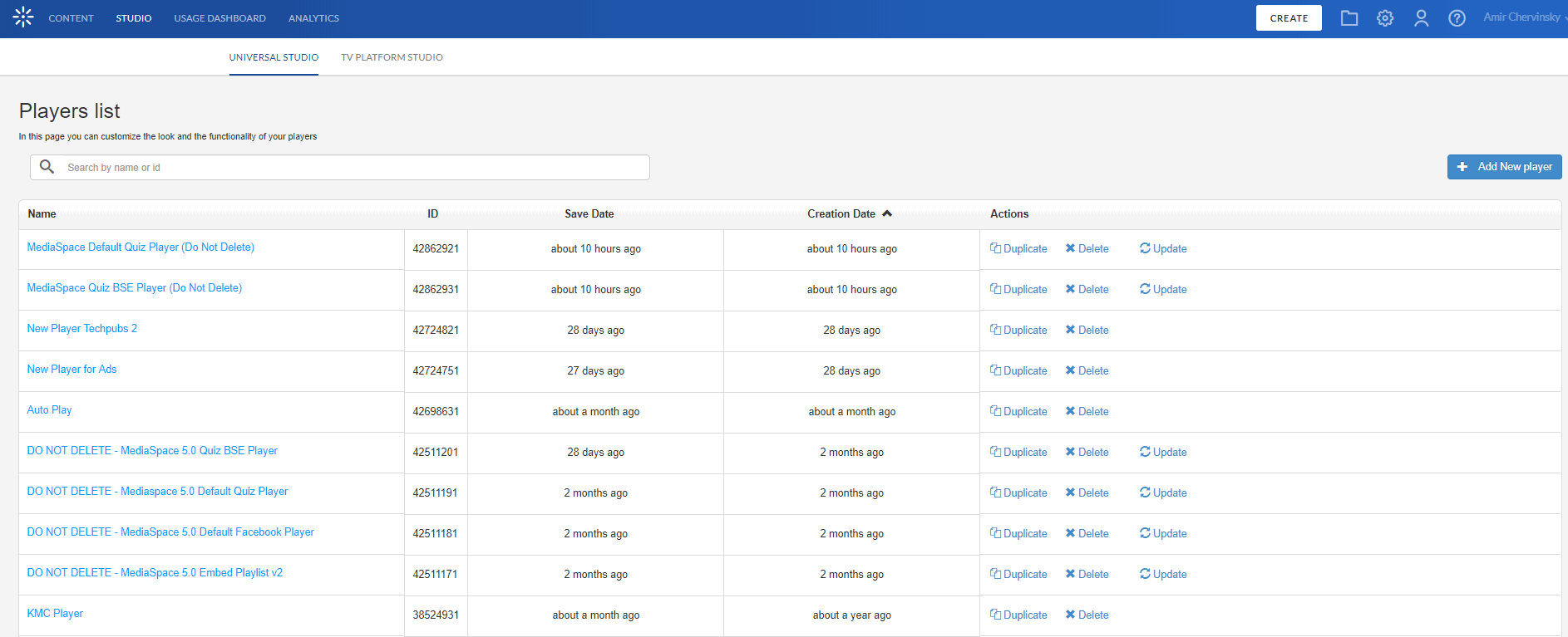
To update the players
- Select the Studio tab and then click Universal Studio.
The list of existing players is displayed. - Click Update to update the player to the Universal Studio player.
An Update request box is displayed.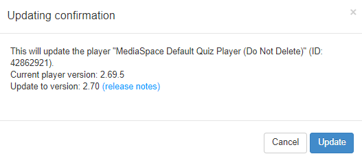
- Click Update.
An update confirmation box is displayed.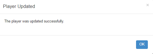
- Click OK.
- Begin to configure the Universal Studio player settings.


Universal Studio Icons
The Universal Studio icons represent the following configuration options:
|
Icon |
Name |
Description |
|
|
Search icon. |
Use this section to search for configurable properties across all player plugins. Opens the Menu Search window. |
|
|
Basic Display icon |
Use this section to set the player name, entry and aspect ratio. Opens the Basic Display window. |
|
|
Look and Feel icon |
Use this section to adjust the visual appearance of the player. Opens the Look and Feel window. |
|
|
Analytics icon |
Use this section to configure analytics via the Kaltura platform as well as via 3rd party analytics providers. Opens the Analytics window. |
|
|
Use this section to configure content monetization plugins. Opens the Monetization window. | |
|
|
Plugins icon |
Use this section to configure additional plugins. Opens the Plugins window. |
Search
Use the drop down to search for similar configurable properties across all player plugins.

Creating a Player in the Universal Studio
Each player contains a collection of features of a specific Kaltura Player configuration. In addition to the Kaltura defined features, a player can include a custom plugin configuration.
To create a player
- Select the Universal Studio tab.
- Click Add New player.
The Basic Display window is displayed.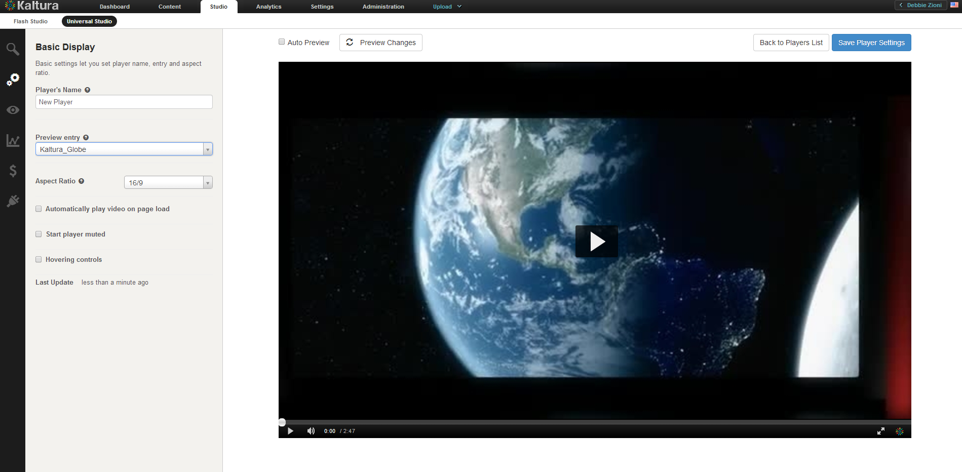
- Configure the Basic settings.
- Configure the Universal Studio Player Look and Feel Features.
- Configure the Analytics. (Optional)
- Configure the Monetization. (Optional)
- Configure the Plugins (Optional)
- Click Save Player Settings.

Basic Display
Use the Basic Settings to set the player name, entry and aspect ratio.
Enter the following information:
|
Field |
Description |
Values |
|
Player's Name |
Enter an informative Player Name (required). |
|
|
Preview entry / playlist |
Choose an entry/playlist to preview using the player. Some features may be dependent for specific entries. |
A list of entries/playlists for your account.The Playlist plugin can be found in the 'Look and Feel' section. |
|
Player Dimensions |
The default player size is 560 px by 395 px. Use this option to create a custom player size that is constrained to the selected aspect ratio. |
When you select an aspect ratio, the height is automatically calculated according to the selected aspect ratio. You can select Custom from the drop down menu and enter the custom width, the height is derived automatically. |
|
Update Version Automatically |
Automatically update this player when a new player version is available. | |
|
Enable mobile skin |
Use this option to enable the new, touch friendly player design for mobile devices. Note that enabling the new skin will override any existing custom CSS. |
See Using the Kaltura V2 Player Mobile Skin for more information. |
|
Automatically play video on page load |
If the player should automatically start playback. |
True or false |
|
Start player muted |
|
|
|
Hovering Controls |
|
|

Editing a Player
All changes you make to an existing player will propagate to all sites where the player has been embedded, including syndicated players on other sites.
- Select the Universal Studio tab.
- Click on the relevant player in the Player List.
- Select an icon to modify the current player configuration.
- Click Save Player Settings.
Duplicating a Player
- Select the Universal Studio tab.
- Click on the relevant player in the Player List.
- Click Duplicate.
The player configuration Basic Configuration window is displayed and the player is rendered as a copy of the existing player. - Modify the player's Basic Display settings to give the new player a distinct name
- Click Save Player Settings.
Deleting a Player
Deleting a player eliminates it from all the locations where the player has been previously embedded. For example, if you have embedded a player using this design on your site or an external site, after you delete it from the Player List, the player will no longer appear and a blank area is displayed on the website.
- Select the Universal Studio tab.
- In the Actions column of the relevant player, click Delete.
A Delete confirmation prompt is displayed. - Confirm the deletion.
508 Compliancy
All Universal Studio players are 508 compliant. The player's features include:
- Support for captions file in timed text or SRT formats for the video/audio file
- Support for an audio description in a standardized format for the video/audio file
- Hidden text elements for every non-text element (for screen readers)
- Tooltips
- Keyboard tabbing and controls
For more information see 508 Support within the Kaltura Player Toolkit.
CVAA Compliancy
All Universal Studio players are CVAA compliant. The player's features include:
- Studio support - Enable options menu
- Captions types: XML, SRT/DFXP, VTT(outband)
- Displaying and changing fonts in 64 color combinations using eight standard caption colors currently required for television sets.
- Adjusting character opacity
- Ability to adjust caption background in eight specified colors.
- Ability to adjust character edge (i.e., non, raised, depressed, uniform or drop shadow).
- Ability to adjust caption window color and opacity.
- Support for displaying multiple language tracks and simplified or reduced captions.
- Ability to preview setting changes, have display setting remembered between viewings and turn captions on or off as easily as muting or adjusting the volume.
- Capability of displaying various caption formats (i.e., pop-on, roll-up and paint-on)
All captions configuration options must be set prior to beginning playback. Caption settings are put into the player when it is setup.
For more information about the closed captions editor see Closed Captions.
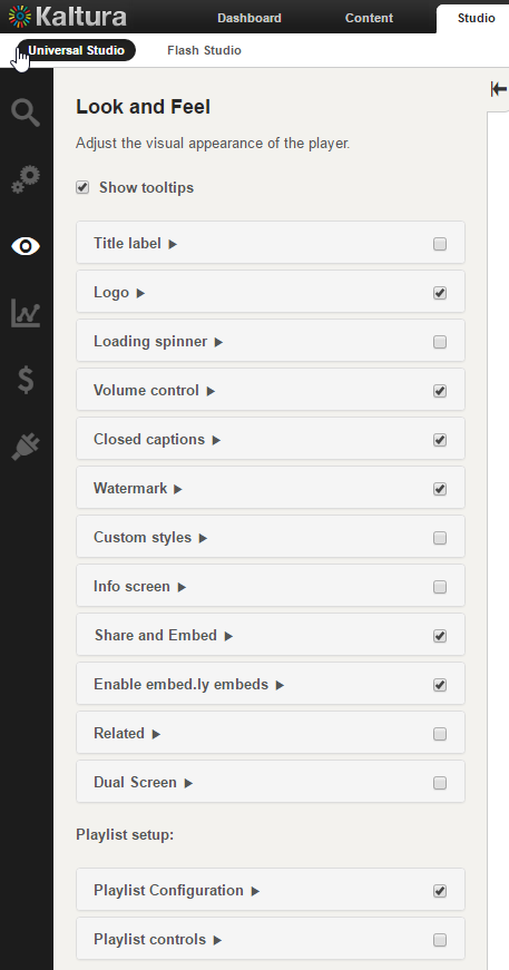
Configuring the Player's Look and Feel
The Look and Feel tab is made up of different sections, controlling the various features of the player.
Use the options in this window to select the features (buttons, layers and modules) to be included in your player. As you select your features from the list, you can preview the changes in real time in the preview pane on the right.
Universal Studio - Player Look and Feel Features
The look and feel features include configurable features (buttons, layers and modules) available for the Universal Studio Player. Checking the box next to any feature allows you to preview it in the Preview Pane. Most of the features have in-depth configuration options.
- Displaying/Hiding Tooltips – Use to enable or disable tooltips display.
- Title Label- Use to set the title text within the hover.
- Logo – Use to load the image URL.
- Loading Spinner – Use to set the Loading Spinner.
- Volume Control- Use to control the player volume using mute/unmute buttons and a volume slider.
- Closed Captions- Use to set up closed captions and the caption display. Kaltura includes multi-lingual closed captions support that comply with FCC regulations.
- Watermark- The Kaltura watermark plugin.
- Custom Styles– Modify the theme CSS style.
- Info screen - Add Information screen about the video.
- Shareand Embed - Add the Share and embed interface to the player.
- Enable embed.ly embeds - Enable embed.ly sharing of the Kaltura player.
- Embedding a Playlist - Embed a playlist with an HTML5 player.
-
Related - Add the Related Videos screen at the end of the video to attract users to watch additional videos.
- Dual Screen - Provides you with multiple interactive viewing options.
- Playlist Setup - Use to configure and setup a playlist.
- Select the Universal Studio tab and then select a player.
- Select the Look and Feel icon.
- Click on the feature to configure.

Displaying/Hiding Tooltips
Many of the player's features include tooltips, a small pop-up window that appears when a user pauses the mouse pointer over an element, such as over a button
- Select the Universal Studio tab and select the Look and Feel icon.
- Check the box next to Show tooltips to enable this option. Uncheck the box to disable the tooltips display.
Title Label
Use the Title label to set the location and text of the title label.

- Select the Universal Studio tab and select the Look and Feel icon.
- Check the box next to Title label to enable this option.
- Select the alignment location from the drop down menu.
- Enter the Text for the label. The default is the mediaProxy entry name. (That is the original name you gave to the content when you uploaded it to the KMC.)
- Click Apply Changes to preview your modifications.
- Click Save Player Settings.
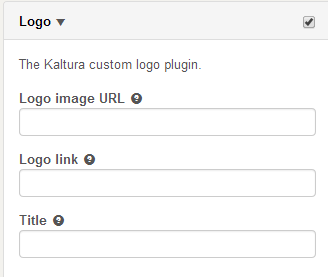
Logo
Use the Logo label to set the custom logo plugin.
- Select the Universal Studio tab and select the Look and Feel icon.
- Check the box next to the Logo label to enable this option.
- Enter the Logo image URL. The logo image URL can be obtained by right-clicking on an image and selecting "Copy image address".
- Enter the Logo link. The logo link is the website address that is being referred to upon clicking on the logo image.
- Enter a Title. The logo title will be displayed when hovering over the logo image.
- Click Preview changes to preview your modifications.
- Click Save Player Settings.
Loading Spinner
Use the Loading spinner options to customize the look of the loading spinner.
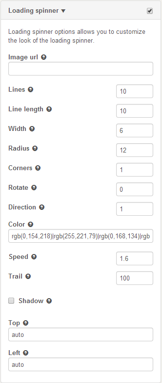
- Select the Universal Studio tab and select the Look and Feel icon.
- Check the box next to Loading Spinner to enable this option.
- Enter the image URL.
- Enter the Logo link.
- Set the parameters.
- Click Preview changes to preview your modifications.
- Click Save Player Settings.
Volume Control
Use the Volume Control option to control the player volume using mute/unmute buttons and a volume slider.

- Select the Universal Studio tab and select the Look and Feel icon.
- Check the box next to Volume Control to enable this option.
- Check Show slider to display the column slider.
- Check Accessible controls to enable them.
- Select the accessible volume change value from the drop down.
- Click Preview changes to preview your modifications.
- Click Save Player Settings.
Closed Captions
Use the Closed Captions option to set up closed captions support and the caption display.
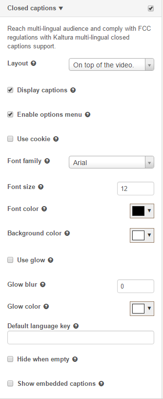
- Select the Universal Studio tab and select the Look and Feel icon.
- Check the box next to Closed Captions to enable this option.
- Select the layout (location on the video) from the drop down menu.
- Modify other closed captions' options as required.
- Click Apply Changes to preview your modifications.
- Click Save Player Settings.
- Select the Universal Studio tab and select the Look and Feel icon.
- Check the box next to Closed Captions to enable this option.
- Check the Enable Options Menu box to enable the captions styling menu.
- Click Preview Changes. The Options menu in the Closed Captions popup menu is displayed.
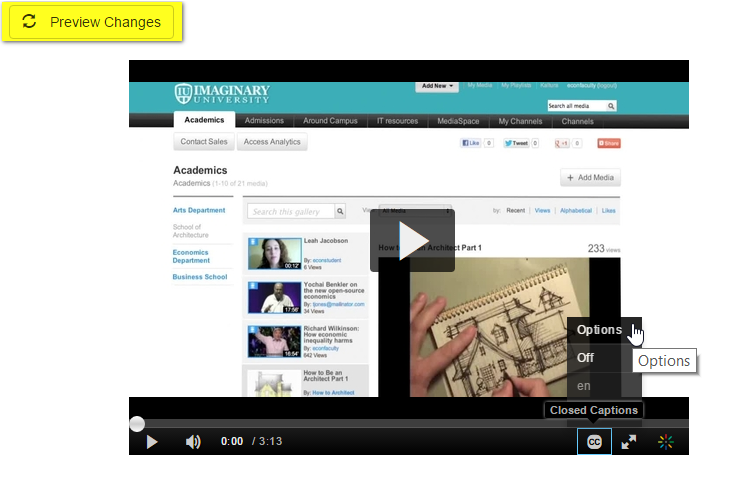
- Click Options to display the caption styling editor.
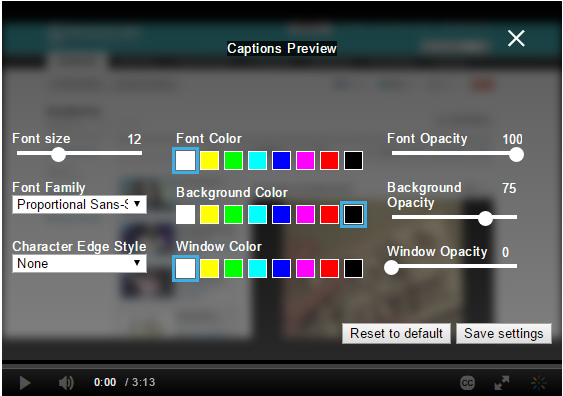
- Select your caption display preferences using the scrolls and menus and click Save Settings.
The video player renders the captions with the configured settings.


Add or Modify the Watermark
Use the Watermark option to set the watermark image and location of the watermark.
- Select the Universal Studio tab and select the Look and Feel icon.
- Check the box next to Watermark to enable this option.
- Select the position of the watermark location from the drop down menu.
- Enter the watermark image URL.
- Enter the Click URL.
- Select the Padding CSS to determine the padding from the edge of the play screen. Enter the value in pixels.
- Click Preview changes to preview your modifications.
- Click Save Player Settings.
Create and Modify Custom Styles
Use the Custom Styles option to modify CSS styles.

- Select the Universal Studio tab and select the Look and Feel icon.
- Check the box next to Custom Styles to enable this option.
- Modify the parameters.
- Click Preview changes to preview your modifications.
- Click Save Player Settings.
Info Screen
Use to add information screen about the video.

- Select the Universal Studio tab and select the Look and Feel icon.
- Check the box next to Info screen to enable this option.
- Modify the parameters.
- Click Preview changes to preview your modifications.
- Click Save Player Settings.
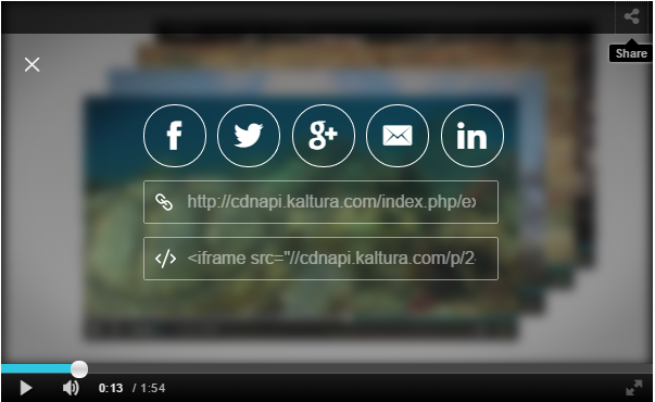
Share and Embed
Use the Share and Embed feature to add the Share and Embed interface to the player and to share and embed a video in social websites and email.
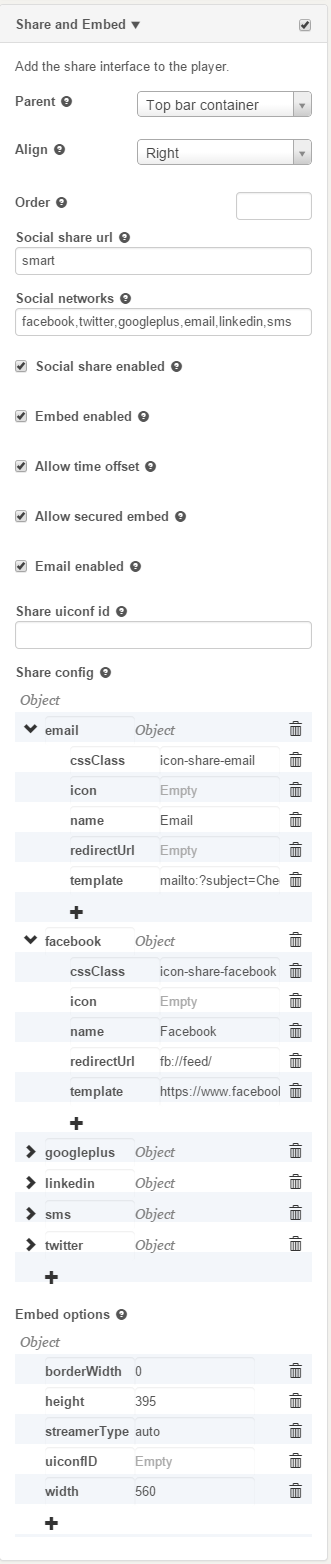
Share and Embed Configuration Fields
Use the fields to configure the Share and Embed interface to the player.
|
Field |
Description |
| Parent |
Parent container for component. Components include default placement, leave as null if unsure. |
|
Align |
Alignment for component, can be left or right. |
|
Order |
Draw order of the component within the container. Together with alignment, determines component placement of the component. Order is set with respect to siblings on the parent container. |
|
Social Share URL |
Allows you to define the URL shared for this player:
|
|
Social Networks |
Define included networks, separated by commas.Networks currently supported: facebook,twitter,googleplus,email,linkedin,sms |
|
Social Share Enabled |
Display Share link. True or False. |
|
Embed Enabled |
Display Embed code. |
|
Allow Time Offset |
Allow setting a time offset for the entry. |
|
Allow Secured Embed |
Display secured embed option. |
|
Email Enabled |
Display Email in the share options. |
|
Share uiconf ID |
Specify a UIConf ID for the shared link. Leave empty to use the current UIConf. |
|
Share Config |
Configuration options for all share networks. Use these fields to define each social network's icon, tooltips and template. |
|
Embed options |
Embed code configuration options. borderWidth - Enter the embed frame border wdth in pixels. height - Enter the video frame height streamerType - Select a Kaltura video delivery streaming type. uiconfID - Use to define a specific uiconf ID for the embedded video. Leave this field emplty to use the current player's uiconfID. width - Enter the video frame width. |
- Select the Universal Studio tab and select a player to edit or create a new one.
- Select the Look and Feel icon.
- Check the box next to Share and Embed feature to enable this option.
- Select the parent (where the Share and Embed button should be placed) from the drop down menu.
- Use the table to configure the fields.
- Click Preview changes to preview your modifications.
- Click Save Player Settings.
Using the Share Button
After you configured the Share and Embed option in your player you can use the links provided in the player to embed your video.
- Click on the Share icon. The location of the icon depends on your configuration.
The following share and embed window is displayed on the player.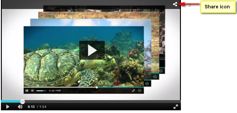
- Click on the social media or email icon to open the relevant social media windows or email for sharing.
- For additional embed code and JSON configuration information see the Share Plugin API.

Enable embed.ly embeds
Embedding a Playlist with an HTML5 Player
Related Videos
Use this option to add the related videos screen at the end of the video to attract users to watch additional videos.

- Select the Universal Studio tab and select the Look and Feel icon.
- Check the box next to Related feature to enable this option.
- Select the parent (where the Related Videos button should be placed) from the drop down menu.
- Select the alignment location.
- Enter the Order where the icon should be displayed.
- Enter the Related Entries Source to select data the source for the related videos.
The options are:- Related to Entry – the server side determines which entries are related to the entry using the system logic. Entries related to the current entry are displayed. If there are no related entries, the plugin is disabled.
- Playlist ID – select from the dropdown for available playlists.
- Entries List – enter a comma delimited list of entries.
- Enter the configuration settings.
- Click URL – Enter the URL to click on to get to the related items. If this field is left blank, clicking will replace the current video with a new one. For example:
- Auto continue time – Enter the number of seconds for auto play.
- Items limit – Enter the maximum number of items to show on the related screen.
- Display on playback done- display related screen automatically when playback is done.
- Auto continue enabled – should the next item automatically play.
- Store session – store the played entries across the page views in the related clips display.
- Click Preview changes to preview your modifications.
- Click Save Player Settings.
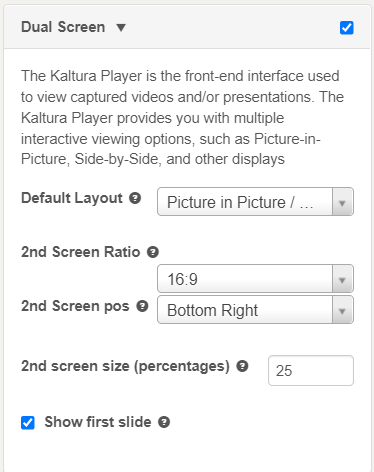
Dual Screen
The Kaltura Player is the front-end interface used to view captured videos and/or presentations. The Kaltura Player provides you with multiple interactive viewing options, such as Picture-in-Picture, Side-by-Side, and other displays. Select one of the display options from the drop down menu as your display preference.
Playlist Setup
Use the Playlist setup options to configure the playlist's settings and configure the playlist controls. You can set a playlist Preview id in the Basic Settings.
Playlist Configuration
The Kaltura playlist plugin supports associating multiple clips in sequence.
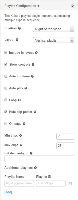
- Select the Universal Studio tab and select the Look and Feel icon.
- Check the box next to the Playlist Configuration feature to enable this option.
- Select the position where the playlist should display. The options are to the right, left, above or beneath the video.
- Select the layout, vertical or horizontal.
- Enable the playlist features by checking the relevant boxes.
- Check On (Publisher's) Page to display the playlist on the publisher's page. If unchecked, the playlist is displayed on the player's iFrame. (Recommended)
- Enter the minimum amount of clips of display. The number represents the minimum number of clips to show in the playlist without scrolling.If the playlist has fewer entries than the specified Min Clips value, all the clips in the playlist are displayed.If the MinClips value specified prevents optimal viewing, (may cover the video or shrink the player display) - the Min clips value for display are determined to provide optimal video viewing.
- Enter the initial entry ID that should be played first. In the Init item entry id.
- Enter the Playlist Name and the Playlist ID.
- Click Add.
Playlist Controls
Use to configure the Next and Previous buttons on the playlist.
- Select the Universal Studio tab and select the Look and Feel icon.
- Check the box next to the Playlist Controls feature to enable this option.
- Select where you want to display the Next and Previous buttons. The choice are the Top bar container or the Controls container. Leave this field empty if you are uncertain where you want these buttons displayed.
Configuring the Player's Analytics
Kaltura supports robust analytics via the Kaltura platform as well as via 3rd party analytics providers.
The following Analytics options are supported:
- Akamai Media Analytics - Supports sending player analytics events to Akamai.
- Google Analytics- Supports sending player analytics events to Google.
For full implementation guide see Google Analytics in the Knowledge Center. - comScore - Supports sending player analytics events to comScore
- Nielsen Combined- Supports sending player analytics events to Nielsen Combined
- Omniture on page-The Omniture s_code config version of the plugin allows you to connect the Omniture plugin to your existing s_code.js configuration for easy integration of video analytics into an Omniture site.
- Kaltura Analytics/Statistics - Use Kaltura analytics to track Kaltura player events. Statistics are enabled by default. Configuration consists of adding additional tracking info.
- Youbora Analytics - The Youbora plugin listens and reports all the different player states in the current video session to Youbora Analytics.
- Select the Universal Studio tab and then select or create a player.
- Select the Analytics icon.
- Check the Analytics option you want to configure.
- Enter the relevant parameters for the chosen option.
- Click Save Player Options.
Akamai Media Analytics
Akamai Media Analytics are designed to provide consistent and accurate data about the playback and quality your audience is experiencing on any device.
| Field | Attribute | Value | Description |
| Configuration XML path | configPath | http://ma193-r.analytics.edgesuite.net/config/beacon-3431.xml | URL for Akamai's configuration XML. |
| Media Analytics SWF path | swfPath | http://79423.analytics.edgesuite.net/csma/plugin/csma.swf | URL for Akamai Media Analytics SWF. |
| Track event monitor | trackEventMonitor | trackAkamaiAnalyticsEvent | Track Akamai media analytics events with a named callback. |
| Player id | playerId | null | Override the default value for the playerId field, By default it is the uiconf_id. |
| Title | title | null | Override the default value for the title field. By default it is the entry title. |
| Category | category | null | Override the default value for the category field, By default it is the media type. For example, image, video, audio. |
| Sub Category | subCategory | null | Override the default value for the subCategory field. The default value is null. This field can be used for additional segmentation. |
| Event Name | eventName | null | Override the default value for the eventName field, custom set by event |
Google Analytics
| Field | Attribute | Value | Description |
| Google urchin code | urchinCode | The Google urchin code i.e. UA-30149691-1 | |
| Event monitor function name | customEvent | doPlay | Function called on parent page for every event. |
| Custom events list | doPlayCategory | My Custom event | Comma separated list of events you want to track. |
| Category for event | Category sent to Google Analytics for prefixed event. | ||
| Action for event | doPlayAction | player is playing | Action sent to Google Analytics for prefixed event. |
| Value for event | doPlayValue | 1 | Value sent to Google Analytics for prefixed event |
comScore
Nielsen Combined
| Field | Attribute | Sample Value | Description |
| Client ID | clientId | us-502202 | The client ID. |
| Video IS | vcid | c15 | The video ID. |
| Title tag | tag_title | {mediaProxy.entry.name} | The title tag. |
| Category Tag | tag_category | {mediaProxy.entry.categories} | The category tag. |
| Sub-category tag | tag_subcategory | {mediaProxy.entryMetadata.subcategories} | The subcategory tag. |
| Census Category tag | tag_censuscategory | {mediaProxy.entry.censuscategories} | The census category tag. |
| Thumbnail URL tag | tag_imgurl | {mediaProxy.entry.thumbnailUrl} | The thumbnail URL tag. |
| Event Function name | trackEventMonitor | trackEvent | Function called on parent page for every event. |
| clientId | us-502202 | The client ID. | |
| vcid | c15 | The video ID. |
Omniture on Page
The Omniture s_code config version of the plugin allows you to connect the Omniture plugin to your existing s_code.js configuration for easy integration of video analytics into an Omniture site.
Please note Omniture SiteCatalyst is now Adobe Analytics.
| Field | Value | Description |
| Code URL | The URL to the Ominture generated sCode file. If null, a local copy of s_code.js is used. Must be set in uiConf not via flashvar | |
| Entry code name | . "s' by default. | The name of the s_code entry point in the global window scope. ("s" by default ). |
| Monitor event tracking interval | Set to an interval (in seconds) for tracking the Omniture 'monitor' event. | |
| Omniture events function name | A global callback function for logging Omniture events. | |
| Media name concatentation rules | Default should be left null. | A per partner key for special media name concatenation rules. By default this parameter should be left null. |
| Kaltura player events | A comma separated list of Kaltura events you want to track. | |
| Omniture variables and properties | Acomma separated list of Omniture evars and props, you wish to pass along with every media event. | |
| Kaltura values | A comma separated list of Kaltura values to pass along with every media event. Values will correspond to the evars and props comma separated map defined in the "Omniture variables and properties" field. |
Kaltura Analytics - Statistics
| Field | Attribute | Value | Description |
| Track Event Monitor | trackEventMonitor | kalturaSendAnalyticEvent | Enables you to audit Kaltura events with a named callback function. |
Youbora Analytics
Youbora Real Time Analytics & Monitoring uses a plugin on every player on every device of every user to track and monitor all information relevant to every view (real time for VoD and live video).
For additional information on Youbora Analytics see the Youbora Player Plugin Setup and Information Guide on the Knowledge Center.
| Field | Attribute | Value | Description |
| userId | string | The Youbora user ID of the current user. | |
| bufferUnderrunThreshold | number | The default is 1000. | The minimum buffering time (in milliseconds) required to trigger the buffer under-run beacon. |
| Track Event Monitor | trackEventMonitor | kalturaSendAnalyticEvent | Enables you to audit Kaltura events with a named callback function. |
Monetization - Configuring the Player Advertising Settings
The Kaltura platform supports VAST 3.0 as well as 3rd party ad plugins to facilitate content monetization.
The following monetization options are available:
- Select the Universal Studio tab and then select or create a player.
- Select the Monetization icon.
- Configure the VAST 3.0 or third party plugin advertising settings.
- Save your changes.
Bumpers
Bumpers are videos that act as ads and do not use an ad server. Bumper videos uploaded to Kaltura can be inserted before or after a video, to function as pre-rolls or post-rolls.Bumper videos are associated with a player, and not associated with a specific video.Bumper videos are independent of actual pre/post-rolls and can be played in addition to ads. Bumper videos are helpful for Kaltura partners that would like to advertise their logo, or other information, before or after a video, and for smaller partners that would like to advertise, but do not need advanced tracking tools that ad servers provide.
| Field | Description |
| Bumper Entry Id | The Entry Id of the bumper to be played. |
| Click URL | The URL to open when the user clicks the bumper video |
| Pre Sequence index | The pre-sequence number for sequencing the bumper before or after ads before content. For example can be set to 0 and set an add pre-sequence index to 1, to have the bumper play then the ad. |
| Post Sequence index | The post-sequence number for sequencing the bumper after the content. |
VAST
VAST, (Video Ad Serving Template), includes a standard XML-based ad response for in-stream video as well as an XML Schema Definition ("XSD") for developers. It is meant to accommodate the majority of current practices within the online digital video advertising business.
(http://www.iab.net/iab_products_and_industry_services/508676/compliance/679253 )
VAST Support
Here is a list of some of the largest video ad servers/networks that are VAST-compliant:
http://www.iab.net/iab_products_and_industry_services/508676/compliance/679253 .
VPAID Support
Kaltura's plugin for VAST supports VPAID ads.
VAST Configuration Parameters
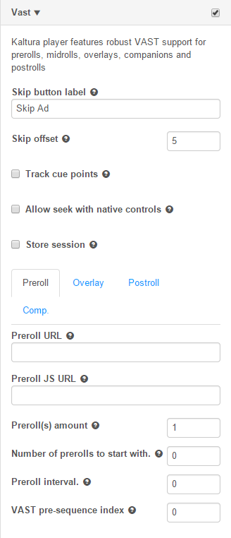
Kaltura player features robust VAST support for prerolls, midrolls, overlays, companions and postrolls.
|
Field |
Description |
|
Skip button label |
Skip button label, for example "Skip Ad" |
|
Skip offset |
The time in seconds before the skip ad link is activated. |
|
Track cue points |
Check if entry cue points should be tracked |
|
Allow seek with native controls |
Allow to catch seek requests during ad and return the player to the original play time. |
|
Store session |
If the frequency playback should be stored across player reloads. By default, only playlists repect frequency intervals. If set to true, the preroll interval is repected across player views. |
|
Preroll URL |
The VAST ad tag XML URL for the preroll ad. For midroll ad requests. |
|
Preroll JS URL |
The VAST tag URL used where platform does not support Flash. If undefined, all platforms use the base preroll URL for ad requests. |
|
Preroll tab | |
|
Preroll(s) amount |
The number of prerolls to be played. |
|
Number of prerolls to start with |
How many prerolls to start with |
|
Preroll interval |
How often to show prerolls |
|
VAST pre-sequence index |
Allows for sequencing the vast ad within the pre-sequence. 1 for ads then 2 for a bumper plugin, would result in an ad and then a bumper |
|
Overlay tab | |
|
Overlay start time |
Start time in seconds for overlay |
|
Overlay interval |
How often should the overlay be displayed |
|
Overlay URL |
The VAST xml overlay ad xml. |
|
Timeout |
The time out in seconds, for displaying an overlay VAST ad. |
|
Postroll tab | |
|
Postroll URL |
The VAST ad tag XML URL for the postroll ad. |
|
Postroll JS URL |
The VAST tag URL used where platform does not support Flash. If undefined, all platforms use the base postroll URL for ad requests. |
|
Postroll(s) amount |
The number of postrolls to be played. |
|
Number of postrolls to start with |
How many posttolls to start with |
|
Postroll interval |
How often to show postrolls |
|
VAST post-sequence index |
Allows for sequencing the vast ad within the post-sequence |
DoubleClick
DoubleClick for Publishers (DFP) Video provides publishers with a platform to increase revenue from video advertising as well as manage costs. Fully integrated with DFP, publishers can manage their entire display advertising through one platform, with video at its core. Learn more about DFP video solutions.
|
Field |
Description |
|
Pause ad on clicked |
When checked, the ad pauses when the user clicks on it. |
|
Lead with Flash |
Check if the Flash based DFP runtime should be used where Flash is available. |
|
Content Id |
The contentId, used by DoubleClick plugin API, generally the entry ID, but can also be custom metadata mapping |
|
Custom params |
Custom parameters passed to the DoubleClick adTag URL. Should be listed as URL parameters key=value&key2=value2 pairs. |
|
CMS id |
Appended to the VAST URL, used by the DoubleClick plugin API |
|
HTML Companions |
Companions list. For each companion, please specify the ad container div ID and the expected ad width and height. Use the add link to open new DivID fields. |
|
DFP Trafficking tab |
DFP Trafficking – uses the Google DFP ad server. If you use this platform the DFP ad Tag is created |
|
Ad tag URL |
The DoubleClick DFP VAST ad tag URL (can include multiple nested VAST URLs) (see Integrating Kaltura with a VAST adTag URL Enter the ad Tag URL in this field. |
|
VAST Trafficking tab |
VAST Trafficking – uses regular VAST ad tags. You can specify your ad tags as a pre roll or post roll. |
|
Track cue points |
Searches for cue points at the entry level. If you define a VAST cue point in your entry, it is triggered when this check box is checked. |
|
Preroll URL |
The pre-roll VAST ad Tag XML URL. |
|
Postroll URL |
The post-roll VAST ad Tag XMLURL. |
|
Timeout |
The timeout in seconds for displaying an overlay VAST ad. The timeout is used for over lays. If you are using an overlay VAST tag, the ad will displayed as an overlay (on top) of the video. The timeout value entered represents the number of seconds the overlay VAST ad is displayed after which the ad will automatically be removed. |
FreeWheel
FreeWheel gives enterprise-level media companies the infrastructure they need to create scaled, profitable content businesses in the new media landscape. Learn more about FreeWheel offerings. Kaltura supports a full featured FreeWheel ad network integration for both HTML5 and Flash players.
| Field | Description |
| Ad manager SWF URL | The FreeWheel ad manager SWF URL. |
| Ad manager JavaScript URL | The FreeWheel ad manager JavaScript URL. Must be set in uiConf not via flashvar. |
| Ad server URL | The FreeWheel ad server |
| Network Id | The network ID property, for retrieving FreeWheel ads |
| Player Profile ID | The player profile ID for Flash, for identifying the Flash player. |
| Player HTML5 Profile Id | The player profile ID for HTML5, for identifying the HTML5 player |
| Site section Id | The site section ID used to segment ad retrieval per site section. |
| Use Kaltura Cue Points | If Kaltura cuePoints should be used for ad opportunities. |
| Video asset Id | Asset ID, for FreeWheel ad targeting. |
| Video asset fallback Id | Fallback asset ID, if the initial asset does not have targeting info. |
Skip Button
|
Field |
Value |
Description |
|
Skip button label |
|
Skip button label, for example "Skip Ad". |
|
Skip offset |
|
The time in seconds before the skip ad link is activated. |
Skip Notice
|
Field |
Value |
Description |
|
Skip notice text |
|
Skip notice text |
Notice Message
|
Field |
Value |
Description |
|
Skip notice text |
|
Skip notice text (can use evaluated expressions) |
Plugins
Use the Plugins tab to configure additional plugins.
The following plugins are available:
- Keyboard Shortcuts - Use to control the player using keyboard shortcuts
- Moderation - Allow your users to flag content as inappropriate.
- Playback Rate Selector - Enables users to select the video playback rate.
- Restrict User Agent - Allows you to block the player to specific user agents.
- Universal DRM - Kaltura Universal DRM enables multiple DRM engines to run within the Kaltura player based on the capabilities of the browser or packaged native applications.
- Source Selector - Enables users to select the video quality.
- Audio Selector - Enables users to select multiple audio tracks.
- Download - Enables users to add a download button to the player controls. The download button enables users to download the media to a local file.
- Strings - Use to over write player strings.
- Chromecast - Allows you to configure Chromecast support
- 360 and VR Videos - Allows you to configure 360 and VR videos or spherical videos
- Hotspots - Allows you to display hotspots annotations.
- Call To Action Buttons - Allows to configure call to action buttons
- UI Variables - Allows you to add UI variables to the player configuration.
Keyboard Shortcuts
Use the Keyboard Shortcuts option to control the player using keyboard shortcuts. See JavaScript key mappings for more information.
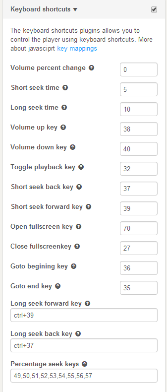
- Select the Universal Studio tab and select the Look and Feel icon.
- Check the box next to Keyboard Shortcuts to enable this option.
- If not otherwise indicated in the table, refer to the JavaScriptkey mappings to see the exact shortcut keys you will need to use.
- Enter values for the following parameters:
Name Description Volume Percent Change This parameter determines the interval of the Volume shortcuts listed below. The values here are: 0-1, .2 for example defines 5 steps of keyboard volume control. Short Seek Time This parameter determines the interval of the short seek time in seconds Long Seek Time This parameter determines the interval of thelong seek time in seconds Volume Up Key The arrow up key that increase the volume by one interval (as set in the Volume Percent Change) Volume Down Key The arrow down key that decreases the volume by one interval (as set in the Volume Percent Change) Toggle Playback Key The key that toggles playback Short Seek Back Key The back arrow key that seeks back according to the interval set in the Short Seek Time parameter Short Seek Forward Key The forward arrow key that seeks forward according to the interval set in the Short Seek Time parameter Open Full Screen Key Switches to full screen Close Full Screen Key Switches back from full screen Go to Beginning Key Goes to the beginning of of the video Go to End Key Goes to the end of the video Long Seek Forward Key Seeks forward in the content using the interval set in the Long Seek Time parameter. Use Ctrl+39. Long Seek Back Key Seeks back in the content using the interval set in the Long Seek Time parameter. Use Ctrl+37. Percentage Seek Keys Comma delimited list of keys used to seek to fixed percentages in the stream. - Click Apply Changes to preview your modifications.
- Click Save Player Settings.
Moderation
Use the Moderation option to allow users to moderate content and flag content as inappropriate.

- Select the Universal Studio tab and select the Look and Feel icon.
- Check the box next to Moderation to enable this option.
- Enter the following parameters:
Name Description Header Header text to show above the form Text Long description for the plugin Tooltip Button tooltip Reason:Sexual Content Indicates the reason for moderation: sexual content ReasonL Violent Content Indicates the reason for moderation: violent content Reason: Harmful Content Indicates the reason for moderation: harmful content Reason: Spam Indicates the reason for moderation: spam Minimum characters in description. 0 means no validation The minimum number of characters required for moderation; if 0, will not be validated - Click Apply Changes to preview your modifications.
- Click Save Player Settings.
Playback Rate Selector
- Select the Universal Studio tab and select the Plugins icon.
- Check the box next to the option and enter the default speed for the player.
- Enter the set of selectable speeds separated by commas, where 1 = 100% speed.
Restrict User Agent
Use to block the player to specific user agents. Use these settings for the player display only. For general purpose access controls, see entry level access controls.
- Select the Universal Studio tab and select the Plugins icon.
- Check the box next to the option.
- Enter the Restricted user agents. Enter a comma-separated list of browsers to search for.
- Enter the Restricted user agent title (error title).
- Enter the Restricted user agent message (error message).
Universal DRM
Kaltura Universal DRM enables multiple DRM engines to run within the Kaltura player based on the capabilities of the browser or packaged native application.
- Contact your Kaltura representative to request Universal modular DRM to be activated for your account.
- Enable Universal DRM on your player.
- Select the Universal Studio tab and select the Plugins icon,
- Check the box next to Universal DRM.
- Click Save Player Settings.
- Enable the DRM access control profile for entries you would like protected. See How to enable the DRM access control profile for entries you would like protected.
Source Selector
Use to select the video quality.

|
Name |
Description |
Values |
| Switch on resize | When the player changes size or goes into full screen the source will update per playback resolution. By default, the embed size is only taken into consideration at startup. | |
| Simple format | Use this format to restrict to two sources only per name size and not list content type. | |
| Display Mode | Set the type of information to display in the source selector's menu. | Size, Biit-rate, Size and Bit-rate. |
- Select the Universal Studio tab and select the Plugins icon.
- Check the box next to Source Selector.
- Set the parameters.
- Click Preview changes to preview your modifications.
- Click Save Player Settings.
Audio Selector
Use to enable multiple audio tracks.
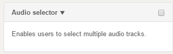
- Select the Universal Studio tab and select the Plugins icon.
- Check the box next to Audio Selector.
- Click Save Player Settings.
To learn more about Kaltura's MediaPrep capabilities for multiple audio track playback, see Using Multi Audio Tracks.
Download
Use to add a download button to the player controls. The download button enables users to download the media to a local file.
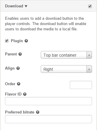
- Select the Universal Studio tab and select the Plugins icon.
- Check the box next to Download.
- Check Plugin to enable the Download plugin.
- Configure the parent container for the component.
- Configure the alignment.
- Set the order.
- Enter the Flavor ID for the downloaded movie source. When specified this flavour overrides any preferred bitrate settings.
- Set the Preferred bitrate. Leave empty for the highest bitrate. Set to zero for the original movie source file.
- Click Preview changes to preview your modifications.
- Click Save Player Settings.
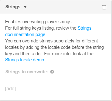
Strings
Use this option to overwrite player strings.
360 and VR Videos
Use this option to enable the 360 and VR video plugin on your player. For more information see the article about Kaltura 360 and VR Video Player Support.
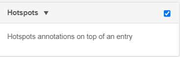
Hotspots
Use this option to display hotspots annotations on the player.
Chromecast Plugin Configuration
Use to enable the Chromecast plugin for your Player controls.
- Select the Universal Studio tab and select the Plugins icon.
- Check the box next to Chromecast.
- In the Parent field, select Controls container.
- If you are not using the default Kaltura Chromecast receiver, in the Application ID, provide the ID.
- Click Preview changes to preview your modifications.
- Click Save Player Settings.
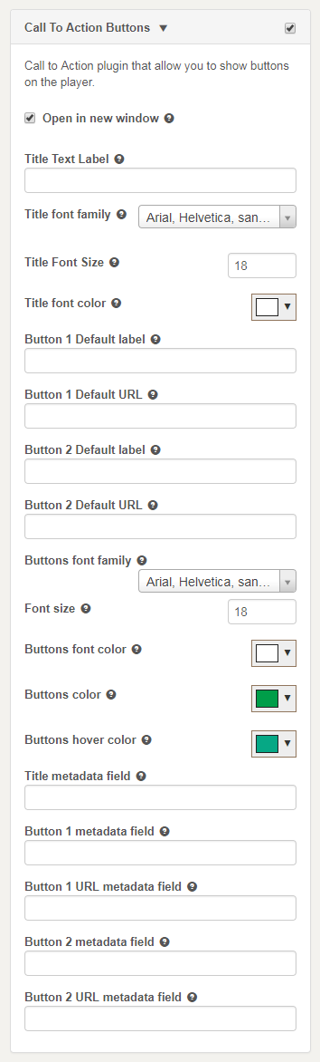
Call To Action Buttons
Use this option to enable call to action (CTA) buttons at the end of playback.
CTAs may include one or two buttons, and may appear with or without related videos, depending on whether the Related Videosplugin isenabled.
The following are examples of how a CTA button(s) may look on the player:


Note that much of the look and feel of the CTA buttons can be customized.
For advanced uses, the plugin can also take the CTA values from entry metadata.
Configurations:
The CTA includes the following configurations:
To configure the player CTA default buttons
- Select the Universal Studio tab and select the Plugins icon.
- Check the box next to Call To Action Buttons.
- Select whether the button links should open in the same window of the player or in a new window.
- Set the CTA Title text label.
- Set the first button label.
- Set the first button URL.
- Set the second button label (only if you want a second button).
- Set the secondbutton URL (only if you want a second button).
- Click Preview changes to preview your modifications (seek to the end of playback).
- Click Save Player Settings.
If no title label is defined, the CTA button/s will appear without it.
For a CTA button to appear, it has to have values in both the label and URL fields; if one is empty the CTA button will not be shown.
To customize the player CTA buttons look & feel
- Select the Universal Studio tab and select the Plugins icon.
- Check the box next to Call To Action Buttons.
- Select the CTA Title font family
- Set the CTA Titlefont size
- Select the CTA Titlefont color
- Select the CTA buttons font family
- Set the CTA buttons font size
- Select the CTA buttonsfont color
- Select the CTA buttonscolor
- Select the CTA buttons hovercolor
- Click Preview changes to preview your modifications (seek to the end of playback).
- Click Save Player Settings.
To have the buttons derived from entry metadata
Prerequisite: you must have a custom data profile defined in your account with metadata fields that can map to the relevant CTA buttons parameters
- Select the Universal Studio tab and select the Plugins icon.
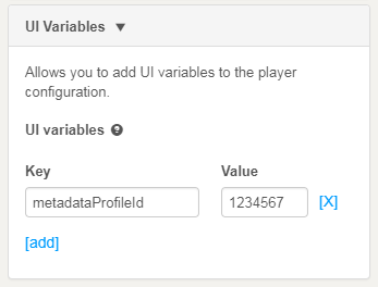
- Map the player to the correct custom metadata profile: Go to the UI Variables, and add the key: "metadataProfileId" with the value of the ID of the custom data profile:
- Enter the field systemname from the custom data profile of the value that should be used to override the default CTA title.
- Enter the field systemname from the custom data profile of the value that should be used to override the default CTA first button label.
- Enter the field systemname from the custom data profile of the value that should be used to override the default CTA first button URL.
- Enter the field system name from the custom data profile of the value that should be used to override the default CTA second button label (if applicable).
- Enter the field systemname from the custom data profile of the value that should be used to override the default CTA second button URL (if applicable).
- Click Preview changes to preview your modifications (seek to the end of playback). Note that since the differences are derived from entry metadata, make sure to use a preview entry with the appropriate metadata.
- Click Save Player Settings.

Note: When defined in the player, the entry metadata overrides the CTA defaults set on the player.This means, for example, that if the player default has no values in the buttons, but a specific entry metadata has values, the player will show CTA buttons for that entry, but not for another entry that does not have values in the relevant metadata fields.
Note: A player can be mapped to only one custom metadata profile. If any other player features or plugins utilize custom metadata profile, the CTA buttons metadata fields should be added to the custom metadata profile in use.
UI Variables
Use to add UI variables to the player configuration.

To simplify the management of many of the player features, Kaltura has implemented the "UIVars" to override and configure player features.
Kaltura UIVars are an incredibly powerful feature of the Kaltura Players which allow publishers to pre-set or override the value of any FlashVar (object level parameters), show, hide and disable existing UI element, add new plugins and UI elements to an existing player, and modify attributes of all the player's elements.
The most updated list of UIVars is here.
Create New Plugin
This option allows you to create a custom plugin configuration. For more information, contact Kaltura Customer Care.
Import Plugin
This option allows you to import a Kaltura player plugin using a one line string. For more information, contact Kaltura Customer Care.