About
The Category Analytics dashboard provides you with data on the category's usage in the platform. To learn more see the article on Category Analytics.
In this article, you can review:
- How to change the time frame for the dashboard
- How to compare between different time periods
- How to filter the data
- How to export reports to a CSV file
- How to filter the Category Page Views
The filters are automatically applied to all elements of the dashboard.
As a reference for analytics terms and definitions, please see the Kaltura analytics terminology article.
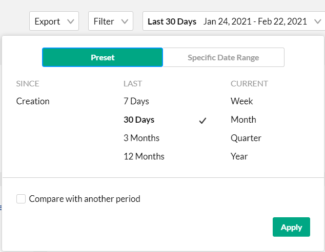
Change dashboard timeframe
Use the date picker at the top of the dashboard to change the timeframe and view data across different periods. You can select preset time periods or choose specific dates.
Preset time periods
Preset time periods are a quick way of looking at recent data, such as the last week or the last month. You can also select time periods such as current year or quarter.
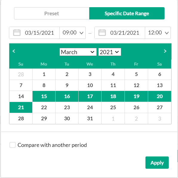
Selecting a custom timeframe
- Click on the date picker and choose the Specific Date Range tab.
- Navigate to the first date of the timeframe and click on the date in the calendar.
- Navigate to the last date of the timeframe and click on the date in the calendar. The timeframe will appear marked on the calendar.
- Select the hours filter to fine tune your filtering to specific hours. Note: if you want to select until midnight, please enter 23:59 as the hour.
- Click Apply to view the dashboard data for the selected custom time period.

Compare time periods
You can compare different time periods to better understand your data considering seasonality and changes in usage following adoption of new tools and capabilities. You can choose to compare between the same period last year or pick a specific date and compare the timeframe starting from this date. You can also use the hours filter to fine tune your analytics for specific hours.
To compare time periods
- Click on the date picker and choose the Specific Date Range tab.
- Select the first time period you would like to explore.
- Check the box to Compare with Another Period.
- Choose the second time period you would like to compare with:
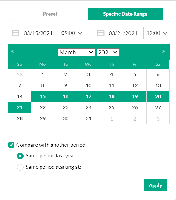

- Choose Same Period as Last Year to compare the exact same time period the year before. For example, if the first selected time period is March 15, 2021 to March 21, 2021, the comparison will be performed to the time period of March 15, 2020 to March 21, 2020.
- Choose Same Period Starting At to compare with a specific time period of the same duration. You may also select to filter the analytics for the hours for a specific time range. For example, if you would like to compare analytics for March to February, select the first selected time period as March 15, 2021 to March 21, 2021. Enter the hours specific hours you want to produce the analytics for. In the following screen, analytics for 9 AM to 12PM have been chosen for rendering. Then select the Same Period Starting At and mark the starting date as February 15, 2021. The comparison will be performed for the time period of February 15, 2021 to February 21, 2021.
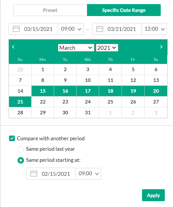
- Click Apply to view the dashboard data and compare the information from both periods.

To return to viewing a single time period
- Click on the Exit Compare Mode link next to the Date Picker.


You can filter the data in the dashboard based on additional dimensions such as the location, tags, categories and more.
To filter the dashboard data based on a specific parameter
- Click on the Filter option to open the Filters pane.
- Fill in the relevant filters you would like to use.
- Click Apply to show the filtered data in the dashboard.
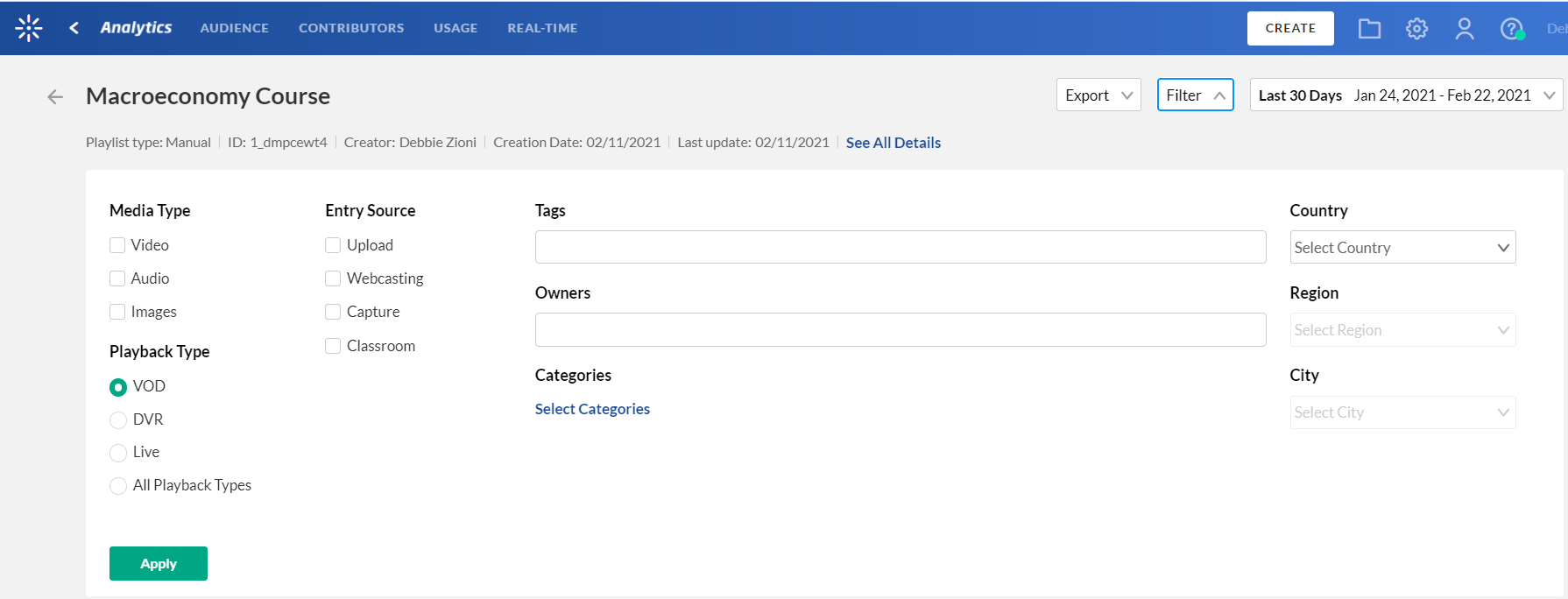

The filtering options are:
- Media Type(s) - video, Audio, and/or Images
- Playback Type
- Entry Source - the source of the content ingested to the system. Content can be uploaded, created via Kaltura's Capture Suite, live streamed, or created in many other ways.
- Tags - the tags on the content
- Owners
- Categories - click Select Categories to select from the list of categories.
- Country, Region City
Export to CSV
All analytics tabs have the option to export to a CSV.
- Click on Export. A drop-down list displays.
- From the drop-down list, select the data you would like to export. One or more options may be selected.
- Click to select the Descriptive Headers checkbox if you would like descriptive ("friendly" and meaningful) report header titles as part of the report, as opposed to system ("non-friendly") report header titles.
- Click Export Reports.
You receive notification that you are about to export and email the report(s) to yourself. - Click Export via email.
You receive an email with a link to download the file(s).
If the data in the report was filtered, the report is based on the filter applied. You will be notified that your export request is being processed and will be emailed to you when completed. Note that export is limited by 60,000 records and time to execute. If you receive an error, break down your report to smaller time frames or use filters to reduce the size of the report.
The file(s) emailed to you expire in 7 days.
Please see User engagement, Top videos, and Media engagement reports for definitions of each metric, along with its method of calculation.
Category Page Views filter
The Category Page Views filter shows the usability of content that may have been shared in other channels or courses. You can compare and filter the data for the category within and without the play context. Through the Category Page Views section you can see the content within the category that is viewed and then shared the most.
After you add an entry in Rich Media CMS or KMS analytics are collected from that point on. You can see the analytics for the entry through the analytics dashboard. However, only after the entry is added to a category, analytics for the entry are counted in the category analytics.
In KMS every play in your category is counted. If your entry is in a few categories, that play is counted multiple times. The Category Page Views filter provides a concise snap of the analytics for a selected category.
Users can watch an entry from a category, however, the media may appear somewhere else as an embed code. The media is still in the category (within context) but the playback is not played within the context of the channel.
For example, the following analytics shows that about half of the plays are within the context of the category, and the rest of the plays are out of context, perhaps viewed from links or embed code that was shared. This analytic is relevant to applications only.

The Category Page Views display plays a strong role in the LMS integrations where in most cases embeds are not allowed and the values should be for plays and viewers in context only,
If you do not have any applications, the numbers should be zero, since there are no plays within an application.
Using the Category Performance Over Time graph you can display the main category playback as compared to context playback.
To filter the Category Page Views click Filter. The analytics for the selected category is displayed.
The Highlights Section displays the following as related to the category you selected to view:
- Number of player impressions
- Number of plays - shown for the category as compared to the total amount of plays for this shared content in other categories
- Number of Unique Viewers
- Number of Minutes Viewed
You can also click on the Parent category to go up one level in the category hierarchy. The analytics display will then show the analytics for all the categories underneath the parent category.

