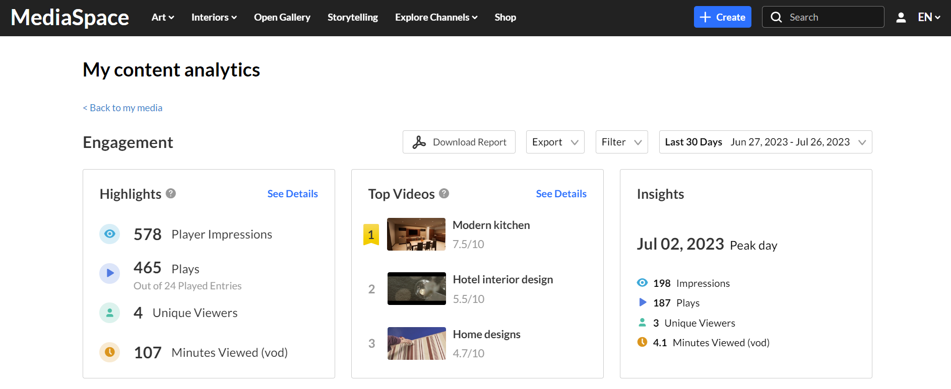
The My Analytics dashboard provides you with data on users' engagement with media. You can use advanced filtering and comparison options to dive deeper into the data and learn more about content engagement trends of all your entries.
Change dashboard timeframe
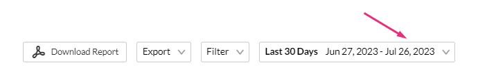
You can use the date picker at the top of the dashboard to change the timeframe and view data across different periods. You can select preset time periods or choose specific dates.
Preset time periods
Preset time periods are a quick way of looking at recent data, such as the last week or the last month. You can also select time periods such as current year or quarter.
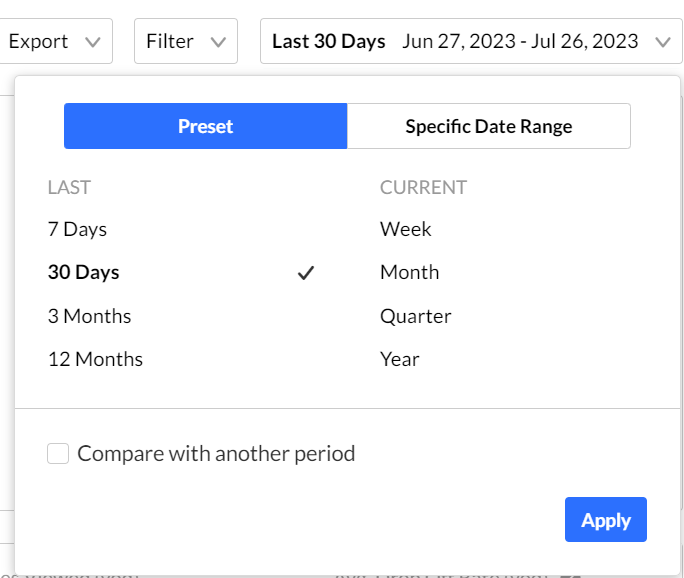
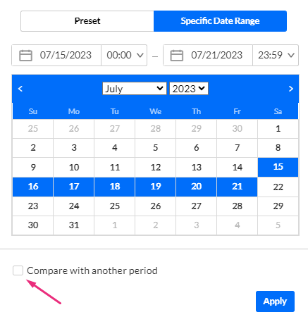
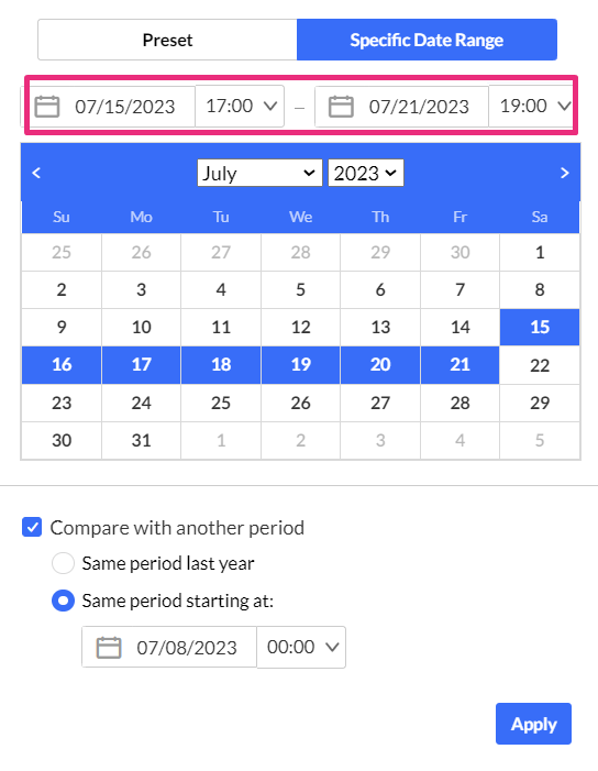
Selecting a specific date range
To select a specific date range
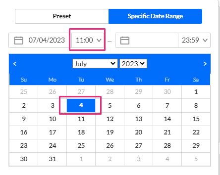
1. Click on the date picker and choose the Specific Date Range tab. 
2. On the calendar, click the starting date of the time range you want analytics for.
3. Select the hours filter to fine tune your filtering to specific hours.
Note: If you want to select until midnight, please enter 23:59 as the hour.
4. Click the last date of the desired time range. The time range will appear marked on the calendar.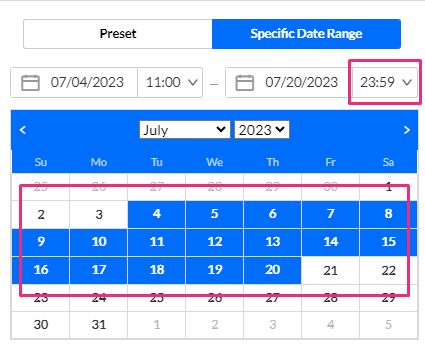
5. Click Apply 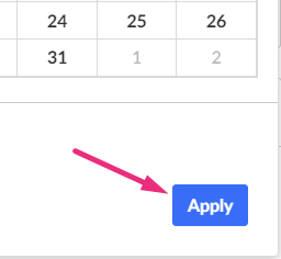
The dashboard data displays for the chosen time range.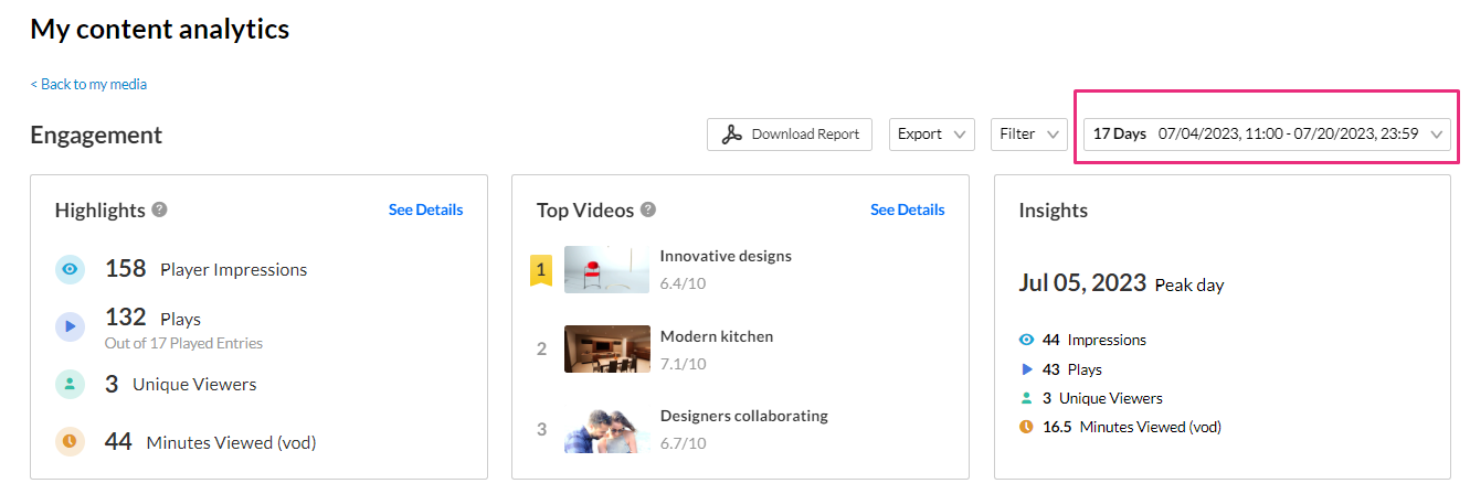
Compare time periods
You can compare different time periods to better understand your data considering seasonality and changes in usage following adoption of new tools and capabilities. You can choose to compare between the same period last year or pick a specific date and compare the timeframe starting from this date. You can also use the hours filter to fine tune your analytics for specific hours.
To compare time periods:
1. Click on the date picker and choose Specific Date Range. 
2. On the calendar, select the first time range you would like to explore by either clicking on the first date on the calendar and then the last date or by entering the dates in the date fields.

3. Check the box Compare with another period.
4. Click the second time range you'd like to compare with - Same period as last year or Same period starting at a specific date:
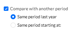
Same period as last year
Use this to compare with the exact same date range as the year before. For example, if the first selected range is July 15, 2022 to July 21, 20232, the comparison will be performed to the date range of July 15, 2022 to July 21, 2022.
1. Select the date range on the calendar.
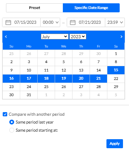
2. Click Apply.
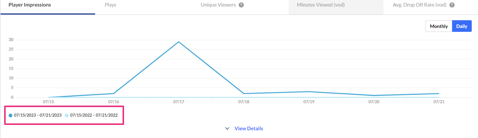
The graph displays the comparison.
Same period starting at a specific date
This compares a specific time range of the same duration as well as for a specific range of hours. In our example below, we're comparing analytics for July and June, for the hours of 17.00 to 19.00.
1. Select the timeframe you want.
2. Select the hours.
3. Select Same Period Starting At.
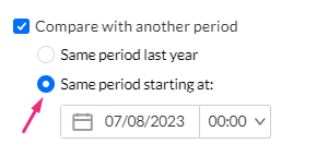
4. In the screen that drops down, mark the starting date.
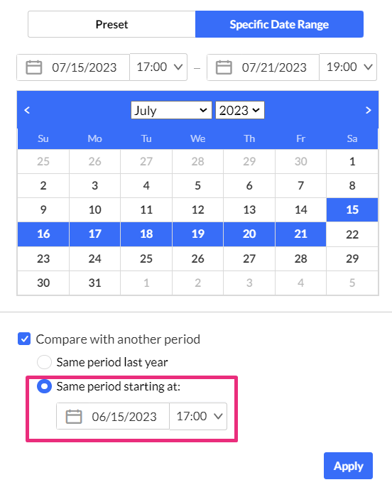
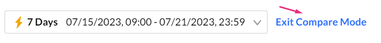
5. Click Apply to view the graph with information from both periods.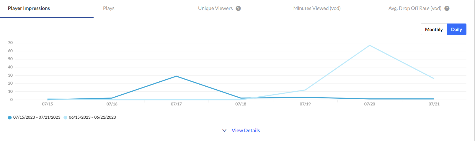
To return to viewing a single time period, click on Exit Compare Mode.
Filter data
You can filter the data in the dashboard based on additional criteria.
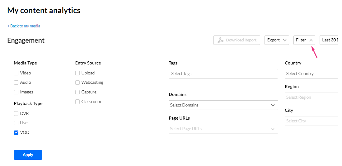
The filtering options are:
- Media Type - video, audio, and / or images
- Entry Source - The source of the content ingested to the system. Content can be uploaded or created via Kaltura's Capture, Webcasting, or Classroom.
- Playback Type - DVR, Live or VOD
- Tags - tags on the content
- Domains - domains where the video was viewed
- URL Pages - URL pages where the video was viewed
- Country - country where the created video was viewed
- Region - region where the created video was viewed
- City - city where the created video was viewed
To filter the dashboard data based on a specific parameter:
- Click the Filter option to open the filters pane.
- Select the relevant filters you'd like to use.
- Click Apply to show the filtered data in the dashboard.
Export to CSV
You have the option to export analytics reports to a CSV. Click Export to open the drop-down list and select the data you'd like to export. One or more options can be selected.
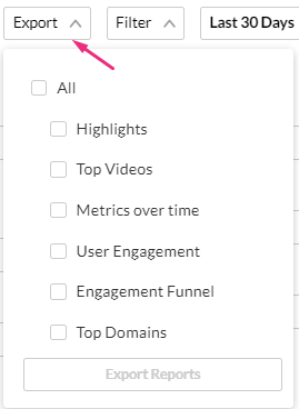
A notification is sent about the export request status. If the data in the report was filtered, the report is based on the filter applied. You will be notified that your export request is being processed and will be emailed to you when complete.
Export is limited by 60,000 records and time to execute. If you receive an error, break down your report to smaller time frames or use filters to reduce the size of the report.
The files expire in 7 days.
Download report
You can get a summary report of the entire dashboard in pdf format by clicking Download Report.
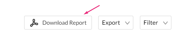
To change the time period or filter the data, use the date picker and filter panel at the top of the dashboard. You can also compare data from different time periods.