/* CSS Template to theme your KMS *//* resize top logo */ #header .brand img { max-height: 40px; } /* this customizes the slider and add some space next to it */ body.module-home #entrySlider { margin-bottom: 0px; text-align: center; /* margin-top: 10px; */ /*. margin-left: 20px; margin-right: 20px;*/ } /* Here we list all the things to search for to make a quick color scheme */ /* Color 1: #333333 PRIMARY NAV */ /* Color 2: #eeeeee LINKS */ /* Color 3: #ffffff Header text and underline */ /* BG color: #367a8e *//* ******* COLOR 1 ******* */ /* This modifies the color of the text and icons in dropdown menus */.dropdown-menu>li>a, #header .nav li>a{ color: #333333 !important; }a, .stat_data { color: #333333 !important; }/* ******* COLOR 2 ******* */ /* This modifies the color of hyperlinked text within mediaspace, as well as certain icons and other dominant UI elements */.nav-pills>li>a#gallerySearch-tab, .nav-pills>li>a#gallerySearch-tab:active, .nav-pills>li>a#gallerySearch-tab:focus, .nav-pills>li>a#channelSearch-tab, .nav-pills>li>a#channelSearch-tab:active, .nav-pills>li>a#channelSearch-tab:focus, #channel_title .muted, #categoryCarousel #filterBarWrap .categorynav #categoryview button.active, .mediaTable tbody tr .entryTitle h4, #videosResultsTable tbody tr .entryTitle h4, .input-append i, .input-prepend i, .input-prepend .btn, #entryButtons #Captions .videoSearchInput:after, #wrap #filterBarWrap #mymediaview button.active, .mediaTable tbody tr .entryTitle, #videosResultsTable tbody tr .entryTitle, #wrap #myMediaCarousel #myMediaEntries #filterBarWrap .navbar-search-wrapper form .input-prepend i, .mediaTable tbody tr .entryTitle a, #videosResultsTable tbody tr .entryTitle a, .thumb_user_content .searchme, #entryCarousel .expandable dl.dl-horizontal:not(.details) dt#appearsIn + dd > a.badge, #entryCarousel .expandable dl.dl-horizontal:not(.details) dt.customdata+dd>a.badge { color: #eeeeee !important; }.mymediaTable tbody tr td.thumbTd .status.label-info, .nav-list li > a:hover, .nav-list li > a:focus, .bs-docs-sidenav li > a:hover, .bs-docs-sidenav li>a:focus, .nav-list li.active > a, .bs-docs-sidenav li.active>a { background-color: #eeeeee !important; }.navbar-search-wrapper form .input-append input,.navbar-search-wrapper form .input-prepend input { border-left: #eeeeee !important; }/* This modifies the color of hyperlinked text that is currently being hovered by the end user as well as certain icons and other dominant UI elements */a:active, a:hover, a:focus{ /* color: #eeeeee !important; */ }.nav-pills>li>a#gallerySearch-tab:hover, .nav-pills>li>a#channelSearch-tab:hover, #wrap .navbar.categorySearchBar .input-append .add-on:hover i, #wrap .navbar.categorySearchBar .input-prepend .add-on:hover i, #wrap .navbar.channelSearchBar .input-append .add-on:hover i, #wrap .navbar.channelSearchBar .input-prepend .add-on:hover i, #categoryCarousel #filterBarWrap .categorynav #categoryview .btn:hover, body.module-quiz.controller-entry.action-add-quiz #wrap #browseTable .navbar-search-wrapper form .input-append .add-on:hover i, body.module-quiz.controller-entry.action-add-quiz #wrap #browseTable .navbar-search-wrapper form .input-prepend .add-on:hover i{ color: #eeeeee !important; }/* This modifies the background color and border color of buttons */button.btn.btn-link, button.btn.btn-link:active, button.btn.btn-link:focus, button.btn.btn-small.btn-link, button.btn.btn-small.btn-link:active, button.btn.btn-small.btn-link:focus, a.btn.btn-link, a.btn.btn-link:active, a.btn.btn-link:focus, a.btn.btn-small.btn-link, a.btn.btn-small.btn-link:active, a.btn.btn-small.btn-link:focus, input.btn.btn-link, input.btn.btn-link:active, input.btn.btn-link:focus, input.btn.btn-small.btn-link, input.btn.btn-small.btn-link:active, input.btn.btn-small.btn-link:focus, div.btn.btn-link, div.btn.btn-link:active, div.btn.btn-link:focus, div.btn.btn-small.btn-link, div.btn.btn-small.btn-link:active, div.btn.btn-small.btn-link:focus, span.btn.btn-link, span.btn.btn-link:active, span.btn.btn-link:focus, span.btn.btn-small.btn-link, span.btn.btn-small.btn-link:active, span.btn.btn-small.btn-link:focus { color: #eeeeee !important; }button.btn.btn-primary, button.btn.btn-small.btn-primary, a.btn.btn-primary, a.btn.btn-small.btn-primary, input.btn.btn-primary, input.btn.btn-small.btn-primary, div.btn.btn-primary, div.btn.btn-small.btn-primary, span.btn.btn-primary, span.btn.btn-small.btn-primary, #entryButtons>ul>li.active>a, #entryButtons>ul>li.active>a:hover, #entryButtons>ul>li.active>a:focus, #entryButtons>ul>li>a.active, #entryButtons>ul>li>a.active:hover, #entryButtons>ul>li>a.active:focus, .nav-pills>li.active>a, .nav-pills>li.active>a:hover, .nav-pills>li.active>a:focus, .nav-pills>li>a.active, .nav-pills>li>a.active:hover, .nav-pills>li>a.active:focus { background-color: #eeeeee !important; }button.btn.btn-primary, button.btn.btn-small.btn-primary, a.btn.btn-primary, a.btn.btn-small.btn-primary, input.btn.btn-primary, input.btn.btn-small.btn-primary, div.btn.btn-primary, div.btn.btn-small.btn-primary, span.btn.btn-primary, span.btn.btn-small.btn-primary, .nav-tabs>.active>a, .nav-tabs>.active>a:hover, .nav-tabs>.active>a:focus, .nav-tabs li a:hover, #entryCarousel .nav-pills > li.active>a, #entryCarousel .nav-pills > li.active>a:hover, #entryCarousel .nav-pills > li.active>a:focus, #entryCarousel .nav-pills > li>a.active, #entryCarousel .nav-pills > li>a.active:hover, #entryCarousel .nav-pills > li>a.active:focus, #entryCarousel .nav-pills>li>a:hover { border-color: #eeeeee !important; }/* This modifies the background color of the hover effect when a child element of a dropdown menu is hovered or clicked */.dropdown-menu>li>a:hover, .dropdown-menu>li>a:focus, .dropdown-submenu:hover>a, .dropdown-submenu:focus>a { background-color: #eeeeee !important; }/* This modifies the color of tags across KMS */.tagsWrapper .badge-info, .tagsWrapper .badge-info:hover{ color: #eeeeee !important; border-color: #eeeeee !important; }/* ******* COLOR 3 ******* *//* This modifies the color of both the text and the underline effect on the primary navigation */#header #horizontalMenu .nav>li>a, #header #horizontalMenu .nav > .active > a, #header #horizontalMenu .nav > .active > a:hover, #header #horizontalMenu .nav > li > a:hover, #header #horizontalMenu .nav>.active>a:focus, #gsearchv2,#header .btn, #header .btn:active, #header .btn:focus { color: #ffffff !important; }#header #horizontalMenu .nav > .active > a, #header #horizontalMenu .nav > .active > a:hover, #header #horizontalMenu .nav > li > a:hover, #header #horizontalMenu .nav>.active>a:focus { border-color: #ffffff !important; }/* ******* BG COLOR ******* *//* This modifies the background color of buttons when they are active or being hovered by a user */button.btn.btn-link:hover, button.btn.btn-small.btn-link:hover, a.btn.btn-link:hover, a.btn.btn-small.btn-link:hover, input.btn.btn-link:hover, input.btn.btn-small.btn-link:hover, div.btn.btn-link:hover, div.btn.btn-small.btn-link:hover, span.btn.btn-link:hover, span.btn.btn-small.btn-link:hover{ color: #367a8e !important; }button.btn.btn-primary:hover, button.btn.btn-small.btn-primary:hover, a.btn.btn-primary:hover, a.btn.btn-small.btn-primary:hover, input.btn.btn-primary:hover, input.btn.btn-small.btn-primary:hover, div.btn.btn-primary:hover, div.btn.btn-small.btn-primary:hover, span.btn.btn-primary:hover, span.btn.btn-small.btn-primary:hover { background-color: #367a8e !important; }button.btn.btn-primary:hover, button.btn.btn-small.btn-primary:hover, a.btn.btn-primary:hover, a.btn.btn-small.btn-primary:hover, input.btn.btn-primary:hover, input.btn.btn-small.btn-primary:hover, div.btn.btn-primary:hover, div.btn.btn-small.btn-primary:hover, span.btn.btn-primary:hover, span.btn.btn-small.btn-primary:hover { border-color: #367a8e !important; }/* This modifies the background color of the KMS header. This is the area that contains the logo and primary navigation */#header .navbar-inner { background-color: #367a8e !important; box-shadow: 0 4px 10px 5px rgba(0,0,0,0.1); background: linear-gradient(0, white 50%, #000 50%);}/* This modifies the color of the text and icons in dropdown menus when that element is actively hovered */.dropdown-menu>li>a:hover, #header .nav li>a:hover{ color: #367a8e !important; }/****** GRADIENTS *********//* This modifies the overlay gradient for thumbnails who use a gradient */body.module-home .photo-group.featured_wrapper .overlay-wrapper, #galleryGrid.grid li.galleryItem div.thumbnail .overlay-wrapper, #mySidebar .thumbnail .overlay-wrapper, .mediaTable tbody tr td.thumbTd .overlay-wrapper, #videosResultsTable tbody tr td.thumbTd .overlay-wrapper { background: linear-gradient(0deg,rgba(0,0,0, .6) 0%,rgba(0,0,0, .3) 30%,rgba(0,0,0, .15) 53%,rgba(0,0,0, .10) 71%,rgba(0,0,0, .05) 100%); }/* This modifies the gradient color wherever thumbnails use gradients that support a hover effect */body.module-home .photo-group.featured_wrapper:hover .overlay-wrapper, #galleryGrid.grid li.galleryItem div.thumbnail:hover .overlay-wrapper { background: linear-gradient(0deg,rgba(0,0,0, .6) 0%,rgba(0,0,0, .3) 53%,rgba(0,0,0, .2) 71%,rgba(0,0,0, .10) 100%); }
}
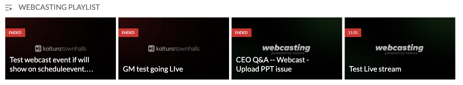
/*This modifies the red banner/flag of the webcasting thumbnail in the Channel playlist.*/
#orderedPlaylists .playlist-carousel-container .thumbnails .channelPlaylistGalleryItem .thumbnail .thumb_icon {width: auto !important;}
}
Click here to see an example.
Without CSS:
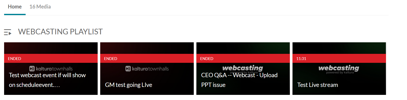
With CSS: